Mission Bay, San Francisco’s newest neighborhood and the largest development in the city’s history, was once 303 acres of former rail yards along the Bay. In the late 1990s, owner Catellus Development Corporation (now held by FOCIL-MB LLC) partnered with the San Francisco Redevelopment Agency to create a flexible plan for a mixed-use, transit-oriented development. Master-planned by Johnson Fain of Los Angeles, the project incorporates up to 6,000 housing units—28 percent of which are affordable—as well as 4.4 million square feet of office / life science / biotechnology / commercial space; a new campus for the University of California, San Francisco; 500,000 square feet of retail; a hotel; community facilities such as a new public school, public library, and fire and police stations; and 41 acres of new public open space. About half of the housing had been constructed as of September 2009, as well as more than 11 acres of new parks and open space and significant elements of the other components.
A number of landscape and architecture firms have worked on Mission Bay’s infrastructure, including EDAW (now AECOM), The Office of Cheryl Barton, Cliff Lowe Associates, Hargreaves Associates, Marta Fry Landscape Associates, WRT, MKThink, and Tom Eliot Fisch. Tom Eliot Fisch designed a number of the park structures and pump buildings. We asked principal Amy Eliot, AIA to talk about her firm’s approach to infrastructure in the new neighborhood, in conversation with Tim Beedle and Amy Neches. Beedle is Vice President, Planning and Development, for Mission Bay Development Group LLC, which is responsible for building the neighborhood’s infrastructure. Neches is Manager of Project Area Planning and Redevelopment for the San Francisco Redevelopment Agency.
Amy Eliot: How did you approach integrating the early elements, such as the urban design, park planning, and infrastructure?
Amy Neches: It is important to understand that the “Design for Development” document was not prescriptive. We didn’t try to prescribe style, because we knew things would happen over time.
Eliot: But was there a significant milestone in setting the tone?
Neches: Doing the streetscape master plan was important, because we did feel that the public realm needed to have some consistency, or it wouldn’t be a true public realm. The risk was that every developer was going to put in his or her own street trees and sidewalks, and the result would be chaos. The work on the streetscape took a long time to get right.
With an open space system, even though it is being built incrementally, you can’t design each piece independently as you go—it’s not like the buildings. So we came up with an agreement that the concept plan for each major park had to be done at once. Ultimately, even though a major public space may be built over time, the pieces will feel like one large park, and will make sense together.
Tim Beedle: The concept plan provides a good framework and general sense of continuity to the public spaces. Also, given both the scale and duration of this project, we had the opportunity to learn from experience through the construction and maintenance of completed parks and infrastructure projects. Those lessons are now applied as we move from the concept plan to construction documents.
Eliot: Let’s talk about the philosophy of infrastructure.
Neches: It’s important to step back from the implementation and understand infrastructure as a manifestation of place. The public realm is the armature that we have created in these 303 acres, and it is expressed in all kinds of ways. The various infrastructure buildings are vertical elements of the public realm.
You can see that public realm expressed in the street grid, which is meant to be as urban as possible. It’s divided into small, walkable blocks laid out in a linear fashion that reflects the grid and urbanity of San Francisco’s street plan.
Infrastructure buildings are an expression of the way cities really work, and of course they are part of that larger comprehensive design.
Eliot: Can you talk about the context for the architecture at Mission Bay?
Neches: There wasn’t anything here. If you look at what’s been built, everything relates to a certain warm, modernist vocabulary. All of these pieces are designed individually, but they are part of an overall design palette that was meant to make Mission Bay feel like a part of San Francisco, while still reflecting the time in which it is built.
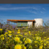
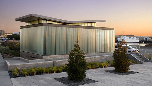
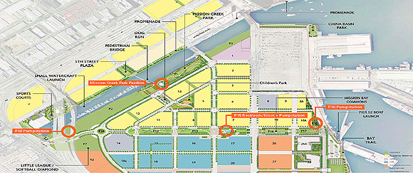
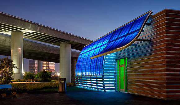
Beedle: Early on, we realized that the infrastructure and related buildings can’t be separated from these design principles. Take, for example, storm drainage management and its supporting infrastructure: there are five stormwater pump station buildings required throughout the project. They’re a major part of the urban environment, and, instead of trying to hide them, we made a decision to place these pump stations within the public parks. Their prominent locations in the public realm and the building architecture make them not remote from the public but rather architectural elements within the park design.
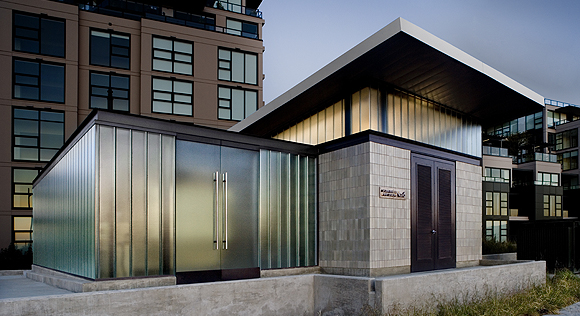
Eliot: We were all pushed by the city’s Arts Commission, which has jurisdiction over the design of these structures, to design pump stations that celebrated a 21st-century vocabulary and were not hidden.
Neches: They really helped push us to reach a higher level of design. It took a few cycles of review.
Eliot: While most of our infrastructure buildings share a common architectural language of channel glass, exposed structural steel, and Heath tile, and are designed to have a lanternlike quality at night, you didn’t prescribe how other infrastructure buildings should look?
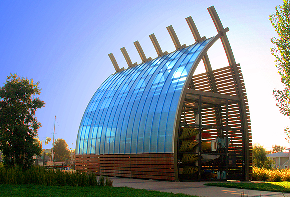
Neches: As with the development buildings, we want each one to be as good as it can be. There are the two buildings that MKThink did, the kayak hut and the maintenance building. We didn’t ask them to design a building like yours. We want the best of each architect involved.
Beedle: And yet they are compatible, because their design expresses the function of the buildings as they relate to the public needs.
Eliot: What about earlier efforts?Neches: We did have a MUNI power station that was built a number of years ago, and we have struggled a bit with that. The first one had a very “designed” look, but we didn’t like it. We didn’t have enough of a sense of what the place was going to feel like. We asked the architect at the city to give us a basic cinderblock building, and we would set aside resources to clad the building later. We didn’t even have the streetscape plan at that point.
Beedle: That raises an interesting point—how should the architect design the building without any context for the future?
Neches: In the beginning, they wanted to do something that referred to the industrial surroundings. We would tell them that those buildings were going to go away and wouldn’t make sense once everything around them was built up.
Eliot: There is a way to extend an industrial aesthetic that doesn’t seem falsely referential.
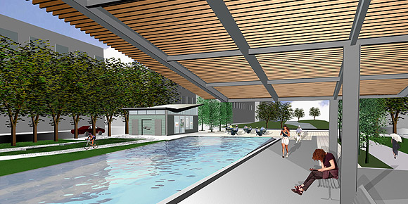
Beedle: We’re trying to maintain a consistent architectural language with the design of the public building in the plans for the future linear parks along Mission Bay Boulevard. In this park, the restroom, kiosks, and pergola shade structure incorporate similar architectural elements used in the pump station buildings at other locations. Other future parks, such as a children’s park and an active recreation park, have been designed to incorporate features that borrow—literally—from prior architectural elements found at Mission Bay; for example, using large steel I-beams recycled from the warehouses structures.
Eliot: What has the public response been?
Neches: Most people really love the infrastructure buildings, but some people really don’t. It’s the same with the other buildings in Mission Bay. But that happens in any city.
Originally published 4th quarter 2009 in arcCA 09.4, “Infrastructure.”


