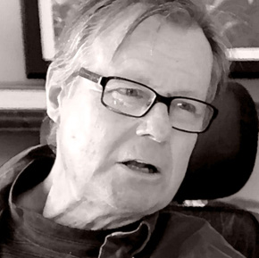
 Duke Oakley served as Campus Architect for UCLA from 1986 to 2000. Before joining Steven Ehrlich Architects in January 2005, he was an associate partner at Altoon + Porter and founder of an independent practice in campus design and planning.
Why did you come to UCLA?
In the mid ‘80s, the UC Regents had decreed that every campus had to do physical master planning and have outside peer review for new projects. They hired me as a consultant to do both of those tasks. I was there because Charles Young was chancellor. First he helped build the school into a world-class university, then he decided it should look like one, too.
Looking back, with what accomplishment are you most pleased?
There are a few ways to answer that. At different times in architectural fashion, the thought of the day is more sympathetic to the ensemble, or the place, and other times it is more supportive of the individual object. In most human settlement, there is probably tension between the individual and the collective. I think college campuses are one of the few great successes in the American built environment. Ironically, this may have happened because the college campus can be less democratic, more authoritarian. Campuses can be a wonderful place to practice a responsible urban architecture. In our training, we were rewarded for being the rugged individual, the Howard Roark. But on campuses, I believe you can and must both be original and pay attention to the larger community.
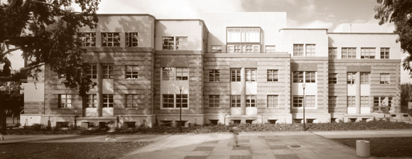
The place I am most proud of at UCLA is the entrance sequence on Sunset at Westwood on the north edge of campus: the underground parking, the refurbished gyms, the new Arthur Ashe Health and Wellness Center by Altoon + Porter, and Wooden North, an addition to John Wooden Recreation Center, which also forms the south end of the soccer field. The whole entrance looks like you are entering a college campus—it is an ensemble. That is what architecture can do—good individual pieces working together to make a special place.
There are also some fine buildings that work to create a total environment and are also intellectually stimulating as independent buildings. Right off I think of an addition to J. D. Morgan Hall that Susie Rodriguez of Polshek Partnership did. This small addition was the last piece to face on Bruin Plaza. It had to resolve the several competing building styles already defining that important campus place. There was the neo-Romanesque Men’s Gym, Rebecca Binder’s muscular student union, and the sort of modernist Wooden Center. And this new building resolves all of those issues. It’s modern, picks up on the brick and the horizontal banding, and looks like it fits. The space inside works and it’s not yelling anything. It doesn’t have to shout out its difference; it has a good presence.
Of course, another important achievement was Pei Cobb Freed’s Anderson School of Management. Now Harry Cobb is a hard-ass modernist; he designed the Hancock Tower in Boston. He was asked to design a large complex immediately behind the iconic neo- Romanesque Royce Hall, which of course is a knock-off of Sant’ Ambrogio in Milan. Clearly Anderson is a modern building. There is an overlay of two grids, the campus grid and the angle of Sunset Boulevard as it goes by on the north side. But it’s made out of brick. Harry took a lot of time to get the right mix of brick. The complex connects the upper and lower campuses, breaks down what would have been a huge lumbering building into six separate parts, and you are led through it. Harry has always been good on the path through the place—and he makes a wonderful place within the larger place of the campus.
With the popularity of mid-century Modernism, what would you say about the ‘60s era buildings on the campus?
It’s generational. The mid-century Modernists thought they could do it better than the Beaux Arts crowd with all their biaxial symmetry. In the immediate postwar period, Modernists kept the old planning principles but experimented with different forms. But then the fashion was to move away from those planning principles, and you got the impression of so many muscular buildings scattered around. It is important to remember we also had a change in the scale of building systems when we had growth in the student body. But some of that early Modernism that is popular now, like the Case Study houses, didn’t scale up so well. These large buildings with their uniform modules didn’t have the same warmth, the same appeal to the eye and the heart, that the smaller buildings did. Maynard Lyndon’s Bunche Hall is not generally well liked on the campus, even though it is quite a good building; there’s a lot of intellect in it. But I don’t see much heart when I walk around it. There was supposed to be an organizing principle, the Grand Axis, which ran from Franz Hall to the Dixon Art Center, and they plopped new larger-scale buildings in, and nobody can perceive it. The planning was lost.
Why did you leave?
I came there as a practicing architect and when I was there I thought of myself as a practicing architect. In addition to the regular roles of a UC Campus Architect’s office, such as master planning, project management, and construction oversight, we had what was in effect a small architectural office on campus and designed a few buildings and much of what we called “little architecture,” such as vending machine kiosks and bus shelters. Yet, during the entire fifteen years there, I felt like a subversive—sort of like a spy. Fifteen years as a subversive is draining. I saw myself as bringing the value system of the architect to the administration of a great university. It was a good time to leave. Chuck Young had retired, and I had always meant to go back to being a practicing architect.
What have you been doing since you left the university in 2000?
First I went to Altoon + Porter. They do large, complex retail centers. Our idea was that, between what I knew about campuses and what they knew about the public realm and retail, we would generate a lot of interesting commissions. To put it simply, developers didn’t take to academics, and potential academic clients were wary of shopping centers. The intellectual synergies that we saw were not evident to potential clients in either the private or the public sectors. Perhaps we were ahead of our time.
Then I was on my own and consulting to architecture and planning firms. Steven Ehrlich and I were on the design review board at UC Riverside. Steven was thinking from the object, and I was thinking towards the object. He understands my bias. If I were purely object-driven, I wouldn’t have been of interest to him. I’ve been a Principal here since January of 2005, and we have been doing more planning work. We are part of a team that won the job to be consulting campus architect at San Luis Obispo, we have done some master planning work for an academic medical center in southern California, and we are doing master plan oversight at Rio Hondo College in Whittier. These projects flow out of my work at UCLA: an architect who understands context and individual buildings and the process that connects them.
At the risk of oversimplifying, what is the most important lesson that can be observed from your experience at UCLA?
Something that the UC campuses continue to go through is moving from a suburban to an urban paradigm. I spent most of my early time there convincing the campus community that there was space to build. During the time I was there—not counting the hospital—we built 4.5 million square feet. That’s more than all of UC Riverside at that time. There was plenty of room, but we had to change our thinking about how you shape space. You have to have a denser campus as far as buildings go. Of course this costs money, it’s not cheap. People before me had built on easy pieces of land. We had to build on hillsides or at the periphery where you had to install infrastructure. I see the society going through the same pattern. In order to accommodate growth, we have to move to a denser urban configuration. You can point to UCLA as a place and say having more density does not mean a loss of quality of life. Indeed, it means quite the opposite.
UCLA, Arthur Ashe Health & Wellness Center, Altoon + Porter Architects.
Interviewer Kenneth Caldwell is a writer and communications consultant based in Oakland.
Originally published 4th quarter 2006 in arcCA 06.4, “The UCs.”


