For an issue on architectural awards in California, it seems appropriate to reflect on one of the region’s oldest such programs, which is run by Sunset magazine. Officially called the AIA-Sunset Western Home Awards Program, it began in 1957 and runs every odd year. The questions we might ask in reference to this program are the age-old ones: how are awards made, and how have architectural values, and in this case homes, changed over the years. But first, some context.
At Sunset, which was founded by the Southern Pacific Railroad in 1898, the home has always been an important subject. In the early years of the 20th century, there was a monthly department called “The Home in the West,” and articles like “The Maybeck One-Room House” appeared occasionally in the 1910s and 1920s. But reporting on “The Changing Western Home” (which ultimately became a trademarked headline, used to this day) really flourished in the pages of Sunset after the magazine was sold to the Lane family in 1928. The cover for April of 1931 brings the subject into perfect focus: a Spanish Colonial Revival-style (i.e. western) house occupies the center of a bull’s eye, surrounded by the magazine’s other editorial departments: Food, Garden, and Travel. Clearly, homeowners were the target audience: they would need the magazine’s advice and had the disposable income that advertisers sought. It was a formula for success that remains essentially true to this day under the ownership of Time Warner.
 As a regional magazine looking for ideas to help its readers adapt to what was essentially an empty, arid land, Sunset ultimately sought innovative, functional, and regional solutions to everyday problems—from siting a house to building a barbecue. Many figures helped shape the magazine’s architectural bent. Ranch house popularizer Cliff May was foremost: his rambling houses integrated structure and site in a way that was perceived to be vividly western and contemporary without being cold or austere. Cliff May was himself a fan of Frank Lloyd Wright, whose ability to combine progressive design ideas with a sense of romance experienced a renaissance in the late 1930s, 1940s, and 1950s.
In a sense, May and Wright helped inspire Sunset’s architectural orientation. Here’s a quick story to illustrate. Wright came to visit Sunset’s new headquarters, designed by Cliff May with gardens by San Francisco landscape architect Thomas Church, in 1954, after a lecture at Stanford. But he refused to get out of the car, because he didn’t like what he saw. Luckily for Sunset, he had been taken to the wrong address, an insurance company not far away. His driver, who was Mrs. Hanna—owner of the famous Wright-designed Hanna honeycomb house of 1937—finally arrived at Sunset, and Wright disembarked without incident.
After his tour, led by the publishing company’s owners Bill and Mel Lane and editor Proctor Mellquist, he pronounced it one of the best office structures he had ever visited. Not surprisingly, he liked the way the building reflected some of the ideas that he had championed over his long career, such as the continuity of paving material between inside and outside and the way structure and landscape formed a seamless whole. According to Bill Lane, there was only one thing Wright didn’t like: the rough terra cotta floors. Wright was used to the highly polished concrete floors at Taliesin West, which he could shuffle over with ease (he was 87 at the time). Needless to say, publisher and editor were charmed and delighted; Wright’s visit was a confirmation of their success.
Today, Sunset’s office building is considered a classic early example of environmental design. Its overscaled ranch house esthetic of adobe walls, patios, long overhangs, expansive lawn, and long garden border tracing a metaphoric outline of the Pacific Coast comprise an emblematic setting for a publishing company devoted to the celebration of living well in the West. It was the perfect regionally inspired shelter for this regional shelter magazine. Indeed, as Proctor Mellquist once told me, “You know Disneyland’s Main Street. It’s an urban design at 7/8 scale. Well, Sunset is just the opposite: a residential design at 9/8 scale.” For both, imagery and the connection to a popular architectural idiom were very important. Sunset’s building was, ingeniously, meant to bring the magazine to life.

A remarkable continuity of concepts is apparent in the winners over the years. One particularly consistent interest of both the magazine and the juries is in making the most out of limited means. This was true in 1957 and is even more urgently true today, though there are always exceptions. A head- line from the 1977 program captures the principle succinctly: “Painstaking design makes small spaces live larger than they really are.” The 1999 program gave awards to three winning houses of under 1,000 square feet and to an owner-built, 1,100 square foot house that cost $100,000. The same program also awarded a sculptural, 5,000+ square foot house on an unlimited budget that included a special structure described as a “car wash.”
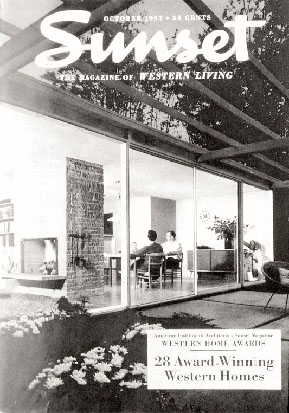
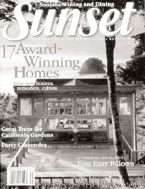
Conceptual consistency is most strikingly illustrated by comparing the first awards cover of 1957 with one from 40 years later. The earlier image depicts a wood and glass box—a sort of a Philip Johnsonesque glass house made of red cedar. It was a $14,000, three bedroom, one bath subdivision house in Kirkland, Washington, by Seattle architect Paul Hayden Kirk. Its all-glass rear façade appeared to double the size of the modest house by incorporating the landscape into its design. It was modern, but a wood trellis gave it warmth. The house on the 1997 cover is also a wood and glass box. This time it’s a vacation house built as a retreat for the architectural firm that designed it, Boora Architects of Portland. Though the type of house is not the same, the concept is: again, continuity between inside and outside is the key. The house becomes a lens for the view, expanding through glass walls to incorporate the Oregon coastline.
As would be expected, and in line with national trends, the overall size and complexity of the western house—as seen in the entries—has increased, even as lot sizes have decreased. Family rooms, great rooms, eat-in kitchens, home offices, media rooms, mud rooms, and exercise rooms have all added to the sophistication and square footage of the early 21st century home, whether new or remodeled. The rise of historic preservation has broadened the appreciation of a diversity of architectural traditions. The open plan has spawned such new developments as the quiet dishwasher. Universal design principles are more evident. Energy conservation and the use of “green” materials have burgeoned, re- invigorating such age-old traditions as rammed-earth construction. And broader interest in interior design has led us to launch a new biennial awards program, jointly sponsored with the American Society of Interior Designers, which is open to interior designers and architects alike. All of which means that the premiated designs of today reflect a vastly more varied array of influences than the award winners of decades ago.

Author Daniel Gregory, Ph.D., Associate AIA, is home editor for Sunset magazine and a member of the arcCA editorial board.
Header photo by Marc Phu; all other photos courtesy of Sunset magazine.
Originally published 1st quarter 2001, in arcCA 01.1, “Awarding Honor.”


