Even with the recent stock fluctuations, Silicon Valley remains the site of the largest creation of wealth in the history of mankind. The question now is: what is all that money going to look like? In the past, wealth brought us the exaltation of cathedrals, the grandeur of palaces and the gritty monumentality of factories. What will be the monuments of Silicon Valley? Nobody yet knows, but a few architects and planners are making some suggestions. Along the way, they are building the first pieces of what may be a new aesthetic, rooted in science and technology, but as fragmented and provisional as our culture.
These fragmented buildings surround, and are penetrated by, threads of communal landscape. The prominence of shared outdoor spaces is a theme that runs through the best Silicon Valley buildings. It may have started on the campus of Stanford University, the mothership from which many of the Valley’s high-tech companies were launched. The red-tiled roofs and arcaded forms of that campus, designed a hundred years ago by the Boston firm of Shepley, Rutan & Coolidge in collaboration with landscape architect Frederick Law Olmsted, have become the lingua franca of the Valley. They have been draped over tilt-up buildings and homes everywhere. Yet, as Stanford University Architect David Neuman, FAIA, points out, “the spaces in between the buildings are at least as important.” Neuman has renovated those spaces on his campus and has become a great advocate for making outdoor spaces where people can gather, learn and just run into each other. “Technology demands of buildings that they remain flexible,” he says. “That means that you cannot do that much with them. The outside stays. That’s where you should look for building a sense of community.”
Two Campus Landscapes

A good example is the campus of Silicon Graphics (SGI), a leader in hardware and software for high-end graphic design. “We are in the visualization business,” says SGI vice president Ray Johnson, “so it’s important for us to have good architecture.”
In SGI’s Entry Site Project and the more recent Amphitheater Technology Center, both designed by Charles Dilworth, FAIA, Erik Sueberkrop, FAIA, and David Sabalvaro, AIA, of studios Architecture, fragments point to a larger whole. Here is a collage of forms that could have come out of a computer but that also reflect the continually changing nature of a human landscape where electronic technology demands flexibility.
The 500,000 square foot Amphitheater Technology Center sits on top of an artificial hill that contains underground parking, a rarity in an area where seas of cars surrounding low-slung, spread out buildings are the norm. The U-shaped structure looks out over a five-acre park the company deeded to the city, and its playful forms, designed by landscape architect Dan Tuttle of SWA, continue into the complex to make areas where employees can play volleyball, eat lunch or just wander.
The Technology Center resembles a fragmented version of Thomas Jefferson’s Lawn at the University of Virginia. In both cases, a series of pavilions stretches out on either side of an open space, surveying the land below. At Virginia, the head of the campus is a domed library. At the Technology Center, where hierarchies are definitely not part of the culture, the end piece is just another three-story office building. The places of gathering and learning are lecture halls, demonstration rooms and theaters that stick out of the rows of office buildings into the central space. Instead of a central monument to meaning, this complex has fragments for brainstorming.

More typical of new corporate campuses is that of Electronic Arts. Designed by Craig Hartman, FAIA, of Skidmore, Owings and Merrill, it sits near what the local wags call “Oracle Castle,” the glass- encased mid-rise buildings that house the Oracle Corporation, and “Sun Quentin,” a massive and rather forbidding compound of low buildings that is the home of Sun Microsystems. Electronic Arts, on the other hand, is an open and almost humble essay in simple, elegant structures. The first phase of the plan, recently completed, has three buildings. One is a parking garage, in front of which Hartman placed a gymnasium and cafeteria. As elsewhere in Silicon Valley, Electronic Arts is competing for engineers with such amenities, and they often become the architect’s only chance to distinguish the buildings.
Beyond the refined skins and scale of the Electronic Arts complex—a legacy of SOM’s long experience in making elegant office buildings—what sets the complex apart is the beauty of its shared open spaces. Like SGI’s Amphitheater Technology Center, it was designed as an extension of the surrounding landscape. Here, that means that the architects took a reclaimed salt marsh and turned it into lively strips of green, planted and paved areas. The rich pattern on the ground does not become a monumental focal point, but encourages wandering through a fragmentation of the grids that mark the surrounding façades.
River and Paseo

The sense of outdoor space as essential for gathering people together pervades Silicon Valley. San Jose, the largest town in the Valley, has grabbed onto the only natural feature that distinguishes it from the sprawl all around it—the Guadalupe River—to make it into a civic space linking a convention center, a children’s museum, a hockey arena, the headquarters of industry giant Adobe and, eventually, the airport that serves as the gateway to the whole Valley. Designed by landscape architects Hargreaves Associates of San Francisco, the Guadalupe River Park has been under development since 1988, and half of its full four-mile stretch is now complete.
Hargreaves Associates have underscored the sinuous nature of the river with earthen tiers of snaking mounds that terrace up each bank. They become amphitheaters, pathways and places to rest, as well as embankments that hold the water back. The park also serves to funnel crowds to and from the arena and the convention center. At strategic points, bridges and plazas mark the intersection between the river and the grid of the city. This is design as a form of natural archaeology that seeks to find the nature of a nature that we usually just build on top of.

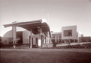
San Jose’s and the Valley’s most remarkable civic monument is the San Jose Repertory Theater, designed by Holt Hinshaw Architects of San Francisco and completed in 1997. The result of a decade-long fundraising project, its construction marked the arrival on the cultural scene of the Hewlett and Packard families, whose vast foundations were among the first to translate digital dough into do-good funding, and who each gave multi-million dollar donations to make the building possible.
The Theater is quite small—a conscious choice, according to its artistic director, Timothy Near. “This has become a place of community, where people see each other. It is our village square.” The Theater sits at the edge of a diagonal paseo or passageway that the city planners cut through the Anglo rigidity of San Jose’s grid and decorated with the words of Mexican poets. Instead of trying to imitate the Mexican forms that this gesture implies, Holt Hinshaw confronted its meander with an angular metallic rock that rises up and over the paseo. Its bravura gesture of destabilization is only proper in a world of technology that has moved away from the old sureties of humanist logic.
Shards, Blobs nd Monuments
The fragmented lofts of SGI lording over the swamps, the curve of the Guadalupe River tying together an anonymous landscape and the condensed spectacle of the San Jose Repertory Theater—all seem like good places to watch the immense wealth of Silicon Valley come together. Much of that money is fleeing to castles and haciendas hiding in the hills, where armies of craftsmen are hard at work building anything from Japanese tea pavilions for Larry Ellison, chairman of Oracle, to French chateaux for his minions. In the public realm, however, where we can see the results of all that electronic magic and the paper wealth it produces, we are beginning to see forms we haven’t known before. They are shards, prows and fragments, curves and curlicues and collages. They sum up the current state of the art in thinking about architecture, which borrows from physics and biology to tell us that our search for rational forms is a futile retreat into an old fashioned way of defining human construction. Building on chaos theory and on the pro- grams produced by companies such as SGI, designers are proposing—and now building—“blobs” and “self-organizing systems” that may be as strange and as expressive of the power of invention as the Empire State, Chrysler and Rockefeller Center Buildings were almost fifty years ago. Surrounding and surrounded by these novel forms are what may finally be the true monuments of Silicon Valley: its redwoods, its Bay and its fragments of open space.
Author Aaron Betsky is Curator of Architecture, Design and Digital Projects, San Francisco Museum of Modern Art; Editor-at-Large, Architecture magazine; and a frequent lecturer, teacher and author, most recently of Architecture Must Burn.
Originally published late 2000, in arcCA 00.2, “Common Ground.”


