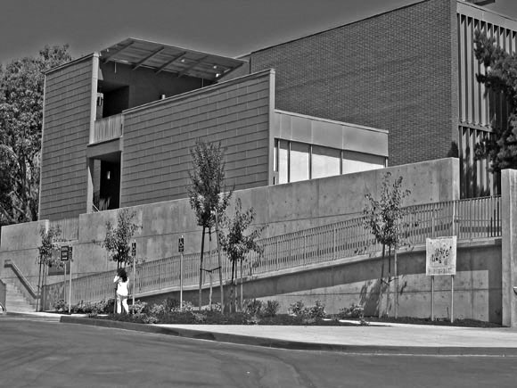
Anshen + Allen was commissioned to design an addition to an existing physical sciences building, designed by John Carl Warnecke, FAIA, at Diablo Valley Community College in Pleasant Hill. We asked Associate Principal and Director of Interior Architecture Lynn Befu and Project Architect and Project Designer Shelley Anixter, AIA, about how the construction documents contributed to the effort to preserve a mid-century building.
What were the challenges, and did your construction documents answer most of the questions?
Anixter: The largest challenges were seismic upgrade issues, the restoration of the original aluminum sun louvers, and the zinc shingles on the new addition. The zinc shingles, although a new product on the West Coast, were well explained in the documents. The louvers, as with many preservation elements, needed clarification. Some of them were manually operated and some were automated. Originally, we thought the louvers could be mechanically cleaned and painted, and we left it to the contractor to decide whether to dismantle the assembly. But the aluminum was not a heavy gauge, and it was not possible to remove decades of rust and dirt without removing them and having them dipped in a solution and repainted. In the end, we had to test several kinds of paint to be sure it would adhere to the bare aluminum after it had been stripped and cleaned.

How are drawings and specs different for mid-century buildings?
Befu: Mid-century projects are like other preservation projects: You don’t know what you are getting into until you open up the walls. There are two key differences from earlier twentieth-century buildings. The materials used in “modern” projects were often experimental and sometimes failed. On the positive side, drawings can be easier to obtain, as they were in this project.
Why did you use a relatively new material—the zinc shingles—on a publicly bid project?
Anixter: For one, it is a sustainable material. It has been used successfully on the East Coast and in Europe. Since it was new out here, two manufacturers gave us an enormous amount of attention and assistance. Their review of our drawings, specs, and shop drawings was very valuable to us. The contractor wanted to substitute another material, but the client supported us. There were instances in which we had to reject some of the contractor’s details and refer them to the drawings, which were very clear. In the end it turned out well.

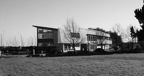
The new South Beach Harbor Building by Tom Eliot Fisch employs an Ipe wood screen to give the building shape, relate to the marine uses, and offer protection from the western sun. We spoke to Principal Amy Eliot, AIA and Associate Principal Alyosha Verzhbinsky, AIA.
Why did you employ this kind of design element?
Eliot: We wanted the building to relate to marine and harbor uses in a

way that avoided the clichés of blue metal roofs and porthole windows. On the west side, there is a need for sun protection, and it is the dominant view from public transit. There was an opportunity to create something that is an abstract characterization of what boats are and how they were historically made.
What were some of the challenges in terms of the documents and constructability?
Eliot: Ipe is very hard to work with, because it is so dense. That’s why it stands up well in marine conditions.
Verzhbinsky: The number one challenge was the geometry of the arcs. One radius is over a thousand feet and the other is over three hundred feet—the center is somewhere out there in the Bay. The contractor couldn’t inscribe those circles on the ground, but the work points we gave them allowed them to calculate the lengths. The fortunate thing is that this wall was one of the last things they built, so they had a lot of time to consider it.
Another issue was tolerance. We had a wood building onto which we attached a steel structure onto which we attached a wood screen wall. These three construction methods have different tolerances, both vertically and horizontally. With a 200-foot-long screen wall, you don’t want to see much deviation vertically, from board to board. And the wood came with differences as much as 1⁄4″ in a 1 x 6. I am not sure if it’s our batch, or normal tolerance for Brazilian-produced wood, but it’s definitely outside tolerances for American milled product.
We paid particular attention to shedding water. We didn’t want the slats to be completely horizontal; you don’t want standing water in a recessed fastener. We used wood spacers to adjust for different tolerances. These angled the wood slats so water can run off. In our drawings, we had called for neoprene spacers, but those couldn’t be found, so the contractor custom milled wood spacers.
How much work was done in the field?
Verzhbinsky: One contractor thought building it in their shop and assembling it on site would make sense, so it was designed to be modular. We thought that would allow us to deal with the tolerances. But the contractor who won the bid preferred to build it on site, piece by piece. This was a surprise. The final tolerances are fine for a building exterior.
Do you see this as a Bay Area building?
Eliot: Yes, but in an unusual context of waterfront buildings that are highly industrial in nature, of the overwhelming ballpark, and of massive condominium towers. The site needed a strong move that could acknowledge this complexity in a simple but elegant way. When we think of the best of Bay Area architecture, the things that come to mind are tautly wrapped and beautifully composed structures, often utilizing wood as both structure and skin, a certain density of texture, and an immediacy in the way a structure expresses how it is put together.

San Francisco’s Masonic Auditorium, designed by Albert Roller and completed in 1958, features an unusual and very large mural overlooking the building’s lobby, which many mistake for stained glass. The creator, artist Emile Norman, called it “endomosaic,” a process by which a number of materials are sandwiched between two sheets of acrylic. The restoration of this mural involved two distinct construction documentation processes, one for reinforcement of an existing exterior screen, to which new exterior panels that block out ultraviolet rays are being installed, the other for the removal and restoration of many of the forty-five panels that make up the mural. We spoke with David Wessel, Assoc. AIA, Principal of Architectural Resources Group, and Glenn David Mathews, AIA, a Principal of Architectural Resources Group Construction Services.
Why two distinct processes?
Mathews: The restoration of the mural is more akin to a design/build process. Nobody has ever restored an acrylic mural like this, because it is unique. The restoration survey and analysis will serve as the construction documents for that portion of the work. The screen work is a straightforward construction process with a set of working drawings. The screen protects the mural, but they don’t meet physically, and two different parties perform the work.
How was this mural made?
Wessel: Each of the mural panels measures 5′ 3-5/8″ x 7′ 3-5/8.” The artist sanded a sheet of acrylic to make it translucent and placed it on a light table. He then arranged what are called the “tesserae” on this sheet to make up the symbolic imagery. These tesserae include glass, acrylic, fabric, metal, dirt from every county in California—sent in by each Masonic lodge— and bits of stone. He glued all this material in place using an adhesive called polybutyl. 3/8” plastic spacers were placed within the image, along with edge strips. A second clear sheet of acrylic was glued over the edge strips.
Why the need for restoration?
Mathews: Exposure to the elements and to UV rays has caused deterioration in both the acrylic sheets and the materials that make up the mosaic. Some of the pieces have fallen out of place, and in some places dirt and moisture have seeped in.

How do you repair such an unusual piece of art or architecture?
Mathews: Carefully. We determined that opening the sandwich panel was not an option. Wessel: We will remove a damaged panel from the frame and lay it flat. A small opening in the side can be made and a piece of metal inserted. Outside the panel, a magnet will help guide the fallen piece of mosaic back into place. Once positioned, a very small hole, just large enough for a syringe, will be drilled above the relocated tessera. The adhesive resin will be reapplied and the hole plugged with invisible material. We will use a similar technique for adhering the acrylic sheets that have delaminated.
Throughout this project, we have been replicating the artist’s original moves. He knew that it might be necessary to repair the mural. He prepared an envelope for the Masonic organization, to be opened only after his death. Amazingly enough, they still had it, and of course they never opened it. We visited Mr. Norman down in Big Sur, and he opened the envelope for us. He had made clear instructions on how the mural was constructed and how it could be repaired. It validated what all of our scientific testing had told us! Likewise, we have thoroughly documented the mural, so it would be possible to recreate it photographically, should the actual mural become too fragile beyond our lifetimes.


Douglas Thornley, AIA, of Baum Thornley Architects LLP designed a new winery for Paraduxx Winery in the Napa Valley. A ten-sided fermentation building offered some unusual challenges. We asked him about the construction.
Why a ten-sided fermentation building?
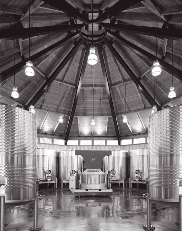
Our client desired a unique form for the heart of a new winery and asked us to look at indigenous barn traditions. It turns out that a ten-sided structure is the most efficient in terms of arranging the fermentation tanks in a circular layout.
So it’s not just for aesthetic effect?
No. The client requested a column-free space. The building is seventy-five feet across without any columns. There is great efficiency in the roof framing material. You don’t have to draw ten different conditions. Each steel roof beam (hip rafter) is exactly the same size and tapers toward the top, where they are collected in a compression ring. There is less load at the top of the roof and more at the perimeter, which allows for the taper. The expressed roof enclosure, which appears like a wood lattice, sits above the steel beams.
Can all this be understood from the construction documents?
Essentially, yes. But the structure is not self-supporting until all of the primary members are in place. It goes up fast.
Were there a lot of questions during construction?
The structural engineer had to be fairly involved, especially around questions of shoring. Most buildings are seen as sequential. What is unique about a roof framing system like this is that you have to get everything in place for it to work. It depends on unity— and the necessity of shoring during erection. That is hard to convey in drawings. It helps if everybody involved has worked on this kind of structure before, as I had in William Turnbull’s office. We are going back to a way of building that was figured out a long time ago without all our modern technology. That is more challenging for us today than it was for our agrarian forefathers.

Interviewer Kenneth Caldwell is a writer and communications consultant based in Oakland.
Originally published 1st quarter 2006 in arcCA 06.1, “Imbedded Knowledge.”


