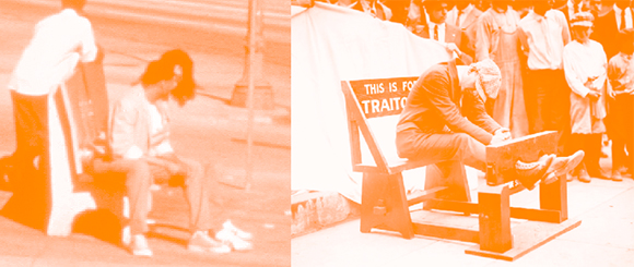
The pillory was a familiar feature of the medieval city. Authorities would erect the wooden structure in a public space so that social offenders would be punished by way of humiliating public confinement. In contemporary Los Angeles, a similar scenario unfolds at the typical bus stop. Our latter-day social offender—the citizen who has failed to obtain a car—is confined to an ugly plastic bench with advertising. The bench sits inches from the curb, where vehicles speed by in alarming proximity. A metal trash can overflows with refuse. Trees are removed so that no shading is available in summer; in winter, rain falls unimpeded. A metal pole carries a route number sign without any information on the route itself or the schedule of the bus. The punishment is completed by hundreds of scornful glances from passing drivers, comfortable in their air-conditioned cars. An Elizabethan constable would have heartily approved.
The neglectful mistreatment of riders at bus stops is only the most visible indicator of the broader decline of the public transit system itself. Los Angeles once had a famous network of trolley lines, but the explosive growth in automobile ownership and post-war suburban expansion eventually made the trolleys seem slow and obsolete. The irreplaceable rights-of-way were abandoned, and trolley lines became bus routes. The buses became stuck in the same traffic as cars. The middle class stopped using the buses altogether. Ridership plummeted. Service declined.
Yet today, even without significant middle class patronage, Los Angeles County still has more than a million bus boardings a day, the highest number in the country after New York. These boardings are made primarily by the “transit dependent,” a technocratic euphemism for the working poor, the mentally ill, the disabled, the adolescent, the elderly, the carless, the homeless, and the occasional solid citizen whose car is in the shop. The middle class is barely aware of the bus system at all, other than the annoying tendency of its buses to get in their way as they drive the boulevards. The bus stop is really the single urban location where the two populations—the transit dependent and the transit independent—actually observe each other at close range. The conditions of the bus stop can only confirm the relief of the middle class motorist at not having to use the bus at all.
Public transit and public space go hand in hand. In both cases, Los Angeles middle class lack of interest has led to disinvestment. The dismaying condition of the bus stops can be extrapolated to large swaths of sidewalks, plazas, and parks. But disinvestment is not the same thing as disappearance. It has become fashionable among certain architectural critics to declare the end of public space. These urban obituaries are usually preoccupied with burnished concepts like the privatization of the public realm, the malling of the street, disneyfication or theme park urbanism, the new electronic agora, the crisis of cultural inauthenticity. But these critiques are primarily concerned with symbols of middle class culture and commerce and usually ignore the very real, very neglected, and very public streets, sidewalks, and bus stops that millions of working class citizens inhabit every day. For them, for better or worse, public space endures.
The pedestrian walking to the bus stop knows that this public space is real because, within it, she puts her body on the line. She isn’t just a pair of Jane Jacob’s famous “eyes on the street,” a metaphor for a shopkeeper or apartment dweller gazing on a crowded public space from the safety of a private doorway or window. The bus rider is a body on the sidewalk. Occupying public space increases your physical vulnerability—to discomfort, annoyance, revulsion, fear, abuse, injury. That’s the price you pay. At the same time, there is supposed to be a reward. Easy movement around the city. Exposure to appealing but hidden places. Chance encounters with interesting strangers. The sense of belonging to an urban community. Even the satisfaction of reducing your contribution to environmental degradation. These are the pleasures that the middle class pays dearly for on vacation but shuns in daily life back home, where armored vehicles with leather seats are the preferred mode of urban mobility. Most Los Angeles transit users don’t have the luxury of that choice. They are the involuntary foot soldiers of the city’s public space. By virtue of their numbers alone, they populate and therefore activate public spaces that the middle class has left for dead.
Over the past decade, this situation has begun to change, as the middle class has come to the tentative conclusion that investment in public transit and public space may have economic and social benefits for them. Streetscape and downtown revitalization projects abound. And Los Angeles now has an embryonic subway system and two light rail lines, with as many as three more light rail lines under construction or under consideration. But rail’s high construction costs, political complexities, and limited potential for expansion have also forced officials to take a fresh look at the discredited bus system.
The existing bus system has the great advantage of going virtually everywhere. Despite the vastness of Los Angeles, there’s actually a bus stop within reasonable walking distance of millions of residences. But it also has two major disadvantages. The first is speed. Slower speeds may be tolerable in compact cities where distances are short and walking is an alternative, but not in an urban area a quarter the size of Switzerland. The economic penalty of long-distance delay is too great. The second is the image of bus transit itself, which is widely viewed as dirty, noisy, and inferior to rail in any form. Some of the blame for this poor image can be attributed to transit operators, who have failed to imagine buses as anything other than rubber-tired boxcars to be covered with advertising. But politicians and the engineering/construction industry have also contributed by pushing exclusively for more glamorous, more expensive, and more job-producing rail projects.
To overcome these disadvantages, in the mid 1990’s the Los Angeles County MTA and the city of Los Angeles’s Department of Transportation began to develop a demonstration project to improve both the speed and image of bus transit. Studies showed that traffic congestion was responsible for only 50% of the slow speeds. The other half derived from time spent waiting at red lights and the “dwell time” at bus stops. Dwell time delays were also multiplied by the high number of stops, typically located every two or three blocks. In the new project—40 miles along Ventura and Wilshire Boulevards—stops would be spaced approximately one mile apart, like a rail line. New electronic technology would be used to hold green lights a few seconds longer for the bus. New buses would be ordered with low floors for easier and faster boarding, larger windows for better views and security, and compressed natural gas engines for lower emissions. The “station stops” would be designed to further accelerate boarding. Electronic signs would give waiting passengers information on the arrival of the next bus. And the whole system would have a new graphic and architectural identity. It would be called Metro Rapid.
Our task was to develop a visual identity for the Metro Rapid system and to create a single, distinctive design for station stops. The design had to speed passenger boarding, provide enhanced passenger amenities, look appropriate in a wide range of urban settings, fit onto narrow sidewalks, minimize visual obstruction of adjacent businesses, expand easily for longer buses anticipated in later phases, anticipate the eventual pre-payment of fares and multi-door boarding, allow for fast and minimally disruptive construction, and be sufficiently economical to allow for widespread application of the design.
We developed the Rapid shape—referred to variously as the comet, the surfboard, or the airfoil—to provide the system with a distinctive and memorable form. Our hope was to contribute a positive symbol of public investment in public space that could hold its own in the sea of private commercial symbols that border the boulevards.
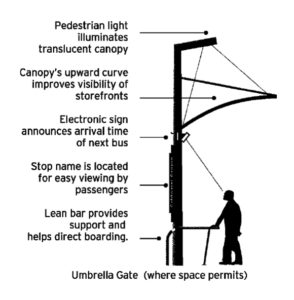
The design treats each stop as a defined public environment within the larger public space of the street. The basic modular element is an “umbrella gate”: two 16–foot steel poles joined at mid-point by a crossbar, surmounted by a curved, translucent canopy. This goalpost form creates a literal gate that marks the exact spot where the doors of the Metro Rapid bus will arrive, which helps speed boarding and deboarding. The base of each support pole is protected by a curved stainless steel railing, which directs passengers to the door and provides support for leaning (seating is typically not provided because of the frequency of Rapid buses, which arrive as often as every 3 minutes during peak hours). The door’s location is indicated by a “welcome mat” of red concrete pavers.
Signage is an important component. Mounted on each gate’s crossbar is an electronic message sign providing real-time information on the arrival time of the next bus. At the leading edge of the stop, a 19–foot high “flagpole” with an illuminated Rapid sign extending over the street helps approaching passengers see the stop from several blocks away. An attached kiosk displays to waiting passengers a large, illuminated map of the entire transit system. Revenue from an advertisement on the traffic side of the kiosk helps pay for stop maintenance.
Metro Rapid was launched in the summer of 2000. The cost per mile: about $2.5 million, compared with $250 million for the subway. It was an immediate statistical and popular success. Travel times have been cut by as much as 25%. Ridership on the two lines has risen by an average of 30%. Perhaps most significantly for the long term prospects of public transit in Los Angeles, half of that increase in ridership is from “new riders,” those who had previously used a car instead of a bus. Within ten months of the opening of the two Rapid lines, the MTA board voted to expand the system from two to 22 lines, with another 14 to be considered later. Six new lines are to be selected for immediate implementation.
The attitude of waiting passengers at the Rapid stops appears to be one of greater assurance and pride. They can see the investment in the place where they’re waiting. Thanks to the electronic message sign, they know when the next bus will arrive. And they know that the bus which arrives will be clean, modern, and fast. The bus stop becomes a lively, dignified, and focused urban space, where many people can harmoniously do many different things, from sitting in the sun, to waiting for the bus, to buying flowers, to making a phone call, to purchasing a transit pass. The bus stop infrastructure is reconceived as a two-way portal—a gateway to the transit system as you board, a gateway to the city as you get off. Pillories transformed into portals: they offer glimmers of hope for public transit and public space in Los Angeles.
Photo of man in pillory copyright Corbis; all other images by Suisman Urban Design.
Author Doug Suisman, FAIA, is the founder and principal of Suisman Urban Design in Los Angeles.
Originally published 3rd quarter 2001, in arcCA 01.3, “Publicness.”

