From the aspirations of California’s first settlers to the rise of its iconic industries—motion pictures, aerospace, and information technology — California’s history is steeped in the promise of the future. The Oakland Museum of California, as an institution and a work of architecture, captures a particular moment in this history. The landmark complex, designed by Kevin Roche of Kevin Roche John Dinkeloo and Associates and completed in 1969, embodied the public consciousness of the time. In imagining an institution that would unite the city’s independent collections of art, history, and natural sciences, the museum’s original champions also saw a place that could bring Oakland together.
Unprecedented in its merging of architecture and landscape and its interconnected assembly of indoor and outdoor spaces, the cast concrete museum signaled a civic and social purpose beyond unifying the museum’s collections. Roche, working with landscape architects Dan Kiley and Geraldine Knight-Scott, layered the three galleries with intimate landscapes and devoted nearly half of the museum’s four-block site to a secluded yet public courtyard. Although the museum took a firm stance toward the city, multiple entries and a series of open-air stairways, walkways, and terraces scaled the building’s topography and invited the community to explore its gardens and galleries.
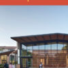
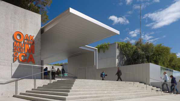
Over time, ad hoc responses to security concerns, weather, and expanding programs encroached on Roche’s vision, and in 1999, the museum began planning for a renovation and expansion—just completed by Mark Cavagnero Associates—that would restore the building’s original clarity and strengthen its presence.
Two courtyards at the top level, unused for decades, have been enclosed to create new galleries capable of housing larger artworks. A series of new canopies frames the museum’s main entrance and unifies the stairs and walkways into a central lobby—still open-air and daylit, yet protected. The lightweight, glass and stainless steel enclosures contrast with the mass of the concrete structure, while their pure forms complement the original building’s simplicity. The steel’s soft luminosity merges with and counters the concrete’s changing presence in the shifting daylight. Bold environmental graphics, designed by SOM’s graphic design studio, mark the renewed museum’s place within the city and the 21st Century.
Each gesture is small relative to the building’s monumental scale, yet through their precision and consistency in form and materiality, their cumulative presence enlivens the powerful structure.
Photo by Tim Griffith.
Author Tim Culvahouse, FAIA, is editor of arcCA.
Originally published 2nd quarter 2010 in arcCA 10.2, “The Future of CA.”