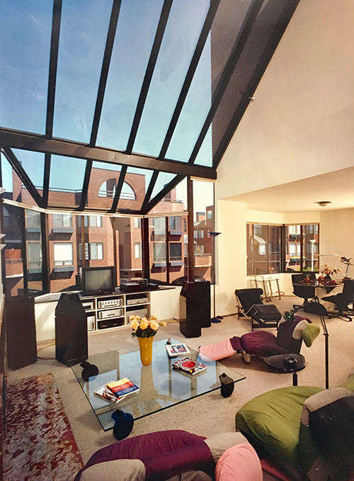
Robert J. Geering, FAIA, was, from 1962 to 2004, a Senior Design Principal at Fisher Friedman Associates, a San Francisco-based architecture firm renowned for innovative single- and multi-family housing. arcCA Digest visited with Bob in San Francisco at his condominium in Golden Gateway Commons, which he designed. Built in stages on three city blocks surrounding Sydney G. Walton Square, a park designed by Pete Walker of Sasaki Walker, the Commons is a sophisticated mixed-use project. In each block, fifty-four condominiums sit atop a two-story podium. At the ground level, retail shops surround a central parking garage; offices do so similarly at the second level. Bob’s condo is one of sixteen in the interior of the block fronting Davis Street between Jackson and Pacific. “I couldn’t afford one with a view,” he says, but in fact the views aren’t bad; his home looks out on a stunning rooftop garden landscape designed by Anthony Guzzardo Associates. We are sitting at a table in a cozy space that opens onto the unit’s double-height living room.
arcCA DIGEST: How did you get interested in architecture?
My father was a Beaux Arts architect. He worked as an apprentice for Willis Polk right out of Lick Wilmerding High School. He joined the Architectural Club of San Francisco, a school where Polk and other respected San Francisco architects and others donated time to teach students. Polk helped my father enter the University of Pennsylvania to study under Paul Cret. He ended up in the same class as Louis Kahn and graduated in 1925. My father worked for McKim Mead & White in New York and, after that, went to Lima, Peru, to design a country club for the Lima Foundation Company, which I believe was a government-sponsored group. He was in Lima for four years before marrying my mother, Ethel H. Trask, in 1930. My brother was born in 1931, and I was born in 1933. We lived in Oakland.
Right after returning from Lima, my father went to work for Louis Hobart, who designed Grace Cathedral. He later opened his own firm in SF, but it was during the Depression, and few projects were available, so he had to go to work for the WPA and CCC to keep food on the table. He also had a studio in back of the house, and among other work he designed house plans that he would sell through the Oakland Tribune toward the end of the Depression. During World War II, he worked for the government in Alameda doing military housing. After the war, he had a little practice doing custom houses, and I worked for him a bit when I was at Berkeley. He drew all these little houses, on two small sheets, built for $4,000 to $5,000. He was ambidextrous, left-handed mainly. He drew with his right hand and lettered with his left, simultaneously, using his elbow to push the T-square. He did beautiful renderings and was an impeccable draftsman and a really fine architect. I happily still have some of his drawings.
arcCA DIGEST: How did Fisher Friedman Associates get its start , and how did you get involved?
Bob Fisher was a year and a half ahead of me at UC Berkeley. He was hired right out of school in 1954 as director of design for Welton Becket’s new branch office on Maiden Lane in San Francisco, across from Frank Lloyd Wright’s Morris Gift Shop. I was the first designer he hired, right out of grad school. Becket was based in Los Angeles; when they opened their San Francisco office, there were about fifteen people, most brought up from LA. They were looking for a young, hotshot designer, so they hired Fisher. He and I were the two designers there, doing big stuff right out of school.
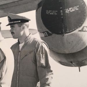
I was drafted into the Navy and was a Naval Aviator for six years. I got out in ‘61 and went back to Becket. My first job was the Palace of Fine Arts, which they were rebuilding. You know it was originally intended to be temporary, and it was falling apart. I designed the interior of the crescent. They wanted a big theater, but they didn’t know what to do with the rest of the vast space, so they asked me to come up with something. There was a good-sized artists’ community at the time in San Francisco—Diebenkorn and other great artists, abstract expressionism—and I was a painter myself, so I had the idea of live-work space for artists: studios, exhibit spaces, lofts for places to live. I designed that, along with the major theatre with a full scenery loft in the center of the crescent and a flexible, experimental theater in the round at the other end. But the reconstruction itself went over budget, so none of my work got built. My first big disappointment!
Welton Becket’s LA office had designed Stonestown Shopping Center in the early ‘50s, near Lake Merced in San Francisco. Around that time, I was designing shops in the mall, among other more comprehensive projects. Bob Fisher was doing some work on the side for the Stoneson brothers, who developed that mall. They also built tract houses and hired Bob to design them. Nick Premiani from Becket was working with him part-time. So Fisher decided to leave Becket to establish his own firm, and he wanted me to come with him, as a named associate and a designer for his new firm, which he set up in Burlingame, where he lived. I joined him in February of 1962. The firm name was A. Robert Fisher – Robert J. Geering Associate, Architects.
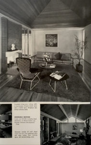
There were just two of us at first; later Bob hired a draftsman. We did merchant-built homes for Stoneson in tracts on the peninsula and in San Jose and other Bay Area cities. Bob and I not only designed many different homes, but also did all the interior design and furnishings for the model houses. They were modern designs, competitive with the Eichler homes of the era. They sold like hotcakes, and we won a lot of architectural awards and were published in Sunset and other homebuilder magazines and architectural journals. We also did a large custom home for one of the Stoneson partners, which also won many awards. All this put us on the map, and we began to receive good commissions from other developers for larger, more comprehensive housing developments. I was working overtime and commuting from Mill Valley to Burlingame, sometimes six or seven days a week.
In 1964, another Berkeley classmate, Rodney Friedman, who was also working as a designer at Welton Becket, came to our Burlingame office. He left Becket with the preliminary drawings for a high-rise apartment building that he’d been working on there. It was a big commission for a major building, so he and Bob Fisher became partners, and Fisher Friedman Associates was formed. Shortly after, we moved to a great building in the heart of the city on California Street, above the Tadich Grill. It made my commute from Mill Valley much easier. I stayed on as a principal, but not a partner. How about that? I must say, a very sore point for me for over 40 years, and still is. But I was just happy to have interesting, all-consuming design problems for all those years, one after another. I was, and still am, obsessed with architecture. I guess this is what kept me going.
Over the years, FFA did hundreds of housing projects. We worked in Arkansas, Florida, Hawaii, Idaho, Illinois, Indiana, New Jersey, New Mexico, New York, Oregon, Texas, and Washington; also in Vancouver, Canada, and in Mexico, as well as Europe, China, and Japan. We did university housing and dining facilities at Stanford, UC Berkeley, UC Irvine, UC Riverside, and UC Merced. And we did lots of other things, including retail facilities, recreation facilities, senior housing, and three city halls.
I don’t mean to brag, but I never designed a project that didn’t win an award.
arcCA DIGEST: How did Fisher Friedman end up doing work in Europe?
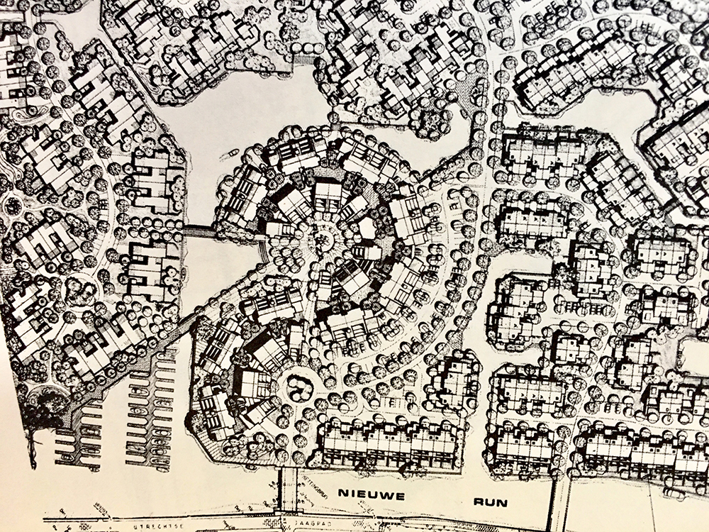
We had a reputation for doing good projects, and we had a lot of repeat clients. One was Lincoln Properties, a big developer. They had brought in Glenn Isaacson as director of housing for their European branch, LinPro, and he knew us. I did a lot of sailing on San Francisco Bay, and Glenn was a sailor, too. And Tony Guzzardo, a landscape architect we worked with a lot, was also a sailor and a friend of Glenn. We had our own pilot, flying back and forth to various sites In Europe, a pretty exciting time. The only projects that got built were one in Madrid and a large project on an old industrial island in Leiden, Holland. When the Dutch clients would come over here, we’d have an all-day meeting, and then they’d want to go out for a drink. They liked the cable car, so we’d usually go to the Buena Vista Cafe at the end of the cable car line at Aquatic Park.
I also designed a beautiful vacation home complex near San Tropez, right on the coast. It had basically been approved, but they didn’t want me to present it, because I didn’t speak French. It was a sensitive site, and they wanted it presented in French by a French architect. The developer hired one, and from what I heard he did a really negative presentation. So that one didn’t get built, which really hurt. It was one of my favorite designs, and I had even picked the unit I wanted to buy.
arcCA DIGEST: You mentioned that you’re a sailor. Did you ever sail with Jack MacAllister?
I didn’t sail with him, but Jack was generous enough to help me on the Chabot Space and Science Center in Oakland. I designed it using exposed concrete and steel. I wanted to show everything. It’s very earthy, gutsy, and didactic. But the poured-in-place concrete walls were turning out really badly.
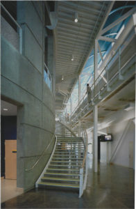
I had expected them to be of Lou Kahn or Tadao Ando quality, but I was very disappointed with what I was seeing. The architect of record was Gerson/Overstreet. They did the CDs and specs. I think our design development drawings were better than the CDs.
So my close friend and colleague, Steve McConnell, who knew Jack MacAllister, recommended I contact him to see if he might be able to suggest a fix. I knew Jack was a fine architect and a great guy, and was also probably the prime expert on structural concrete, having been in charge of detailing the concrete for Kahn at Salk and working on-site during the construction.
He very generously agreed to visit the site with me. When he saw it, he agreed that it wasn’t good and asked to see the specs. He said they were all wrong for the quality I had expected, the mix just wasn’t right, and it was too late to change. So, the only thing to be done was to make sure the formwork and reveals were done according to the drawings. It was a big help and I was grateful to have met him.
arcCA DIGEST: How did you come to do the Space and Science Center? It doesn’t seem like a typical project for Fisher Friedman.
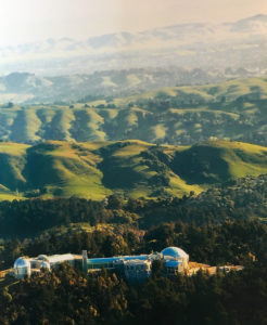
Gerson/Overstreet originally brought BAR in to do the design, but BAR left the project over fee sharing, so they were out of a designer. I got a call from Harry Overstreet, who offered me the design job for a fixed fee. Bob Fisher—who was a terrific designer, but somehow became the one in charge of running the firm and the contracts and all the other difficult business stuff—said we can’t do such a big and complicated job for that fee, and he usually was right. But I was so enamored with its potential, I said, “Well, if we don’t take it, I’ll take it.” So we took it. I was working nights and 70-hour weeks—we had a lot of projects—and I didn’t have any help. I was doing it all myself with hand drawing. Finally, Richard Smith found me a computer-savvy young apprentice architect, Angus Eade, who was a lifesaver.
Richard was probably the smartest guy I ever worked with in my life, he and Aus Vitols, who had been director of Hope Architects, a big firm In San Diego and was a top-notch designer. At the time, Aus was with Kaiser as a construction management consultant, helping to coordinate the Chabot project. We had a mutual respect for each other’s work. He and Richard recommended me to design the Science Center—a fascinating program on a spectacular site. I was ecstatic! Richard worked on refining the building program and designed the “black boxes,” the technical aspects of the planetarium; he even went to Germany to visit Zeiss for the planetarium’s star-ball projector system. And he worked on the science theater and the Challenger Center and the telescope domes. Aus was coordinating with the clients throughout the project and was indispensable. Richard was also on the site as a technical consultant during construction.
arcCA DIGEST: What changes have you seen in the housing world over the course of your career?
I think we at Fisher Friedman helped turn merchant-built housing into true architecture. But sometimes it was very tough to get approvals from planning commissions at public hearings, because the opposition came out of the woodwork. Many times they didn’t want anything built, for whatever reason. Now, there aren’t quite so many NIMBYs. I think more people are aware of the lack-of-housing crisis and the huge inflation of rent and home ownership costs, so hopefully more affordable projects will be approved. And there are a lot of good architects out there who have entered the housing field that I know of in the Bay Area, and I’m sure elsewhere In the world. It seems that more good modern projects are being built and well received than in the past, when most people wanted more traditional dwellings. At least I hope so. I’m still a modernist at heart.
arcCA DIGEST: It’s hard to believe there are fewer NIMBYs now.
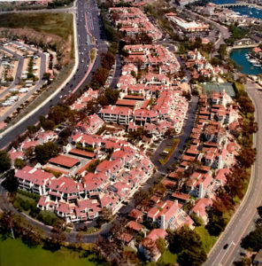
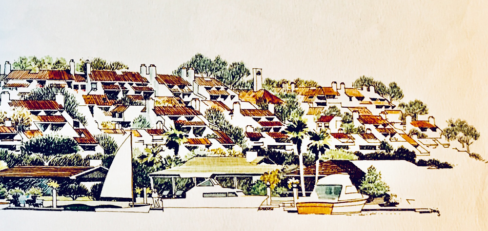
Well, when we did Promontory Point, which was finished in 1975, we made a presentation in Newport Beach City Hall. There were big viewing windows looking into the council chamber. They had to shut the meeting down, because people were shouting and pounding on the windows, they hated the project so much. The California Coastal Commission Act was just coming into effect, and that would have stopped the project, so the Irvine Company invested a lot and built the parking garages before the housing was approved, so it would be underway and could continue. Now everybody loves it, and there would be signs saying “Save Promontory Point!” if somebody proposed to replaced it. It won an AIA Orange County 25-Year Award a few years ago.
I have a thing against most double-loaded corridor buildings. Sometimes you just have to do them, but for every project we did that wasn’t over four stories, I tried to do it without double-loaded corridors. For Promontory Point, I came up with the idea of a system of entrance allées. The building steps up the hill. They dredged the bay and piled up the dirt, raising the height of the site about twenty feet, allowing better views. Nobody has to walk up more than one-and-a-half flights to get to their unit, there are no double-loaded corridors or elevators, and it’s just as dense as a typical apartment building they were building down there.
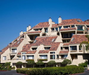
The Irvine Company wanted Mission Style, so I came up with a modern version using traditional materials, tile roofs and blown-on stucco, but with a clean, sharp modern geometry that followed the topography of the site. It was pure white with red tile roofs, which emphasized the strong geometry. Bill Watt, who was director of their apartment communities, was a receptive, hands-on client for all the projects Fisher Friedman did for them. Watt was in Dan Solomon’s class at Stanford, trained as an engineer, but could have been a very good architect. He has an excellent eye for design and is a very successful developer. Ray Watson, president of the Irvine Company at the time, was a Berkeley grad in architecture in about Fisher’s class. He was also very receptive to my designs. All in all, I designed eight projects for the Irvine Company over the years. We usually worked with SWA, who did the landscape.
arcCA DIGEST: Do you have a distinctive way of approaching a project?
The way I approach these projects, the first thing I think about is how people are going to live in it. Along with analysis of site, wind, soils, open space, circulation, and so on, I think basically about the dwelling units. When I designed Golden Gate Commons, my wife and I had just come back from Italy. In the hill towns, it’s interesting to see tight spaces that open up into broader spaces; you get this sense of space and flow and procession. I think of that in all the site plans I work on. I’m always thinking about the interiors, how people will live in the unit, and the outlook, the views to and from the units. Sometimes I go on Google Earth to see what’s happened in places we designed that didn’t get built, hoping that maybe they finally built my projects. Dream on. For a large project in Jersey City, I put the main road on axis with the Statue of Liberty. They built the road but not the project.
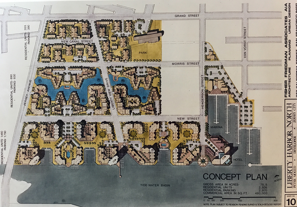
Over the years, I’ve enjoyed doing many urban planning projects, usually going beyond the planning stage and designing the buildings as well, because I see them as connected, and I couldn’t stop at the planning level. Outside of Guanzhou in an area called Rongqi in China, a long ferry ride from Hong Kong on the Pearl River, I designed a very large mixed-use complex in 1989 or ’90. Three of us went to Hong Kong to design the project for two weeks or so. We worked from 7 a.m. until they turned off the air conditioning, in an office tower on the Hong Kong side, then we would cross the harbor by the Star Ferry to our hotel in Kowloon and work in my room until midnight, at least twelve hours a day for two weeks, because the owner wanted us to design the project in front of him. We made drawings and renderings and built study models with a foam cutter. Our 29-year-old, mainland client and his young and very pleasant Hong Kong representative, who translated for him, would come in every morning to check on our progress. It was absolutely wild! A deadline every day. They started building the project from our design drawings a couple of months later, before we had structural drawings and construction documents, two high-rise residential towers, a 700,000 square-foot, three-level shopping mall, three levels of below grade parking, a high-rise convention hotel, and a 30-story office tower on a block as long as two San Francisco blocks. They dug the caissons on a half-mile perimeter by hand, taking dirt out with buckets, labor was so cheap in China then. They did this before they had any engineering drawings. Obviously, they didn’t finish the project as I designed it. I guess they built something, but I don‘t know what. I’ve checked Google Earth but couldn’t find the site. Another frustrating exercise, but it was fun designing such a fantastic and complex project.
We worked a lot with other architects. In Vancouver, for the British Columbia government, with Arthur Erickson’s team, we did the BC Place master plan. We made a 20-foot-long, colored site plan drawing, 12 feet high, to present to the prince, who came over to open the stadium, and we had a huge model and renderings made at the same time. We were trapped for at least two weeks. We were staying in a hotel room near our workspace and hardly saw the light of day. But it was fun! I was our team leader, working with three of the best architects from our office and Arthur’s fine staff architects. Arthur would drop by occasionally when he wasn’t traveling to major projects elsewhere. From the client’s side, the design process was led and reviewed by Dave Podmore, one of Canada’s top urban planners, with the assistance of Peter Busby, an extremely talented young Canadian architect, who has gone on to great things.
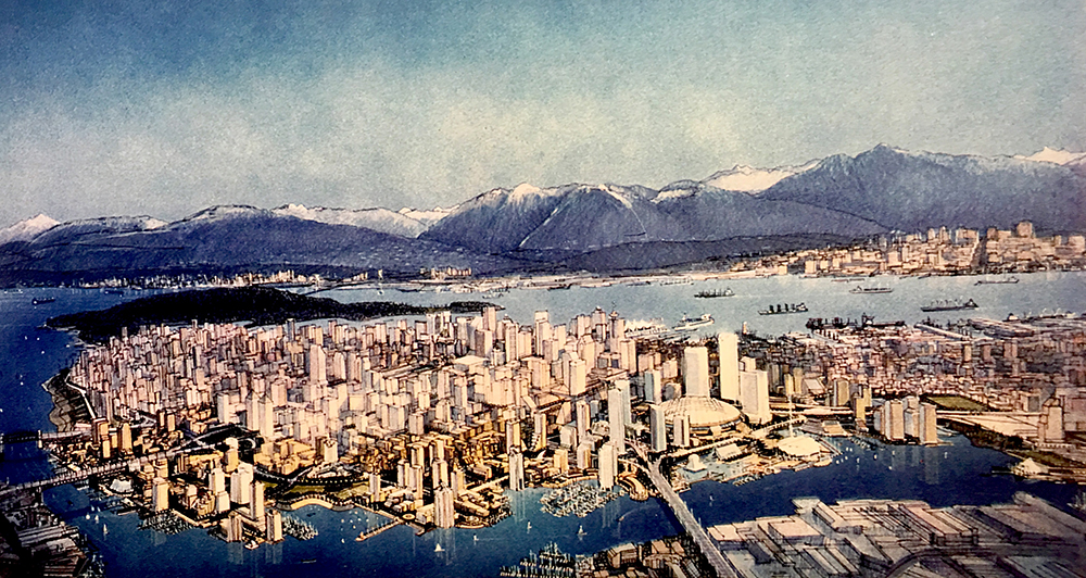
We worked with Caesar Pelli on two large planning projects on the Hudson River across from Manhattan, in New Jersey, and with Charles Moore on two projects, Pleasant Hill City Hall and a university building. Both are completed.
arcCA DIGEST: Tell us about Golden Gateway Commons.
Of the projects I’ve done that are high-density, The Golden Gateway Commons is one that I’m quite proud of.
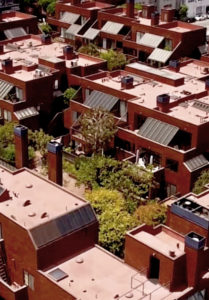
The Golden Gateway Center apartments and retail, just to the south of our Golden Gateway Commons, was a competition in the ‘60s, held by the San Francisco Redevelopment Agency. It was won by Perini Construction out of Boston, with Wurster Bernardi Emmons, DeMars & Reay, and Anshen & Allen as their architects. I think twelve developer/architect teams competed. Becket‘s LA office did a good scheme that was mentioned. Lou Kahn entered, SOM, IM Pei. Some architect named Jan Libizniz—I’m not sure of the spelling—did a wild but wonderful design, which I really liked. It was like Zaha Hadid long before Zaha came on the scene. Wurster Bernardi Emmons and DeMars & Reay won because they included the park, I believe. Carlos Diniz did renderings for Becket’s scheme, and they were beautiful. It was the best presentation by far. Carlos was the best renderer in the country at the time. I helped prepare the display of the presentation in a nice, temporary structure on the site.
At Becket’s, we were involved in this competition in 1961 or so, and then at FFA we got the Commons project in 1976. The way that happened is interesting. This area was the produce district. A railroad track came right in, and trucks and handcarts were everywhere. Italian and Portuguese and all sorts of produce people would work from three in the morning to ten in the morning or so, then play cards, drink wine, and smoke cheroots. Welton Becket SF was the architect for a new produce district to be built south of Market in the Islay Creek area, and our job—another architect, who was in charge, and I, part-time—was to interview these produce guys to determine their space needs at the new facility. We’d come over about noon. They were funny as hell.
So we found out about what was going on there. We had a bit of a hard time recording their needs. They really didn’t want to leave the area.
The three-block site for Golden Gate Commons was just a void, waiting for the next phases, which were going to be more towers, just like the first phase of Golden Gate Center. We were parking our cars there. Then there was an economic downturn, and also the Telegraph Hill people object to any more high-rises to the north of Jackson Street, so they shot the project down. So we just said, “Lets come up with something.” Rodney Friedman talked to the developers and brought in this major commission. We did multiple schemes, pro bono at first, some up to about eight floors. We came up with the concept of mixed-use—housing, office, and retail. We had the site evaluated by soils engineers, and it turned out the present five-story scheme worked for the developers, because it required fewer piles. Everything just worked out, financially and design-wise and market-wise. Everyone was happy. The piles here in Block 1 go to bedrock; the bedrock at the corner of Block 2 is about at 140 feet or so, sometimes driven through old ships and docks and sea walls. This was Bay water in the 1800s.
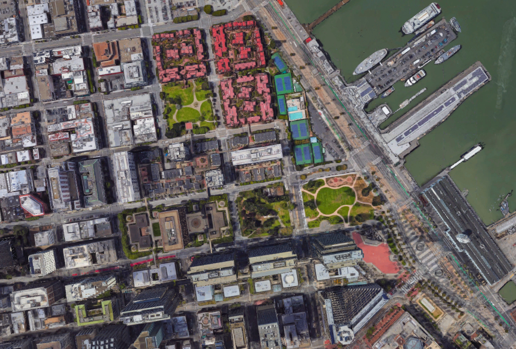
The Redevelopment Agency mandated we stick with the height of the existing podium at Golden Gate Center, so it’s 25 feet up to the podium level; they also required the pedestrian bridges that connect the blocks at podium level, and they mandated the arcade on Davis and Walton Square—all of which we were happy to do.
All the units were townhouses and were to have roof decks, except the flats below the ones in the middle. We had approval for the elevations, including the pediment arches that terminated the walls between the roof decks. But when the working drawings were 99% complete, the contractor decided to take the roof decks off, to save $1.5M or so, which was peanuts, and it hurt me badly, because they provided more private open space and great views and would have made the units more valuable, as well. I wanted to take the arches off then, but we would’ve had to go back through the approvals, both the Planning Department and the Redevelopment Agency, which would have delayed the construction. Allan Temko gave the arches a bad review, and I think he was right.
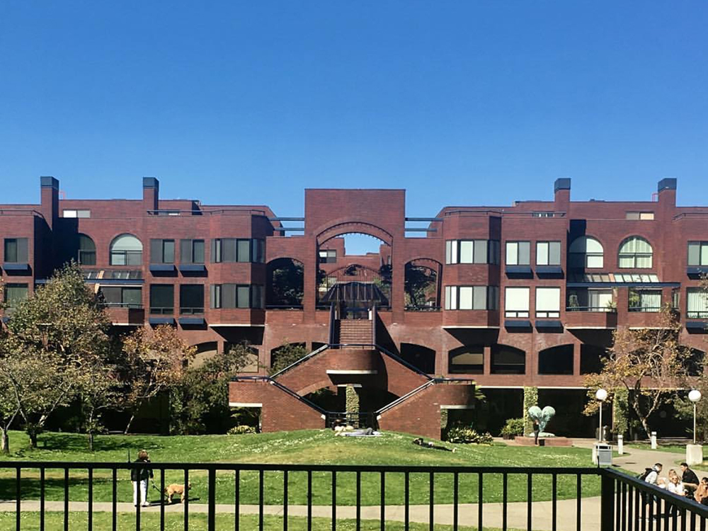
At the perimeter, some of the townhouses are as big as 2,300 sf. It wasn’t intended to be a luxury project, but because of the location and the design it now is. I thought of it as an oasis. Everyone has their own front entrance; there are no corridors. Everyone has a courtyard they walk through to get to their unit. They have their own landscaping. It has a European feel.
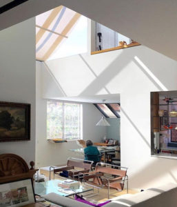
The freeway was thirteen feet from the north corner of Block 2, and the east side of the block faced the freeway in close proximity, so we turned those units inward. Ironically, now that the freeway is gone and there is a great view of the Bay, they are some of the best-located units on the block. All the units have open plans, and many have interconnected two-story volumes and skylights. I must say, they are very good plans. The first block was sold out at completion—even when interest rates were 17%. There was a waiting list for the other blocks. I picked out Unit 45 in the center of Block 1, because I couldn’t afford the perimeter units. I knew I wanted to buy it, so I designed it to meet our needs and desires for urban living. I still wish it had the roof deck, though. I may try to put one on.
When we designed the project, the residential podium was meant to be completely open to the public, which is what Redevelopment wanted. But the first people who moved in didn’t want other people inside their project, so I volunteered to design all the gates. Now I’m stuck designing new gates for further security, pro bono of course.
Not unlike other architects doing good housing, I look at neighborhood identity. I like active streetscapes, so I’m very unhappy with what’s happening with this project now. When it opened, it was a true mixed-use project. At street level on the park arcade, there was the Niantic Bar, named because the building is built over a ship called the Niantic. There was Joyce Goldstlen’s Square One, a great restaurant, the best pizza parlor you could imagine, a nice deli/lunch spot, a coffee bar, a hair dresser, a stationary store, a wine store, dry cleaners, a Sharper Image outlet, real estate offices, etcetera. On the second floor of Block 1 were the Bank of America executive offices. Now it’s all techie, the whole project. The first and second floors are going to be all tech offices. No retail or food service, so not any street activity at all. Very sad. AII the activity surrounding Walton Square Park is gone.
The interior detailing of the retail and office floors was impeccable, but the new owner ripped all that out. The mechanical wasn’t designed to be exposed; now it’s exposed. They also decided to fussy up the arcade—! hate it. They took the aluminum grid ceilings out, stripped it all out without telling any of us. We, the homeowners, have joint ownership of the arcade, so we finally got them to put the ceilings back in, but we couldn’t stop them from doing the fussy furniture and planters. Their idea to get people to use the space was good, but since there’s no retail or restaurants it doesn’t make much sense. It’s no longer a mixed-use project, and I don’t think it will ever be again. But let’s hope it will . . .
arcCA DIGEST: What are you up to now?
I’m still practicing. In 2008, after over 40 years at Fisher Friedman, I took on on a huge planning project in the outskirts of Moscow, with Bill Hablinski, an architect I had worked with many years ago at FFA, an excellent designer with offices In Austin, Texas, and Beverly Hills, who designs wonderful, large houses for very wealthy people.
One was a Russian oligarch with a house in Beverly Hills that Bill designed. He had a big piece of ground on the Moscow River, half an hour from the city center, where the river is 300 feet wide, like a lake. The property, known as Barvija, was originally planted in potatoes; this client had vodka, copper, and oil. Bill and I and SWA produced a master plan.
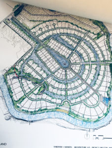
We went to Moscow for a week. It was very interesting, but I wouldn’t want to go there now. The security was high wherever we went. At the bottom of the office building where we had our meetings there were guards, and guards at the top of the elevator, a guard at the conference room, all with weapons. They did treat us very well, and we got paid up front. And I had enough spare time to experience some of Moscow.
We did quite a few schemes, finally ending up with one I wasn’t particularly fond of, though it’s a good scheme. I was trying to get a town center with public access, with canals and with pedestrian access all the way around the riverfront. My plan was a well-structured, more urban design. But no way, they didn’t want any public access, it all had to be totally secure. I designed a project sales office and construction headquarters, which the client thought was too modern. The plan ended up as a nice, well designed, more suburban scheme with one and two-hectare lots for massive houses, each with its own security.
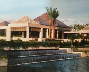
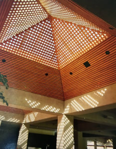
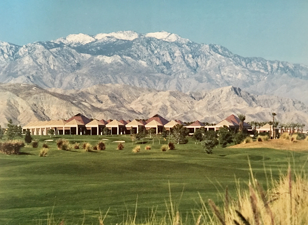
I’ve recently completed a renovation of the Vintage Club in Indian Wells, south of Palm Springs, a project of mine from the Fisher Friedman days. It opened in 1981, about the same time as Golden Gateway Commons. It’s 100,000 square feet, structured on a 24-foot grid, with beautiful, Kahn-esque exposed concrete work, tinted to match the mountains. You enter on axis with Mt. Eisenhower. Over the years, it kind of got wrecked. They sheetrocked all the concrete—most people don’t like raw concrete. They put in chandeliers and too many types of marble. The members finally decided to try to get it back closer to its original character, but they wanted more than that. The renovation cost almost as much as the original building.
One of our best developer clients, Mick Humphries of Vintage Properties, who built the Vintage Club and was a Golden Gateway Commons partner, was a founding member of the club. He found me, after 35 years or so, and asked me to design the renovation. I said, “I would be delighted.” I’m a one-man show now, so I took on the project with Aetyplc, a small firm in San Francisco that one of the former Fisher Friedman primary architects, Mark Steppan, had gone to work for as director of architecture. David Tritt, also from FFA and an excellent designer, was with Aetypic. He worked with me on the design. We all knew each other for many years and worked well together. The first thing I said was, we’re going to take all the sheetrock off the concrete structure. But when they took some off, it turned out the concrete had been destroyed by power-driven fasteners, and to repair it wasn’t feasible, so we kept the sheetrock. That was a disappointment. The renovation turned out well, the club members are very happy, and we won another award, to boot.
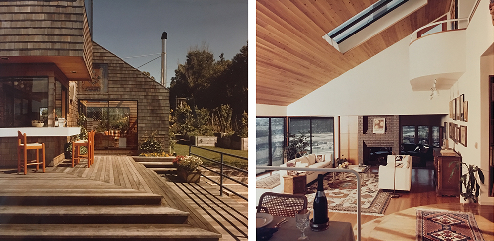
I’ve done several custom houses; some have gotten built and some haven’t. One is a remodel of a big Shingle Style house at Stanford, in Professorville, around where Frank Lloyd Wright’s Hanna House is. It had had only two owners in its lifetime, and it had to be restored. I simplified it and rearranged rooms and did a new kitchen and all the baths. It was quite extensive interior remodeling, but I kept the character of the historic house. The new owners are ballroom dancers, so I designed a ballroom on top of a new three-car garage. It also won an award.
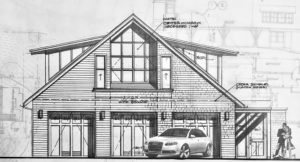
I’m trying to decide whether or not to take a project in Los Altos, $40 million of elderly housing off El Camino. But that planning department is tough. We made a proposal and won the job. I said I’ll do the project, but I’ll only go to two planning commission meetings—that’s always been the worst part of being an architect for me. Especially in housing. I would be working with Aetypic, and I may just let them do it without me.
I try to keep up. I subscribe to lots of architectural journals. I have a vast architectural library, which somehow keeps growing. My beautiful wife of 62 years had worked at William Stout Books for 29 years, and we still go to Bill’s store on Montgomery often, and I always end up with one new book or more. It’s addictive, I will tell you.
I wish I were still doing multi-family housing, because there’s so much need and so much going on and so much good work being done by Leddy Maytum Stacy, David Baker, Dan Solomon, Kennerly Architects, Aidlin Darling, Paulett Taggart, to name a few—the city has top-notch “young” firms. I haven’t done any of the stuff that David Baker’s doing, for instance, wonderful affordable housing with a high level of design.

I draw all the time on anything that‘s available—even my iPhone for abstract drawings for fun in my spare time. I use my computer, but not for design. You just have to draw. It comes from the head to the shoulder to the elbow to the wrist to the hand to the fingers to the pencil or pen and to the paper, and during that time ideas flow and evolve, and later on in the process everything crystallizes and becomes more an act of precision thinking.

From arcCA DIGEST Season 1, “Housing.”

