“Architecture is the ultimate erotic ‘object.’” – Bernard Tschumi, “Architecture and Transgression”
Skin, surface, structure: all convey associations with the body. “We experience a building through its material details: both visually and tactilely,” says architect and theorist Marco Frascari, “that is, through our body.” It is a sensual experience, comprehended first through vision, then developed by hearing (revealing the size and proportion of a space) and, finally and most immediately, by touch. Besides providing a physical means to solve often-difficult problems, materials are an expressive language rich with signification. By incorporating a process of material investigation and developing the use of unconventional materials and applications, a number of experimental architects are expanding the contemporary definition of architecture.
These experiments include explorations into the ductile limits of a material system, the translucency or opacity of a material, its absorptive qualities or reflectivity. But they are more broadly inclusive, as well. As Peter Pfau, AIA, says, “It’s also about relating an unfolding, didactic language of assembly to a sequence of human experience.”
Many of this year’s AIACC Design Award winners are research-based design firms. Research forms an essential stage in their design process. The differences between this process and a conventional architectural process begin with an inquisitive philosophical stance, a refusal to know what a future building ought to look like—“an intrinsic uncertainty,” as Eric Owen Moss, AIA, puts it. A project may start with a concept or a field of inquiry, but the design process may veer from initial expectations into a new direction entirely. Play is an integral part of the process, something explored without a defined purpose. This non-linear exploration has few parameters. It takes twice as long and involves “lots and lots of failures,” says Annie Chu, AIA, of Chu+Gooding Architects, “but eventually you discover the one idea that works.”
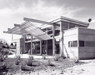
Innovation does not require a background in industrial design, but it does require a working knowledge of how materials are joined. “First familiarize yourself with conventional construction,” says Kevin Daly, AIA, “then you can identify where to make a radical intervention.” Daly, Genik Architects took this approach in their House at Valley Center as a response to extreme environmental conditions: the previous dwelling had burned in a wild fire. In addition to designing with fire-resistant materials—corrugated concrete board and aluminum sheathing—they were also concerned with modifying the intense sunlight. Two different sliding partitions and operable panels veil the structure. When closed, they function as a double envelope, providing both privacy and energy conservation. For additional sun control, the vertical perforated metal panels slide into various positions, providing shade or additional reflected light according to the season. The mechanism, similar to a garage door, provided the owners with a simple means of maintaining temperature control in their building.
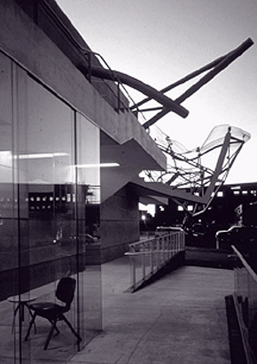
SCIArc Director Eric Owen Moss believes that architects have always emulated the processes of industry. In his own work, however, materials take second place to larger issues of organization, space, and form. Moss is interested in architecture as social critique and in displacement as part of the broader cultural condition of Los Angeles. In Culver City, faced with a waning industrial presence, Moss has dissected and reassembled existing structures to provide for the leasing requirements of a digital and economic shift. Here, he has designed “emotive geometries” of steel, concrete, concrete block, and glass, inserted into existing wood bowstring truss structures to create a conceptually rich landscape.
Within the Culver City complex, The Stealth (so named by Wolf Prix of Coop Himmelblau) is constructed of commonly available materials, but derives its immense visceral impact from its sheer scale and depth of color, a composite of black, green, and brown, applied and blended with a steel trowel.
Moss’s Umbrella Building, an exuberant example of technical virtuosity, explodes most people’s preconceptions about glass. Curved, laminated glass panels cascade beyond the roof, supported by recycled trusses and new structural steel. This collaborative effort with Kelly Green of California Glass Bending involved numerous consultations and shop drawings examining the bending properties of glass. Immense heat was required to reshape the glass by slumping over pre-made forms. Later, the support structure was built in situ and the glass attached in place.
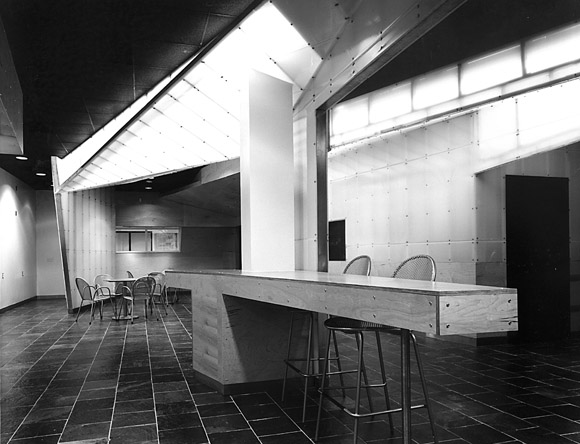
Many times, research is prompted by the rigorous demands of a limited budget. It may require that a given material perform more than one function, redefining its conventional use. During the schematic design phase for the Tatum Student Lounge, California Institute of the Arts, by Griffin Enright Architects, a number of pragmatic concerns demanded their attention. The limited budget required an original solution. “We worked with materials that anyone could get, but used them to do lots of things not normally associated with their given specifications,” explained Margaret Griffin, AIA.
Their insertion into an existing 1960s concrete structure is comprised of a discrete palette of materials employed to unify spatial surfaces. Birch plywood and polycarbonate panels integrate programmatic functions to allow for flexibility and multiple uses. Materials shift their planar axes. An obliquely framed partition bends to create a sculptural wood ceiling that transforms into a faceted light structure. This same fluid lighting shell pierces an existing glazing system, while its diffuse glow serves as a beacon to the dorms beyond. The hardwood floor rises from the horizontal plane to become a bench or table, which then changes direction again to become a wall. Furniture becomes architecture and architecture changes into furniture or lighting.
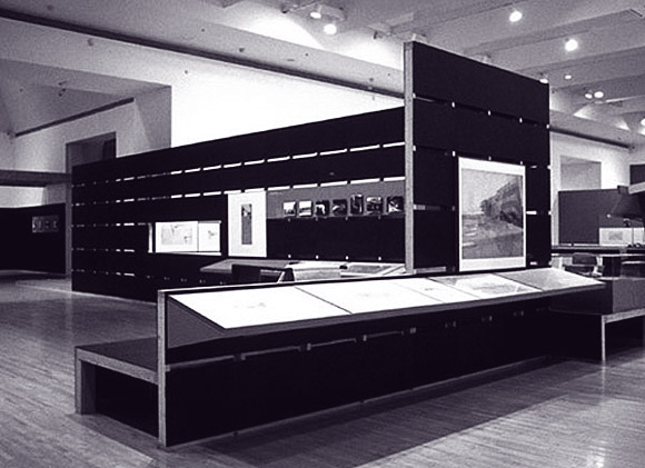
Materials were central to the organization of Chu + Gooding’s “The Architecture of R.M. Schindler” exhibit at MoCA, providing a means to discern the periods of Schindler’s career. They were also instrumental in creating a space where the viewer could make the transition from the unfocused experience of the museum lobby to the contemplation of small-scale drawings. The existing, expansive entry space suggested a landscape to Chu + Gooding. Their desire to convey a sense of Schindler’s experimentalism without resorting to mimicry led the designers to the simple use of materials, color, and light. The color concept, a key element in the design, was conceived in collaboration with Kay Kollar Design.
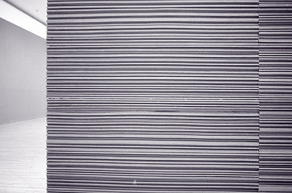
This language of materials was developed during both Annie Chu and Rick Gooding’s previous design experience with Frank Israel Design Associates and Tod Williams Billie Tsien & Associates. Appropriating an industrial design methodology learned from their mentors, the Chu + Gooding team constructs full size maquettes in-house. Testing yields unpredictable results; in a design for the exhibit “Architecture Tomorrow” at the Walker Art Museum (1988), part of their experience working for Williams and Tsien, a foam mold exploded. In that exhibit, they stacked 144 layers of Homasote to explore their expressive and constructive possibilities. Results included walls and chairs made out of the typically concealed material. Working with the manufacturer, they recommended an expanded color palette and suggested a pre-sanded finish in order to remove the underlayment’s waffle pattern. The finish idea was adopted by the manufacturer and is now available. To be effective as a designer, “an architect needs to understand the manufacturing process,” says Chu, “and then erase preconceived notions in order to re-imagine the process and applications in a different way.”
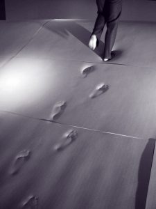
These architects often experiment with materials or forms unknown or atypical in architecture. In his “Mute Room,” for the exhibition “Rooms for Listening” at the CCAC Institute (2000), Beige Design’s Thom Faulders worked with a spinoff from space technology called memory foam. Not only was the foam comfortable, part interior landscape and furniture, but it also released imprints of people’s presence like the lingering echoes of sound. “Knowledge is bordered by what we don’t know,” explains Faulders. “The only way to learn something is to push through it, to break the bubble.”

Each project is the outgrowth of a particular form of questioning. The original Jellyfish Watch inspired Pfau Architecture’s Swatch Pavilion for the 1996 Atlanta Olympic Games. Working with design firm eye-candy and his own in-house team, Peter Pfau, AIA, wondered if a building could be made entirely of plastic, so that its inner workings could be visible, as they are in the watch. While exploring plastic’s characteristics of opacity, translucency, and solar gain, the team came up with the idea of using extruded polycarbonate panels for the interior and exterior skins. The resulting privacy and sound issues at the bathrooms led to the idea of using packing peanuts to fill and obscure the panels in these areas.
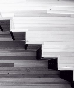
Andrew Dunbar, AIA, of Interstice Architects, sees great potential in composites, in which materials with dissimilar characteristics are layered and then fused together, creating a product with hybrid properties. He enjoys attempting something new on every project and works from what could be described as an industrial designer’s perspective. “It is essential for the architect to take an avid interest in understanding the manufacturing method,” suggests Dunbar. “It may require a large investment of time, but it builds confidence with the client and the contractor.” During his previous work in Canada, where less routine construction methods support a tradition of risk-taking, he found it relatively easy to design innovative materials applications. In the United States, liability issues and a more routinized construction industry make material innovation more difficult. In extreme situations, he has fabricated or installed the design with his partner, Zoee Astrakhan.

In a research-based approach, the architectural firm usually carries the financial cost of material investigations. Firms like Daly, Genik and Pugh + Scarpa have laboratory workshops as part of their architectural office; here, assemblies can be fabricated and evaluated. Pugh + Scarpa are actively developing and researching new uses of materials, without any client in mind. Most of their experiments, however, have somehow found a way into their architectural projects.
Lawrence Scarpa, AIA, frequently collaborates with manufacturers in order to refine fabrication or installation details. One of his recent investigations explores the experiential possibilities of wood. “The carving reveals an awareness of wood as a living organism,” explains Scarpa. “It heightens our understanding not only of the material, but of the relationships interweaving the natural environment and ourselves.” The fine line between art and popular culture informs much of Pugh + Scarpa’s work. In their Dixie Cup façade (above) something familiar found in an unfamiliar setting allows for new interpretations.
Author Therese Tierney, Associate AIA, holds a Bachelor of Landscape Architecture degree from UC Berkeley and a Bachelor of Architecture degree from CCAC. She is currently a student in the Master of Architecture program at UC Berkeley. She writes frequently for arcCA.
Originally published 4th quarter 2002, in arcCA 02.4, “New Material.”

