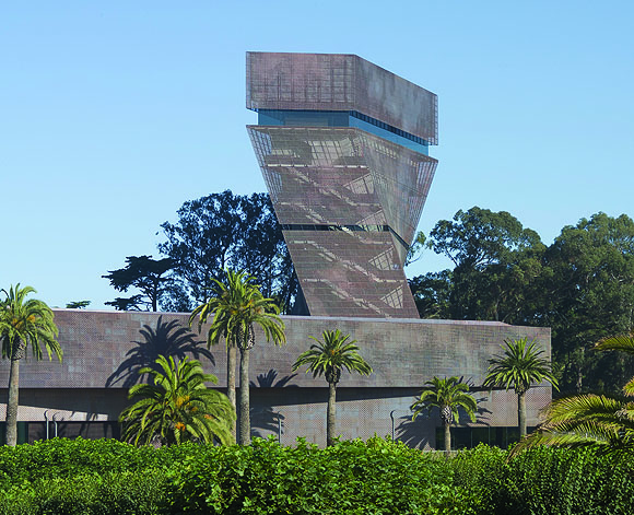
Underlying the design of the new DeYoung Museum is the idea that it should be integrated into the natural landscape of San Francisco’s Golden Gate Park. Heeding recommendations against a wood-clad exterior, design architects Herzog & De Meuron turned instead to copper, which would develop an appropriate patina over time. Following other work of their firm, in which images are inscribed on the building surface, they sought to reproduce in copper panels the impression made by light filtering through a tree canopy, creating an abstraction that resonates with the de Young’s tree-filled park setting.
Because off-the-shelf copper panel systems did not afford sufficient variability, executive architect Fong & Chan Architects invited three metal fabricators to discuss possible approaches. A. Zahner Co. of Kansas City, being the most experienced with sophisticated design explorations, were chosen for the job.
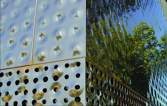
The architects worked back and forth with Zahner to explore ways of capturing the effect of the tree canopy, eventually deciding on the use of two overlaid treatments: a pattern of circular perforations varying in diameter from 0.625″ to 1.875″, and a pattern of alternating inward and outward dimples impressed into the copper panels, varying in depth from 0.125″ to.75″. These treatments could be executed using custom dies on Zahner’s existing machinery.
The architects laid out test panels in AutoCAD, but, as Fong & Chan project architect Nuno Lopes observes, if they had drawn every panel of the building in AutoCAD, they would still be drawing holes today.
To make the process practically expedient, Zahner commissioned custom software to translate data from a JPEG image into a DWG file, which in turn could be used to direct the fabrication machinery. Herzon & DeMeuron abstracted photographs of the tree canopy in Photoshop. Fong & Chan prepared outline DWG file drawings of each of the building’s folded faces at their true dimensions, and imported them into Photoshop. The tree canopy abstractions were overlaid onto the rasterized outline images, with two independent files made for each of the building’s folded faces—one to produce the dimple pattern, the other to produce the pattern of perforations.
Zahner then translated the Photoshop files into corresponding DWG files, in which each depth of dimple or diameter of perforation was indicated by a different color. Just as color assignments designate pen widths when a drawing is sent to a plotter, so here the color assignments correspond with the dies to be used in the metal stamping process.
Two sets of manual corrections were required. The architects tweaked the patterns in AutoCAD wherever there was insufficient visual continuity from folded face to folded face; and Zahner made sure that the inward/outward alternation of dimples was consistent from panel to panel. Otherwise, the digital translation was error-free.
Originally published 1st quarter 2006 in arcCA 06.1, “Imbedded Knowledge.”

