arcCA is pleased to present here the Design Awards winners from the AIACC’s 2000 Awards Program, each one a remarkable project. The Editorial Board selected six projects to explore in depth. They follow the gallery. The selections are not judgments about which are the better projects. Instead, they identify stories—like the sixteen-year political struggle that led to the realization of Moonridge Village—that particularly intrigued the Board. Had space allowed, we would have loved to write about all fourteen.

PS#1 Elementary School
Santa Monica
Koning Eizenberg Architecture, Santa Monica
Honor Award
Photos by Benny Chan
Author Lisa Findley, AIA, is an architect and artist practicing in Oakland, an Affiliate Associate Professor in the Department of Architecture at CCAC, a contributing editor for Architectural Record, and a member of the arcCA editorial board.
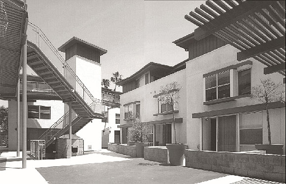
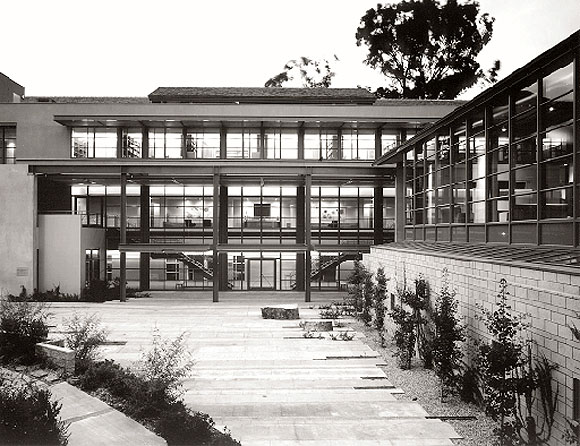
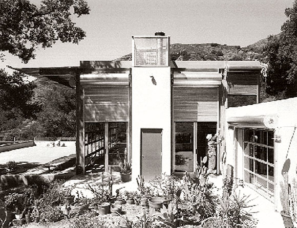
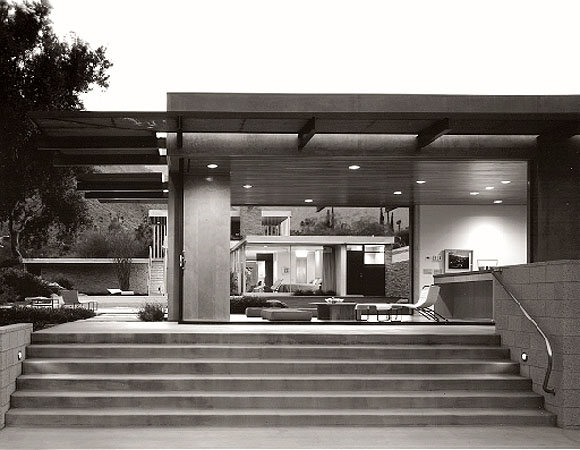
Designing a school always raises the question of how a building in which learning takes place might also teach. With the 20,250 square foot first phase of their project for PS#1 in Santa Monica, Koning Eizenberg Architecture have answered this challenge in playful and sustainable ways.
Despite its name, PS#1 is a private, non-profit elementary school. The project is the first part of a three-phase Master Plan for the 175-student facility, spread over three lots, including one across an existing alley. The Master Plan knits the site together, using buildings to contain the playground. Only the first phase is complete, with Phase Two, the Library and Aftercare Facility, and Phase Three, a Multi-Purpose Activity Center, not yet underway, as the school considers buying adjacent property. Phase One, completed in January 1999 for just under $100 per square foot, includes a two-story bar with seven classrooms, administrative offices, and a bridge linking two pieces of the site over the alley.
As a direct result of this workshop, the architects integrated a range of spatial experiences and a variety of ways to move through the site. The buildings are activated by hyperbolic paraboloid roofs and façades that are layered with windows, louvers, and canopies over doors. The size of spaces and the length of walkways are broken down and varied by the pushing out of a wall or the change in the height of an over- head plane. The stairs shoot out at angles from the building, with one enclosed on both sides by walls and the other open with steel mesh guard rails. The bridge, which connects the site over the alley, is built like a fishing pier with cracks between the floor boards so the children can see the alley below. Movement is further activated by the play of light and shadow filtered through different materials in different places: wooden slats here, steel mesh or corrugated fiberglass there.
Rather than reduce the building to a series of recognizable childish icons, the architects decided to make it more like an artist’s studio: spare to allow room to create, filled with daylight, and straightforward and expressive in its structural expression. The project is playful as it teaches. Along the ground floor classrooms, big round concrete columns hold up steel I-beams that hold up the framing for the second story balcony. Inside the classrooms, exposed steel web joists make clear how the ceiling is supported. Students can easily understand how the buildings are held up and how materials are connected together.

The unusual spaces of the school provoke the students to think about their surroundings. With PS#1, Koning Eizenberg have won not only the approval of their peers, as indicated by the AIACC’s Honor Award, but also the approval of much tougher critics, the students. For the end of the school year celebration in June, the students did enthusiastic drawings of their favorite places in the building. The architects are proudly scanning these drawings into their website.
El Sereno Recreation Center/ Indoor Pool
Los Angeles
Cannon Dworsky, Los Angeles
Honor Award
Exterior photo by Timothy Hursley; interior photos by Tom Bonner.
Author Lisa Padilla, AIA, is an associate partner in the Los Angeles office of Zimmer Gunsul Frasca Partnership, where her project focus is urban design and master planning for public and private institutions. She is a member of the arcCA editorial board.
A common media representation of Los Angeles juxtaposes the skyscrapers of Bunker Hill against the San Gabriels, a privileged vantage seen from a helicopter or blimp, one that conceals as much as it reveals. Hidden from view are a number of working-class communities that developed in the hills east of Chinatown in close proximity to the region’s original industrial core along the Los Angeles River. El Sereno is one of these communities, a place defined by modest housing, local schools, and a neighborhood park, the latter a treasured remnant of open space. Many residents can walk to the park, which is in the geographic center of this roughly two square- mile district in the City of Los Angeles. In 1930, the city’s Playground and Recreation Department oversaw construction of the El Sereno Plunge, a municipal pool, bathhouse, and community center completed at a cost of $50,000. It was one of sixteen such facilities, respites for children and adolescents in need of “mental refreshment.” Here, trained staff offered classes in swimming, diving, and lifesaving, and under their watchful eyes the children of immigrants might become healthy citizens.
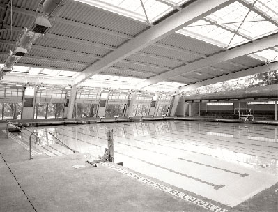
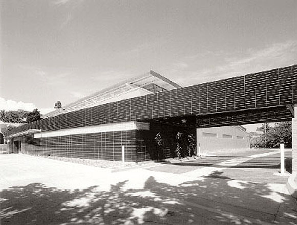
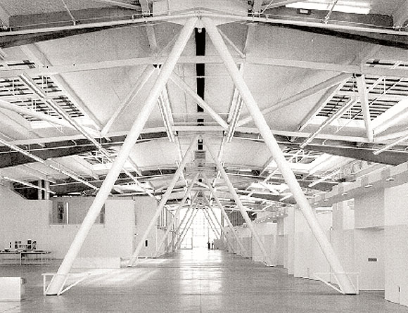
With assistance from the city’s Department of Recreation and Parks, the design team worked closely with Hispanic residents and community leaders in meetings and public workshops. Yazdani looked to the natural landscape surrounding the park as a primary design cue. Two elements, a one-story structure with multi-purpose rooms and lockers and the indoor pool itself, are housed beneath a graceful, sloping roof element mimicking the adjacent hills. The Department of Recreation and Parks expressed concern regarding the project’s initial cost and maintenance requirements. Local youth would need to be dissuaded from tagging the new facility. The team selected a combination of ceramic tile, metal panel, and painted plaster for the building’s exterior walls. Views to the outside were preserved with clerestory windows and, facing the park, with a large, open-air wall, which could be enclosed during winter days with translucent rolling panels.
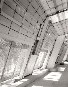
Cannon Dworsky collaborated with landscape architect Calvin Abe on the integration of the building into the existing park. The park’s simple landscape of grass and jacaranda trees is pulled up to the buildings’ adjacent face. Low-shade planting preserves views from the indoor pool to the park and baseball fields beyond. Colorful, drought-tolerant ground planting was selected along the sunny, west-facing entry, in striking contrast to the deep blue tile walls that suggest the aquatic environment inside.
Today, the Department of Recreation and Parks has been charged with upgrading facilities throughout Los Angeles. Most of these projects will be funded by a combination of existing funds and newly approved state and local bonds. The El Sereno Recreation Center and Indoor Pool project signals a readiness by the city and its residents for adventurous architectural expression in public facilities during this time. Architects and landscape architects should have increasing opportunities to partner with communities throughout Los Angeles, in a collaborative effort to build recreational spaces that can be enjoyed by all.
Conference Barn
Middleburg, Virginia
Sant Architects, Inc., Venice
Honor Award
Photos by John Linden
Author Anne Zimmerman, AIA, is principal of AZ Architecture Studio in Santa Monica, a firm focusing on quality design f orthe public realm and the underserved, inspired by place andurban issues. She is a member of the arcCA editorial board.
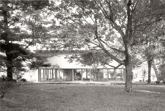
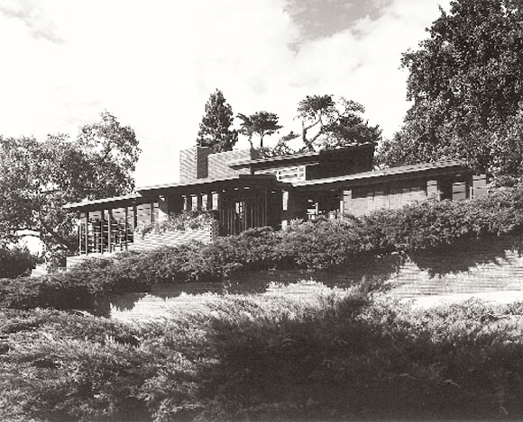
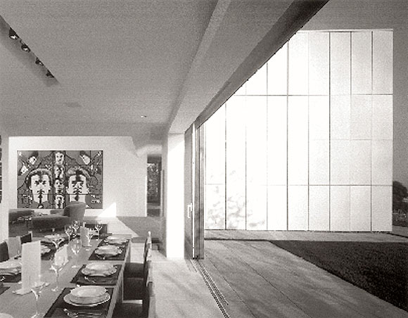
Sometimes, it’s tough to get even your own family to hire you. Initially, the parents of Michael Sant, AIA, of Sant Architects hired another architect to design a conference and office building for their non-profit foundation, which focuses on population and environmental issues. The scheme that resulted was very formal, and Sant was asked to comment on the proposal. He needed to assuage his parents’ concerns that, if retained, he wasn’t going to design a wild, Venice kind of building. Ultimately, the Sants did hire their son to design, for their 150 acre property in Virginia horse country, a structure that would relate an existing Miesian glass house with a traditional barn and provide them with office and meeting space.
The challenge of the distant site seems to have been easily bridged; Sant Architects handled all architectural services including permits and plan check. Over the two years it took to build the project (due to the not uncommon reluctance of the contractor to build atypical but well-thought-out details), Sant and colleague Jason Teague made a total of five trips to Virginia. To prod and inspire the original general contractor, Sant’s brother-in-law, Dan Plummer of Plummer Construction, brought a “can do” enthusiasm to the construction of the building.
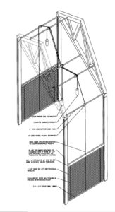
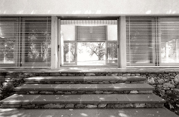
Reclaimed timber columns and trusses from mills and factories provide a rustic richness. The steel roof is coated with a lead free, zinc and tin based coating. The dual-glazed sliding doors and skylight are low-E tempered glass, and the lift-and-slide hardware creates a tight weather seal, preventing wasteful infiltration.
Maintaining a professional posture is sometimes difficult when the clients are your parents, according to Sant. There were tensions about the size and scale of the building, which now seem ideal to everyone. The lively acoustics of the building are a surprise success; music sounds incredible in the building.
The end result is a beautifully detailed, elegantly proportioned and sited building, designed with environmental sensitivity, blending the simplicity of traditional Japanese design and precise Miesian detailing with the rustic qualities of traditional American barns.
Downtown Homeless Drop-in Center
Los Angeles
Michael B. Lehrer, AIA, Lehrer Architects, Los Angeles, with F. Ameen, Los Angeles Honor Award
Photos by Michael B. Lehrer, AIA
Author Anne Zimmerman, AIA, is principal of AZ Architecture Studio in Santa Monica, a firm focusing on quality design f orthe public realm and the underserved, inspired by place andurban issues. She is a member of the arcCA editorial board.
Intrigue, politics, mayoral and political support (or interference, depending on the point of view), input by a developer/contractor friend of the mayor’s, project delays, personal conflicts, a multi-headed client and stakeholder team that boggles the mind, function as controversy, color as controversy: who could ask for a more dynamic, fascinating and ultimately more important project?
Owned by the Los Angeles Homeless Shelter Authority (LAHSA), a city agency, developed by Single Room Occupancy Housing Corporation, funded by HUD, operated by Volunteers of America (VOA), and adopted by the Mayor as a “pet” project, it is a complex beast.

Over the years, Skid Row’s single room occupancy hotels (SRO’s) have been significantly upgraded. Many are thoughtfully designed by talented architects. Several missions and parks serve the neighborhood’s homeless. Until now, however, there has never been anything like the Homeless Drop-In Center. Initially criticized by some activists in the Skid Row community as a “concentration camp,” a deceitful vehicle to herd and eliminate the homeless, it is instead a sanctuary, an oasis, and a respite from the street. The Center is about kind- ness and human dignity, and it is beautiful, working with the material and budget limitations of durability, maintenance, and affordability. It has also been recognized by an AIA/LA Award of Merit, an LA Business Council Beautification Award, and an AIA/Concrete Masonry Institute top award.
The Center was designed to serve about 200 people per day. Approximately 800 to 1500 people now use the Center on a daily basis. A staff of 35 provides whatever services a guest might want. Nothing is forced on the guests, but a climate of “health realization” is promoted in which an individual’s assets are identified and nurtured. People are encouraged into transitional housing and into mainstream society. Food is not served; instead, guests are encouraged to utilize the nearby downtown missions for meals.
Bud Hayes, CEO/Executive Director of Single Room Occupancy Housing Corporation, conceived the Los Angeles Downtown Homeless Drop-In Center on a napkin during lunch with Associate Executive Director Jeffrey Gilbert and architect Farooq Ameen, AIA, who later turned the design of the project over to Michael Lehrer, AIA. Hayes told those present he wanted a Mediterranean courtyard, lots of green, lots of open space, and a water feature.
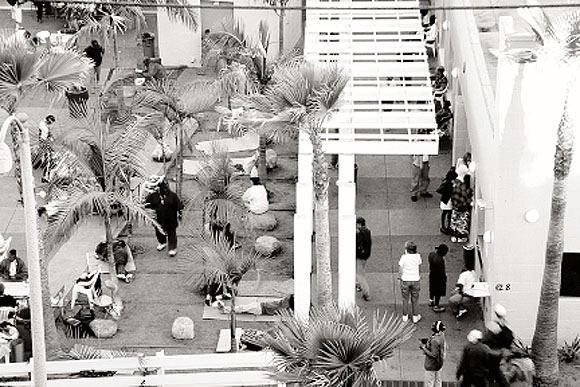
The result is a welcoming and non-controlling place for the homeless to congregate, shower, hang-out, store their belongings, and sleep for up to 8 hours. It was accomplished with an $850,000 construction budget (out of a $1.2 million project budget) and designed and built in 18 months. It is mostly an outdoor place, a working courtyard. The 8,500 square foot, U-shaped plan houses 32 dorm style beds (8 of which serve women and families), bathing, a “Clubhouse” multi-purpose room, administrative, health services and counseling offices, storage for belongings and laundry—all wrapping the 6,500 SF courtyard. The courtyard provides a variety of places, perspectives, and pathways and defines the architecture. Outdoor sleeping is allowed. Light and color are the medium of the architecture; vertical latticework, arcades, palm trees and trellises create changing patterns of sunlight and shade. More shade is needed, however, and shade trees would have made a great addition to the palms.
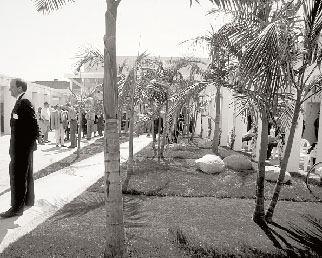
There is no pressure here to behave a certain way or to participate in anything. There are no strings attached. As long as guests are not violent, they are welcomed by the Center. This is a place about and for people, one that allows people simply to be themselves. As Arthur Fox, one of the guests I chatted with, said, “This is the greatest thing that ever happened to Skid Row; living in the open can get pretty hectic.”
The philosophical questions of the morality of homelessness in our society baffle the mind, as do the numbers: 80,000 homeless in Los Angeles County, including 30,000 in downtown LA and 8,000 in Skid Row. Though there will always be some people who have adapted and prefer the street, many of the homeless are on the street because of mental illness, substance abuse, or poverty, and they need options and support. A true continuum of care and facilities for people needing help does not exist in this society, though it has been envisioned by those actually involved in serving the homeless. Many more such oases are needed to provide a safe, enjoyable, and nurturing environment for the homeless in LA and elsewhere.
Moonridge Village
Half Moon Bay
David Baker FAIA & Associates, San Francisco
Merit Award for Affordable Housing
Photos by Cesar Rubio
Author Tim Culvahouse, AIA, is editor of arcCA.
Mention “Silicon Valley,” and the last thing people think of is impoverished farm workers. Just over the hills from Woodside, however, along the coast of wealthy San Mateo County, farm workers’ families live in broken down trailers and makeshift shacks, or squeezed twelve together into two-bed- room apartments.
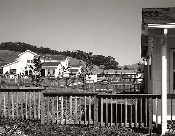
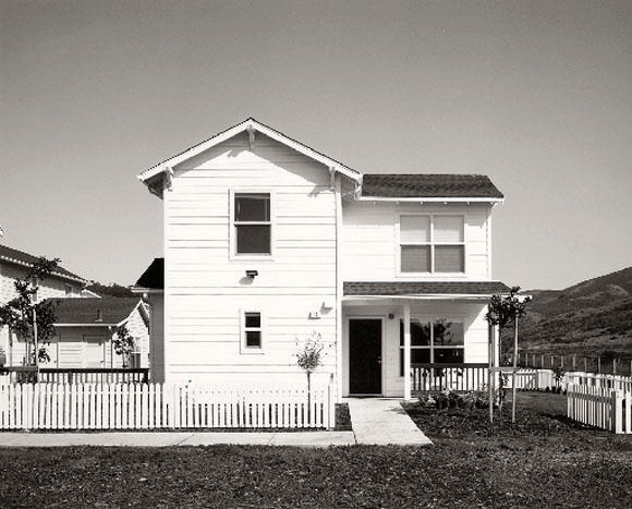
In 1983, in response to these dismal housing conditions, County Supervisor (now Congresswoman) Anna Eshoo proposed development of a 40 acre valley just east of Highway 1 below Half Moon Bay. Sixteen years later, after innumerable challenges, Moonridge Village opened in September 1999, providing homes for 80 families out of thousands who had applied by lottery. In 2001, 80 more units will complete the plan.
From the outset, the project faced difficult hurdles: lack of water and available sewer capacity and a lawsuit by the local school district, in addition to the typical scarcity of funds. After extended negotiations, a water supply was secured through an agreement between the county and the water district to bring a pipeline seven miles over the mountains from Crystal Springs.
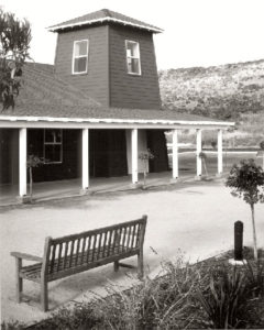
Through all the challenges, the developer, Mid- Peninsula Housing Coalition, remained steadfast and, working with David Baker FAIA & Associates, brought a successful project to fruition. Baker combines four unit types in numerous duplex and fourplex configurations to squeeze considerable variety out of what is necessarily a repetitive scheme. Each unit has its own front porch and back yard, and the complex is formed around a series of community gardens, citrus groves, and tot lots. Community facilities, including laundry, day-care, computer lab, post office, and community room and kitchen, surround a central zocalo, or plaza, five-minute’s walk from the furthest dwelling. A soccer field, basketball court and inline skating court anchor the end of the development nearest Highway 1.
Mid-Peninsula Housing does not just build and manage buildings. With the help of Cabrillo Adult Education and the College of San Mateo, they are offering on-site English and computer courses. Sor Juana Inez, a counseling service for Latina women, has on-site programs, as does the Corporation for Therapeutic Convivials, which brings the village men together around the community gardens. Programs for children include Coast Side Head Start, which is headquartered at Moonridge, and a Summer Enrichment Program.
Moonridge Village has won not only an AIACC Merit Award, but also a Tax Credit Excellence Award from the Affordable Housing Tax Credit Coalition. Fran Wagstaff, Executive Director of MPHC, says that these awards lend credibility to their effort to demonstrate comparability with market rate quality—to produce housing that is not (as is too often considered appropriate) merely “good enough for those people.” What is she proudest of? “It’s wonderful for children.”
Eleventh Avenue Townhomes
Escondido
Studio E Architects, San Diego
Merit Award for Affordable Housing
Photos by Jim Brady
Author Buzz Yudell, FAIA, is Adjunct Professor in the School of the Arts and Architecture at UCLA, a partner in the firm of Moore, Ruble, Yudell in Santa Monica, and a member of the arcCA editorial board.
Eric Naslund, AIA, and John Sheehan speak of their work with quiet intensity and clarity of purpose. They stress their endeavor to provide “good housing for people of modest means,” and they think of housing as an “armature for peoples lives,” one that can help the disadvantaged to “get back on course or get a leg up.” Housing is about “serving a bigger purpose and not just net worth.”
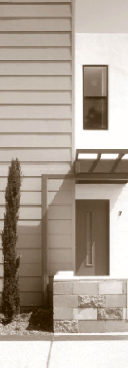
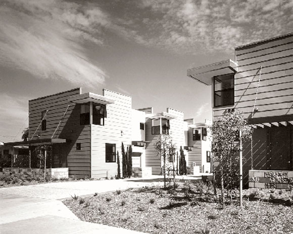
The award-wining Eleventh Avenue Townhomes represents their fifth housing project in Escondido and their third affordable project in its neighborhood. Sixteen two-story rental town- homes are organized along mews in a compact infill site. The narrow, 100-foot frontage on Eleventh Avenue provides the connection between the project and its neighbor- hood. The tree-lined entry lane serves pedestrian and auto access and encourages informal socializing. A plaza is created midway along this path where a meeting hall, inspired by barn construction, fronts a landscaped courtyard and an informal lawn with children’s play areas. At the far end of the three hundred foot long lot is an additional common area with overflow parking and allotment gardens for citrus and vegetables.
The site planning is inspired by such precedents as Southern California bungalow courtyards and London mews. The designers have skillfully deployed the density of 23 dwelling units per acre to achieve an environment that is rich enough to inspire a sense of community yet breathes enough to allow for individual pride and identity. At the core of this success is their understanding and fluency in creating a fine- grained hierarchy of spaces from the communal to the private. Toward this end they have made every element count. While the plans are straightforward and quite flexible, expressive elements skillfully function in multiple ways. Cantilevered canopies are both sunshades and identifiers. Garden walls establish both front porches and back yards.
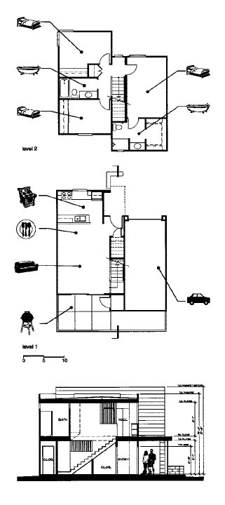
Tight budgeting is handled by early planning, prioritizing, and direct expression of materials rather than by successive rounds of value engineering. Tough materials are selected for their durability and expressive potential. The initial planning considers such economies as short spans and clear, repetitive geometries. The architects are interested and inspired by everyday buildings like barns and factories. The integrity and durability of this esthetic yields buildings strong enough to allow people to inhabit and modify their environments without compromising the architecture. Naslund notes that their housing “doesn’t require that geraniums be specified six inches on center,” but that varied planting and furnishings add richness to the community. At the same time, the architects and their clients focused in detail on designing for every need: from the back-yard barbecue and place for briquette storage to the single car garages, which can be used for home-based work.
Ironically, the collaboration with a non-profit housing organization provided more design freedom than market housing. The budget was comparable to market rate projects, but because the client, SER/Jobs for Progress, will own the project indefinitely, there was more concern about durability. This allowed for a tougher but richer palette than market projects: varied color CMU walls, exterior concrete clapboards, expressed trusses in the community building. Sheehan notes that this long-term and focused commitment avoids the need to design a project that is “all things to all people—a vanilla design.” Instead, the team could work from a detailed understanding of the users’ needs to design a project that “fits like a hand in glove.”
One measure of a successful fit is the positive reception by the inhabitants. To cultivate pride of place, they organized a competition to rename the project. Tenants and local school children participated and the Eleventh Avenue Townhomes were rechristened Emerald Gardens: a sign of pride and hope. A more ironic indicator of the project’s success is the apparent concern of some for-profit developers who feel that the Studio E affordable housing has been “raising the bar” in ways that may reflect negatively on the quality of their own projects.
Studio E Architects exhibit an all too rare set of commitments and skills. They have shown a dedication to place, community, and craft and translated this dedication into eloquent projects that enhance the lives of the inhabitants. They have chosen to work from fundamental principles, eschewing the seduction of elaborate form-making. Their work reminds us that the social values of architecture can be realized while satisfying the soul with the poetics of place.
Originally published 1st quarter 2001, in arcCA 01.1, “Awarding Honor.”


