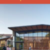
Speaking about Studio E Architects’ Eucalyptus View Cooperative in this issue’s “Prize Housing” interview, principal Eric Naslund, FAIA, says, “We don’t hide the fact that these are simple stucco boxes. But we create contrast to get more mileage out of each move. The plantings, trellises, lattice work balconies, and roofs all create interesting shadows on the broad surfaces of plaster. You can create a dialogue with small, fussy pieces and plain backgrounds.” The description reminds me of the Churrigueresque churches of Mexico, with their broad, flat, plaster walls set off by elaborately carved doorways. It makes sense that buildings in the sunny southwest of North America would share a strategy of highly contrasting elements against a simple background—an economy of visual means, informed by what Kenneth Frampton refers to as “the temporally inflected qualities of local light.”
Some architectures are characterized by high contrast; others not. The shallow bas relief of Louis Sullivan’s skyscrapers, for example, tends the other way. Rather than highlighting an individual element, Sullivan’s ornament unifies a monumental form. Louis Kahn favored a similar strategy, though without the expressly applied ornament. At both the Kimbell Art Museum and Yale’s British Art Center, Kahn chose materials to toe a fine line between the expression of individual elements and the unification of the building as a prismatic whole. His is a brilliantly low contrast architecture.
We don’t think of Kahn as an ornamentalist, but, unlike many architects of his generation and later, he was at least willing to use the term. “The joint,” he said, “is the beginning of ornament.” I believe he had two ideas in mind. The first is the fact that much conventional ornament—” trim”—is used to negotiate unobliging joints. More importantly, however, Kahn was keenly aware of the dual obligation of the architect: to both join things together and render things distinct. The question of continuity— how continuous should these two elements appear? How distinct should they be?—is always with us and is a critical test of architectural judgment.
Yet we don’t often discuss visual continuity, because we remain shy of “visual effects,” which sound too much like “style.” And so they are. A style is not only a set of motifs; it’s also an economy of visual continuity, whether Venturi’s “pattern all over” or Kahn’s careful matching of fired stainless steel and finely surfaced concrete (at the BAC) or of travertine and concrete (at the Kimbell).
Colin Rowe and Alan Colquhoun long ago burst the illusion that modernism was “beyond style.” As they made clear, modernism is a style—or a constellation of styles—a fact driven home by the period renovation of the Downtown L.A. Standard, also among this issue’s featured projects. We should get over our aversion to the term “style,” because with it come other terms (visual continuity is one of many) that should be part of critical architectural discussion. We can’t afford to talk only about those characteristics of buildings that fall within the narrow confines of “form follows function” or “honest construction,” remaining silent about the myriad decisions we make “because it looks good.” We need, in fact, to resuscitate our vocabulary for evaluating what makes a building “look good.”
Style is not dishonest; we’re dishonest when we claim we don’t employ one. We need to take style out of the closet. Here, as elsewhere, “don’t ask, don’t tell” is a comfortable excuse for not thinking.
Originally published 3rd quarter 2003, in arcCA 03.3, “Done Good.”


