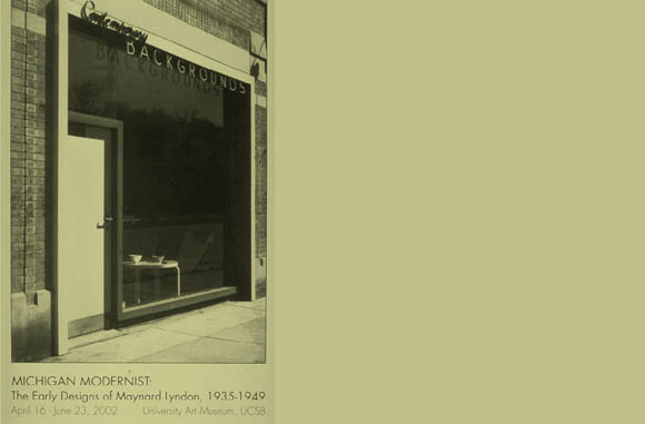
A photograph (circa 1940) of Contemporary Backgrounds, a storefront designed by my father, Maynard Lyndon, FAIA, is a suitable point from which to begin a story of the transmission of ideas across generation
Contemporary Backgrounds is not just the name of this shop, which he and his wife Jo Hale Hand Lyndon created at that time—a shop where Jo sold furniture designed by Alvar Aalto and Bruno Mattheson and offered interior design services—it is a term that clearly represents Maynard Lyndon’s fundamental thinking, at least as I have come to understand it. The name represents an approach to design that is deeply important and was embedded in their work. Each of the two words in the term had distinct significance.
“Backgrounds” referred to the conviction that people’s lives should be in the foreground of architects’ thoughts and that architecture should serve as a background, which can support, highlight, and lend significance to the actions of the people who inhabit buildings. An appropriate architecture would not call attention to itself, but would rather provide ease and comfort and enjoyment for the lives that people live within it.
“Contemporary” referred to the commitment that architecture should deal directly with the capabilities of the time and not be distorted by stylistic designation. In this respect, Maynard was very adamant that what he was concerned with was architecture that was “contemporary” and “of the time”—not “International Style,” which he suspected, and certainly not “modernist.”
To be “modernist” in my father’s mind involved a process of affectation that he vigorously opposed. It suggested that the design process was one of selecting one style of architecture or another for the execution of a project. This he had been trained to do within the Beaux-Arts system of architectural education still lingering at the University of Michigan when he graduated. This he was also required to do when he worked on auto executives’ houses while working in Albert Kahn’s office and also later when he designed visitor centers for the US Park Service under Charles Petersen’s direction. These latter were very handsome buildings, designed in the vernacular of their place, with carefully studied details and proportions and attention to the creation of building complexes. But Maynard Lyndon’s ambitions were greater. He longed instead to take part in evolving a formal and organizational language responsive to conditions and opportunities of the time and to the circumstances of the works.
He was not alone in such ambitions, of course. They came to be shared by many of his colleagues, and they were adamant in their mission to find not only new form, but a renewed mission for architecture, a mission embedded in society and its possibilities for change. Indeed, there are many who now feel that the great International Style show organized by Philip Johnson and Henry Russell Hitchcock in 1932 was a decisive step away from the true message of modern architecture, precisely because it seemed to capture and promote the idea that the appearance, or “style,” of the work was the point, rather than the fundamental organization, approach, or thought process.
Maynard’s interest in modern architecture and its intentions had been fueled by his friendship with Knud Lonberg-Holm, an instructor at the University of Michigan when he studied there. Lonberg-Holm had come to the United States from Denmark, where he had early become a member of CIAM, the Congress International d’Architecture Moderne, the very influential group in which Walter Gropius, Le Corbusier and Sigfried Giedion played decisive roles. CIAM advocated for the establishment of an international movement that would promote modern architecture and direct attention to the evolving technologies and pressing problems of the time, most notably social housing and industrial production. Twice, during the 1930s, my father made trips to Europe for study. These were a revelation for a young man born in Howell, Michigan, who graduated from the University of Michigan. He had studied, through drawings and photographs, many of the great buildings of Europe, but he had no experience of its manners and way of life. Biking through France and the Netherlands and staying for longer periods in Paris, he was an energetic observer. His sketchbooks are filled with elegant, precise drawings, and his camera became the vehicle for strong images of the adventurous modern architecture that he sought out. Lonberg-Holm was instrumental in this, too, having given Dad lists of new and important buildings to see and introductions to members of CIAM, including, among others, Le Corbusier in Paris and Van Eesteren, the influential De Stijl architect who became city planner for Rotterdam. These were heady and exhilarating days.
From my discussions with him, much later, and through the evidence of his work, the buildings that most influenced Maynard were those designed by Johannes Duiker and Willem Dudok in the Netherlands, by Le Corbusier in Paris, and the collection of model housing structures at the Weissenhofsiedlung in Stuttgart, perhaps particularly those of J.J.P. Oud. The work of Mies van der Rohe was always present in his thoughts, though I think mostly from drawings and photographs, especially of the Barcelona Pavilion.
The chance to launch out on his own came to Maynard through his college friend Eberle M. Smith. Eb contacted him while he was working for the Park Service in Washington and asked whether he would like to come back to Michigan to join in designing a school for the small town of Northville, Michigan. They formed the firm Lyndon & Smith, with Maynard producing the design and all the architectural drawings in a remarkably short period of time, several weeks, if I recall properly, and Eb providing the engineering. The final drawings are dated 1936, the year of my birth.

As a “first work,” the Northville School is a wonder. To my knowledge, Neutra’s Corona School in Bell, California, is the only earlier public school in the U.S. (1935) that is as uncompromisingly modern in its expression. The volumes of the Northville School are taut and handsomely proportioned, its very large windows set flush with the surface of the brick in a way that emphasizes that volumetric clarity. The massing of the wings, smoke stack, and delicately scaled entry owe much to Dudok. The ample fenestration, which prefigures Maynard’s life-long interest in daylighting, clearly has Duiker’s “Open Air School” as a background.
The kindergarten wing, scaled down to the size of a domestic volume with a separate entrance and windows low enough for young children to see through, strikes a theme of graduated volumes that also recurs in his subsequent work. The construction system, made up of concrete columns and floor slabs, wrapped with a continuous brick enclosure creating the weather seal, could as well have been one of the advanced factories that Albert Kahn was then creating for the auto industry and was kin to Le Corbusier’s Domino system.
The execution of the building’s skin was exceptionally refined. The flush windows, another theme that became persistent in his work, were a way of eliminating exterior sills, Maynard would quickly explain, which would only catch water and create places that could leak. Sharply formed metal drip caps at the head of each window threw water off the surface of the glass and cast small but decisive shadows. These characteristics and the massing and proportioning of parts made up the visual quality of the building, with no applied ornament or obfuscating details.
A large, unnumbered clock over the entry and a sleek sign with cast metal sanserif lettering (two more abiding interests) were the only visual elements that were not directly the result of simplified construction or the accommodation of light, outlook, and entry. The imagery of the school was so clear (clairvoyant, one might say, given the work that followed) and the design so timeless, that a few years ago a nearly 60 year old photograph of the interior of the kindergarten was used for a poster announcing a conference at MIT on “Designing The New American School.”
This was the first of a series of school building commissions in Michigan. Others quickly followed. In 1936, the equally handsome and dynamic gymnasium in the neighboring town of Farmington was designed. These buildings received national and international attention, with prizes in a National Competition for Education Buildings, publication in Architectural Record and in the Architectural Review of London, and a Silver Medal and Diploma from the Pan American Congress in 1940. In 1937, Lyndon & Smith also was given, along with Gropius, Saarinen, and a few others, a special invitation to participate in a competition for a performing arts center at Wheaton College. In all, there seem to have been about 15 projects in Michigan by Lyndon & Smith, mostly schools, with a few industrial buildings and several public housing projects.
Maynard and Jo moved to California in 1942, in the midst of the Second World War and the near absence of domestic construction. In his first years in California he worked for the aircraft industry as a draftsman and on some war housing. Their move to California was characteristically spirited. Before leaving, Maynard called Richard Neutra, whose work he admired and whom he knew slightly through mutual contacts, to ask if he knew whether any of his houses were for sale. As I remember the story, Neutra replied that yes, the Douglas Fir Plywood Model Demonstration House of 1936 had been moved from its exposition site to a plot in West Los Angeles and was now for sale. He gave him the phone number of the agent. My father called, bought the house and the adjoining lot over the telephone and moved to Beloit Avenue. It was a perfectly wonderful house, which opened wide to a patio, a great stretch of lawn, a hillside of Eucalyptus, and a hedge-enclosed vegetable garden in which we each had our own specially selected fruit tree.
Immediately after the war, there was a very productive rush of professional activity. Dad quickly became involved again in designing schools, this time adapted to the California climate and light and to the common wood frame and stucco skin construction system through which California was being transformed.
His studies for the Saugus School, adopting a filtered system of natural lighting, were published in Architectural Record in 1945, and shortly later he developed what he came to call the “Ojai section,” which used bounced and filtered light from the south to balance full expanses of glass on the north and create a nearly evenly distributed natural light across the surface of the classroom.
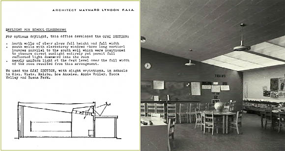
These one-floor classrooms were laid out in rows along open passageways. The north walls were open to courts between, the south walls solid below, along open passageways sheltered by flat canopies with slim steel columns. The canopies bounced the bright south light into clerestory windows above them, where it was diffused through louvers into the classrooms behind. The system was elegant, simple, and entirely straightforward.
The “fingerplan” schools that resulted consisted of rows of classrooms and courts, augmented by separate, differently sized masses for service spaces and bathrooms, for administration, multipurpose rooms, and sometimes separate kindergartens. Their stucco walls and canopies were painted in strong, subtle colors, always related to the conditions of the surrounding site. Maynard designed a number of such schools throughout Southern California (more than 20 by my count), with several each in Ojai and Vista.

These schools made up the bulk of my father’s practice in Southern California, and he was very proud of them. The Vista Elementary School of 1950 was picked by Henry Russell Hitchcock as one of the buildings to be featured in Arthur Drexler’s book, Built in USA: Postwar Architecture, published in 1952. The Apperson Street School in Los Angeles received a national AIA Honor Award. A number of other buildings received honor awards and national notice. The most importantly situated of these was the Santa Fe Ticket office on Pershing Square at the center of Los Angeles. It was an immaculately detailed, spacious, and elegant space made romantic by a curving panoramic painting of the Grand Canyon, visible from the street through uninterrupted panes of glass.
During this general period, Maynard was made a Fellow of the AIA and served as president of the local chapter. He was also a fifth year studio critic in the USC School of Architecture. It was at about this time that Project Architects was formed. It was a consortium of architects with small firms and shared convictions who thought that together they would be able to garner some of the major work that was being given over to larger, corporate practices. The members of the group included Raphael Soriano, Douglas Honnold & John Rex, A. Quincy Jones & Fred Emmons, and Arthur Gallion, a planner. A building for the San Pedro Hospital was the only major project that they finally worked on together, but it was a stimulating association. Quincy Jones, especially, became one of my father’s closest friends, and they later did the Ocean Park competition for Venice, California, together.

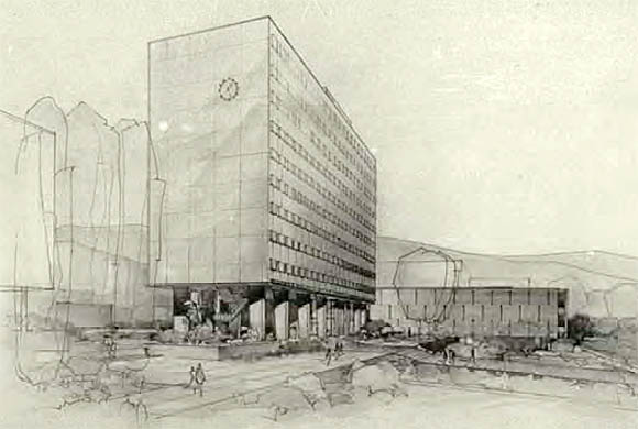
The classroom building is very different in character. Rather than opening freely to the surroundings, it seems to be a brick mass, with narrow slits for windows, fortified against the sun. Inside, however, is a very large, high court, which is ringed by several levels of balcony, with an open sunscreen capping the space. The whole place is bathed in the soft light filtered through those sun baffles, and it is filled with palm trees, benches, and overlook. This great court has a grandeur that gives dignity and scope to the activities of meeting inside its walls, with no semblance of the flash often associated with commercial atria.
The most noticed feature of Bunche Hall is the wall of square openings shielded by glass panels that rise up into the skyline of the campus on the surface of the office block. The wall is surfaced with a glass tile of a gentle but lively brown color, which is comparatively dark in order that it not dominate the skyline or call attention to itself. The tall mass is instead compatible in color with the hills in the background beyond. (This, my father recounted, required considerable persuasion of the campus architect, then Welton Becket, who had decreed that all new buildings should have white frames and light colored surfaces, irrespective of their situation in the landscape.) The square glass panels projecting from the building wall, rather than recessing into it, are the result of an ingenious sun protection system. Each window opening has a dark glass shield mounted in an aluminum frame set out in front of it and free of the wall, so that it can be cooled by breezes rising up the surface of the building. Framed in squares larger than the windows themselves, these shields, though visually pronounced on the face of the building, disappear from view when seen from the inside. The north wall, on the other hand, oriented away from the sun, is full glass, with spandrels as well as windows sheathed in a flush, continuously reflective surface, merging with the sky.

Throughout this work, Maynard was persistently seeking problems to solve—problems that would have significance in the way in which life could be lived within the places he designed—problems that had to do with the making of things in a way that was true to the possibilities of the time and situation. My father was committed to doing things in the “right” way, a way defined not by custom, but by reason, qualified by an innate sense of elegance. Many elements, devices and motifs recur in his work. Having determined to his own satisfaction that he had found the right way of doing something, he did not abandon it in search of novelty. Fresh invention was fascinating for him, but it needed the stimulus of freshly defined problems. Thinking beyond convention was essential, but novelty for its own sake held no attraction for him.
Two of his works, a church in Westwood and a house in Malibu—both built during the years that I was first thinking about architecture—have been especially influential in my thought. The Twenty-Eighth Church of Christ, Scientist, designed in 1952, is one of the most compelling of his works. The composition of the building so deftly incorporates the geometry of its angled corner site that it seems an inevitable solution. The auditorium, set slightly into the sloping ground, is bordered on the Hilgard side by a stately colonnade of concrete fins that follows the curve of the street, connecting the free standing Sunday School to the Church entry, the building to its site and the city. The spacious glass-walled lobby that can be entered from either bordering street is sheltered behind a curved concrete wall, perforated by a pattern of small tubular openings. It makes a quiet but memorable face to the intersection, while allowing light to filter in, minus the confusions of a traffic intersection.
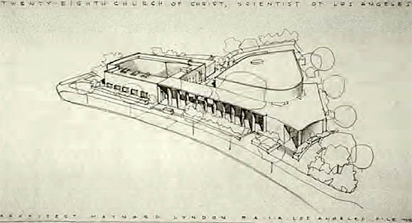
Inside, the church is a serene composition with a wide auditorium that is simple and profound, centered on a carefully arranged and proportioned marble and wood speakers’ platform bearing inscriptions. This focal area is backed by a beautifully simple wood organ grill and flanked on either side by walled gardens, which bring soft reflected light in through plate glass openings. Designed by the late Garrett Eckbo, these sunken gardens are isolated from passing traffic and disturbance. The whole interior space is suffused with the glow of apricot-colored upholstery and carpet, lit from a galaxy of recessed downlights in the black ceiling. All attention, within this warm ambiance, is directed with calm certainty to the Readers and the assembled congregation—to the communal significance of the word. Nature, tempered, is given precedence. Architecture, tempered, speaks softly and eloquently of human presence.
The other great influence, of course, has been the house that he designed for our family in 1949, one of the first houses on Point Dume in Malibu. Like two other notable houses built that year, the Philip Johnson House and the Charles and Ray Eames House, it had great walls of glass. Unlike either of those, whose wall geometries and floor plans precisely delimit the inside from the outside, the Lyndon House fused the two, with planting areas on either side of the glass, nearly inconsequential mullions, and almost continuous concrete floors.
The plan was extremely simple and efficient; the roof and end walls, painted white, were concrete slabs tapered to a thin continuous edge that was like an orthogonal tent set down on the landscape. Walls and ceiling inside were made with perforated Transite panels, rendered in soft, subtle colors, varied to the visual tasks at hand. The ocean, the sky, and shadows from the sun traced themselves across our consciousness; those and the quiet, purposeful thought that would be revealed when you chose to look.
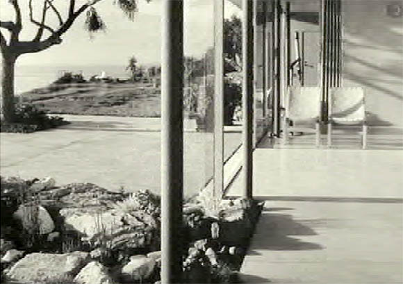
The Mattheson chairs, elegantly formed in Scandinavia, which first entered our family as floor samples at Contemporary Backgrounds in Detroit, appear comfortably in photographs of our Westwood house recently published in Richard Neutra: Complete Works, and figure prominently in this photo of the Malibu house. They still beckon human presence today—now in my studio at The Sea Ranch.
Though my own architectural work is very different, the sense of that house (long since transformed by subsequent owners) and the convictions and care that it embodied remain with me always as an exemplar. This photograph, taken by my father decades ago, recently became the cover of the “Dwellings and Outgoings” issue of PLACES, a journal that I edit. The accompanying text explained:
“The outgoings at hand consisted of a view of the Pacific Ocean, a perpetually benign climate and soil to cultivate. Neighbors were in short supply. Every decision about the house was intended to emphasize the interdependence of inside and outside: to speak at once of the pleasures of the place and of the importance of giving disciplined thought to its nurture. Nature, tempered, is given precedence. Architecture, tempered, speaks softly and eloquently of human presence. The situation is unique; the values embodied are enduring. The challenge is to extend them to neighboring.”
Ideas in architecture are passed on in many ways, through teaching, through companionship, through images, words, and example. Maynard Lyndon provided these for many colleagues, students, and observers. The examination of his buildings, tracing examples of rigorous thought and of inspiring enthusiasms, has certainly been a fundamental part of my education as an architect. Values developed, challenges chosen, and the “chats” we construct around them, are what shape careers and structure the future.
All photos and renderings from the Maynard Lyndon Collection, Architecture and Design Collection, University Art Museum, UCSB. Maynard Lyndon, FAIA, courtesy Donlyn Lyndon, FAIA.
Author Donlyn Lyndon, FAIA, is Eva Li Professor of Architecture at UC Berkeley and Editor of the journal PLACES. He has served as Chair or Head of Department at UC Berkeley, MIT, and the University of Oregon and has been awarded both the AIACC Excellence in Education Award and the AIA/ACSA Topaz Medallion. He is past President of the Association of Collegiate Schools of Architecture. Lyndon was a founding member of MLTW, architects for Condominium One at The Sea Ranch, which has received the AIA Twenty-Five Year Award, and practiced until recently as a principal in Lyndon/Buchanan Associates in Berkeley. The Sea Ranch, a book co-authored with Jim Alinder, is scheduled for publication by Princeton Architectural Press in February 2004. His previous books include The Place of Houses, with Charles W. Moore and Gerald Allen, Chambers for a Memory Palace, also co-authored with Charles W. Moore, and The City Observed: Boston. Lyndon’s first intern experiences were in the offices of his father, Maynard Lyndon, and Raphael Soriano, and his first executed building was designed as an Associate of Maynard Lyndon, FAIA.
Originally published 1st quarter 2003, in arcCA 03.1, “Common Knowledge.”

