Photography can be a way to enter a place, to look at and then through the surfaces made by streets and buildings. The flatness of the photograph need not be a reduced version of reality, but a reminder that buildings as we walk and drive by them usually appear as façades to our eyes. Looking at a building front, watching as its flatness reveals variation and depth, signs of weather damage or repair, is the work that comes later from deliberately observing the flat plane. Looking at the same façade over time, in different weathers, adds the presence of light. From light comes the changing life of a place, its sense of being in time. The landscape painter’s great gift, as Kenneth Clark says of Bellini, is an emotional response to light. What he might have meant by emotional seems uncertain, but it suggests that light itself has a quality of emotion to which we respond. It is the play of light across the most familiar scene—the view out of a bedroom window or across an apartment building’s airshaft—that keeps it from becoming fixed. And that keeps us looking. At the moment when a photograph catches the depth of a scene, as it looks down the side of a building or catches a range of shadows, it can break the two-dimensionality of the façade. And that makes us look again.
Light is the photographer’s medium. It creates the active moment in a scene where nothing else seems to change: the façade of a building, the shape of the street. The photojournalist Henri Cartier-Bresson used the phrase “decisive moment” to describe his style of capturing human life. It signifies that the composition of elements has found its most compelling form: the apogee of the man jumping over a puddle, the smile of the little boy carrying two big bottles of wine. The moment is decisive because it will never come again, and that means not simply that the man is jumping or the boy is smiling but also that the photographer is standing there with a camera ready to shoot. It is about light in time. The fascination with the decisive moment among certain photographers is like the fascination with sudden inspiration among certain writers: each must be intuitively recognized, captured, left to stand uncropped or unrevised. It is there, perfect in itself; and much of the job is to know when to leave well enough alone. There is in this mystique a residue of vanity: the artist is the one singularly blessed by the moment.
What does the decisive moment mean, though, for something that cannot move, that seems fixed in its site? Only that the light at a certain moment illuminates and obscures, throws into relief and shadow, all that is there to compel the photographer’s eye and does so in ways that could not happen at another moment. With patience, a bit of luck, and a good memory, though, the scene can be recaptured: the light will come again and the image can be made again. The moment of light across a building or urban scene is not so much decisive as it is active, because it allows a measure of change into an otherwise static scene.
* * * * *
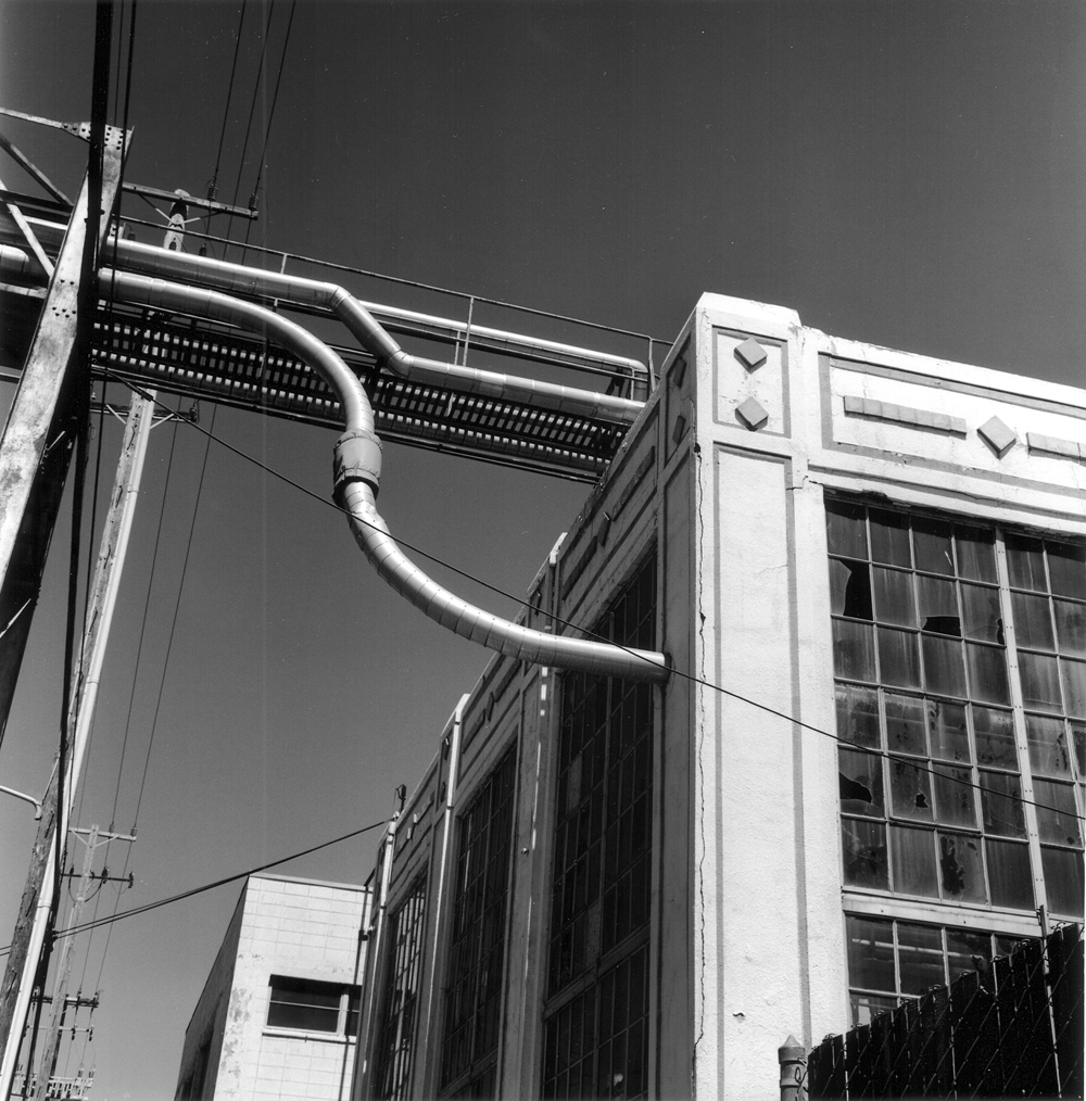
The first carefully composed photographs I took here were done in a light industrial urbanscape off Gilman Street, between 8th and 4th Streets. I took a medium-format camera with a normal lens, two rolls of black-and-white film with 12 exposures each, and a yellow filter to increase contrast. That, along with a light meter and tripod, made for a minimal kit. These technical details matter only as they set the discipline of working with the equipment at hand rather than carrying a wide range of lenses. I photographed some warehouse walls marked with hard-edged shadows cast by skinny tree trunks and electric lines in the morning light. I was following, as far as I could, Harry Callahan’s practice in his great image of a Kansas City building in which the façade functions like a sheet of film to catch patterns of light and shadow. I also found an art deco-ish industrial site for an ink manufacturer with a set of pipes running overhead across the street. One of the pipes took a beautiful s-shape, oriented vertically. The spareness of that curving line, of function finding its form of motion, defined the beauty of the site.
It was a Sunday morning, so the scene was quiet but not abandoned. People walked through on the way to neighboring residential streets and sometimes fell into the rhythm of the image. I felt comfortable being there and began to imagine how to work with the light: let its constant, unshaded intensity shape shadows and traceries and patterns. The shadows on the walls seemed uncannily like light hitting a piece of film, and that was as close to pure photographic possibility as I could imagine.
* * * * *
Looking at the world through a viewfinder distorts it and orders it: the frame composes as it includes and excludes. Given that the image in the viewfinder is fixed (unless a lens of a different focal length is used), every adjustment to gain something means inevitably to lose something. Shift upwards to capture more of a cornice and you risk losing the street level that grounds the image. Focus on a detail set back within the shadows and you risk blurring the rest of the façade. From the limited field of the lens comes the composition, especially when working in streets that hem you in with buildings or fences or parked trucks. The orderliness of the composition also becomes, at times, a limitation. The balance of elements, the axis of the camera parallel to the ground, the pattern of light and shade—all these need to be disturbed slightly so some sense of unease can register in the picture. Some trace of being off-balance, if only by a hair, of feeling that the scene is precarious, is necessary if the static image is to record one’s uncertainty. The too-precise framing of commercial architectural photography, especially that done for prize juries, elevates the building into a sculpture, the pure product of artistic genius. And it does so largely by removing the building from its setting, because that usually lies beyond the architect’s full control. By contrast, that which cannot be designed into place but which happens over time most engages me.
Using black-and-white film is another way of gaining and losing: its tonalities concentrate the eye on the structure or bones of a building, but it also lacks the energies of color, from the garish to the muted. I do not yet fully understand what it will mean to use black-and-white in a place that is usually clear and cloudless, bright and seemingly without nuance. I keep thinking of Marc Riboud’s pleasure at photographing in Paris during an especially gloomy winter. The overcast light was good to work with, he said, because “sunlight is kitsch.” There is an aesthetic in that line. So I will try photographing here on a foggy morning when the light is soft and diffused, though that risks another variety of kitsch. Shooting black-and-white always makes me aware of its artifice, though many photographers will say that black-and-white is the natural, and color the artificial, medium. Looking at the world, though, we see in color, and often a sensation of saturated or bleached color is our lasting impression of a scene: overlit neon jungle, foggy ocean beach. A black-and-white print renounces all that is naturally there for us to see with our eyes in favor of a medium that gives a more astringent sense of line and form. Now that color films have accurate and subtle tones, the renunciation is voluntary. Making fun of Kodachrome in the 1960s and ‘70s for its garish values was easy, as was staying with black-and-white. The choice is harder now, both because color film is subtler and because photographers like Callahan have used color with a tonal austerity once thought to be the defining quality of black-and-white.
A horizontal photograph taken by Callahan in Kansas City in 1981 disturbs all of the orthodoxies about film. It shows the front of an old brick building set on a corner where two streets meet at a diagonal; the main entrance crosses the plane formed by the two façades of the building. All of its doors and windows are boarded up, a “No Parking in Driveway” sign is barely visible at the far right, and several tree trunks of varying girth cast their shadows at an angle onto the front of the building. The image is rich with detail and pattern: the first floor of the building is marked by strong verticals of door and window jambs as well as the planks nailed up to cover the windows; these verticals are then capped by the powerful horizontal of a metal beam studded with rosettes. The second floor shows horizontal brick courses broken by a band of decorative stone at the level of the windowsills. The sidewalk slopes slightly downhill to the left; a white cup (probably Styrofoam) lies on it and marks the center of the image. The composition of verticals and horizontals plays against the angles of the doorway and the shadows of the trees—all on the façade of a vernacular building like many others found in the older and, by now, usually rundown sections of American cities. The caption for the photograph reads “Kansas City, 1981,” but it could just as accurately, if more verbosely, be called “Neglected American City, Late Twentieth Century.” It is, in its simplicity, as close to perfection as a photograph can be in using visual form to represent urban history. Anyone who noticed Callahan shooting this building with his view camera probably thought he was one step ahead of the demolition crew.
As best as I can remember, I first saw this photograph in a black-and-white reproduction that made me assume it was originally shot in black-and-white. Only later, in a better catalog of Callahan’s work, did I see that it was done in color: the cup was white, the shadows were a very dark gray, the façade was a rusty orange-red going almost to terracotta, and there was a patch of white on the far side of the angled door that read as all the whiter because the print was in color. The austerity of black-and-white was here but also a warmth in that rusty orange-red, which suggested what had first captured Callahan’s eye. Despite its formal bleakness, the image celebrated the pleasures of strong light (judging by the direction of the shadows and their effect, probably that of late afternoon) which can enliven even a dreary urban scene. In its composition, the photograph said something necessary about the presence of light in the city, the way it fills a scene, gives definition to the buildings that surround us, forces us to pause and look, brings warmth into our lives.
In the Kansas City photo, Callahan is a severe master of color. I can hardly imagine how long it took him to learn that restraint, how many thousands of black-and-white negatives passed through his imagination and over his light table before he saw how to use color with that restraint.
* * * * *
When I shoot with a 35mm camera, no matter how good it is, passersby do not give me a second glance. When I use a tripod and larger camera, no matter how old it is, they wonder what I am doing and why I am photographing a site, especially if it does not promise a familiar image. Sometimes, though very rarely, someone will stop to talk, though usually about the equipment I am using rather than the picture I am taking. Photographing the Left Bank apartment building where Eugene Atget lived for most of his career and where he developed the negatives that changed the way people look at urban spaces, I was asked by a Frenchman about the lens of my Rolleiflex because he, years ago, had used a similar camera. But such interruptions are rare. Most frequently, people assume (and here I am guessing) that I am photographing a scene that seems featureless—such as an apartment building in Paris like thousands of others—for documentary purposes. Perhaps I am preparing images for a civic inventory or a real-estate transaction or the like.
* * * * *
That act of visibly doing something mechanical, signaled by tripod and bulky camera, makes me feel anonymous about my work, just another person in the city doing a job that clutters up the sidewalk. This anonymity reminds me of Atget going out very early in the morning to shoot the street-fronts, courtyards, corners and shop windows of late nineteenth and early twentieth century Paris. In doing work that was intentionally documentary, that was available for purchase at a very modest price to civic authorities and artisans of various sorts, Atget demonstrated how to photograph Paris and by extension any historically- layered city. So remote do I feel in my ability from the master that I am not at all ashamed to walk around the Latin Quarter with copies of Atget’s photographs in hand so I can put my tripod exactly where he put his and replicate his images in order to learn from him. Sometimes I can find the spot where he worked so exactly that I know what kind of lens—wide-angle or normal—he used because his image fills my viewfinder perfectly. Doing so, I understand why an artist goes to a museum to copy an Old Master painting. It is a way to learn the technique that makes the image possible, to find the use of craft. The point of all copying is to take that lesson in technique out of the museum to one’s own work.
* * * * *
Literary intellectuals who write about photography—Roland Barthes, Susan Sontag, John Berger—treat it almost always as a medium for representing people. Reading their incisive discussions of photography as documentation and portraiture, you rarely encounter any mention of a building or a place. That photography interests them because it depicts people is not hard to explain: they have spent their lives reading, writing and interpreting novels in various ways.
The divide that still haunts discussions of photography between documentary and scenic—between real and imagined, ugly and pretty, socially committed and aesthetically privileged—may have made sense in the early days of the medium. But as notions of photographic form and composition became defined less by painterly conventions than by technical possibilities like faster shutters and sharper lenses, less by moody brushwork than by precise focus, one can see that this divide had as much to do with ideology as practice. Treating all images of spaces and places as merely scenic stopped making sense long before Atget’s work became known in the 1920s and ‘30s, but his practice can serve as the clear refutation of that critical tendency. His photographs of Parisian streets, shops, courtyards, parks, churches and the rest of his urban world are documents of places, usually without people visible in them. Or, at least, with no people visible as human figures, for their traces and habits and uses of space are all recorded with fine-grained precision in his prints.
* * * * *
There is in a typical Atget photograph more evidence of people and their ways of living than in most photographs explicitly representing people and their ways of living. Is this rendering of places without people something that photography does better than painting, at least painting other than a few by Vermeer or, in a very different way, de Chirico? Part of the documentary truth of those Atget photographs is their loneliness, their sense of people being elsewhere than in the place they record. That is also what I feel as I wander around this industrial zone, this place where people work and then leave. Only the homeless settle here in temporary nests under the bushes and overhangs. And unless I know them, I will not take pictures of them or even of their shelters. Places are also marked by their own impositions of privacy.
Author Nicholas Howe, PhD, joined the Department of English at UC Berkeley in 2002. His writings on place and travel have appeared in such periodicals as Southwest Review, Yale Review, Kenyon Review, Dissent, and The New Republic. In addition to publishing various works on medieval literature, he has edited Irving Howe’s A Critic’s Notebook. His most recent book is Across an Inland Sea: Writing in Place from Buffalo to Berlin (Princeton University Press, 2003). He is married to the writer Georgina Kleege. This article is excerpted from an essay originally published in Southwest Review, vol. 89, no. 1, 2004. It is reprinted by permission of the author.
Originally published 1st quarter 2005, in arcCA 05.1, “Good Counsel.”


