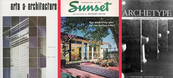
In fast-forward California, one of the best places to view older architecture is on the pages of an older magazine. Not only do we see myriad buildings lost to the wrecking ball, but we see them and the survivors in the context of cityscapes frozen in time and flavored by period streetlamps, automobiles, and signage. Featured buildings look voluptuous in their coiffed, tranquil newness. Rarely do the images convey the clamor of construction, the noise of transport, or the distraction of people. Like outdoor still-lifes, magazine photographs lavish attention on a building’s palpable qualities, fussed and fixed by light. These views also confront us with the transience of architectural ideas and urban neighborhoods. A stretch of downtown Fresno, captured in the 1920s, expresses the economic ripples of that decade, as several recently completed office buildings sparkle with (what would be a short-lived) promise. An advertisement for a San Diego school in the 1950s similarly registers the brief reign of crisp, white modernism.
California’s architectural magazines unfold an exhaustive record of California’s architectural attitudes, both in pragmatic building and slightly-less pragmatic lifestyle creation. No single magazine has covered the era from the late nineteenth century, when publishing began, to the present. Indeed, the different magazines (and their constantly changing formats and names) confirm the state’s volatile design climate. Some magazines promote particular movements while others strive for breadth. Some magazines cater mainly to architects while others appeal to clients (and especially homeowners), and still others extend their reach to academia. In most cases, magazines deal with California. But many disseminate out-of-state developments, and at least one tries to impart cosmopolitan sophistication to the Golden State.
Among the first architectural magazines was The California Architect and Building News, launched in 1880 (as successor to Quarterly Architectural Review) and continued after 1900 as Industrial News. Organ of the San Francisco AIA, the newsprint monthly catered to architects, businessmen in the building trades, and government regulators. The buildings discussed are public edifices in the Beaux-Arts style or prominent houses in a wider palette; they are illustrated on full pages in either watercolor or pen and ink. Generally, the illustrations stand for the buildings, and the short articles engage a spectrum of matter-of-fact issues, such as “The Disposal of Dust” or “The Murderous Sewers.” Often the articles get juicier, as in “Electrolysis in the Streets,” in which the author raises understandable concern for the deadly current leaking from street railways. Or take the churlish piece, “Do the Chinese Invent? ” In the 1880s, the anonymous author argues that the answer is “no,” even when taking paper and gunpowder into consideration.
The most important professionally oriented magazine in the state’s history was the Architect and Engineer, which began publishing as Architect and Engineer of California in 1905 and ended as Western Architect and Engineer in 1962. Edited in San Francisco, the Architect and Engineer was a professional’s magazine, comprehensively reporting on the buildings and building issues of the day. Early on, a visionary tone was set by the architect B.J.S. Cahill—editor of the short-lived American Builder’s Review (1905 to 1907)—who wrote several lengthy articles that passionately argued for developing grand axes of monuments and parks in San Francisco.
But most topic headings were down to earth, literally: concrete and cement; terra cotta and brick; heating, lighting, and electrical systems; seismic issues; new materials like plywood; new lighting systems like fluorescent tubes. A typical article title was “Advantages of Using Damp-Proof Compound,” intended for those not wanting to be left out in the wet. By the twenties, the Architect and Engineer also offered headlines like “Revival of Colonial Architecture” and began to merge its practical interests with lofty aesthetics. We start to see titles like “Paint, Architecturally Considered” or “Building Beauty into Highway Drainage Systems.” Although, to present-day ears, the titles can sound preposterous, the magazine embodied a signal aspect of visual culture decades before visual culture became a commonplace term: leave no aspect of the physical environment un-designed and hence impractical or ugly.
Over time, the Architect and Engineer improved its depth of reporting and graphic appeal. Large numbers of individual building reviews were published, each including a lengthy written description and evaluation, and all featuring copious imagery. Articles include a plan, a photo of the whole completed structure, and a notable detail. Like most of the writing, the photography is comprehensive, not challenging; shots are taken from either a frontal stance or predictably picturesque angle. By the forties, the magazine began to inch toward modernism, featuring many titles that begin with “Trends in Present Day….” Never mistaken for high literary ambitions, in its final years—as Western Architect and Engineer—the magazine occasionally broke out into profound writing and imagery. In September 1961, the architectural historian Esther McCoy wrote a beautiful article on Wilshire Boulevard (accompanied by photos by Marvin Read), that starts out: “Wilshire Boulevard begins in chaos and ends in jeopardy.” Not since Willis Polk’s turn-of-the-century essays on architecture for the San Francisco literary journal The Wave had architectural periodical writing veered so far into poetry.
Years earlier, though, another magazine made poetry out of design, instigating the importation of architectural modernism into the state and crafting its contours to the California landscape and lifestyle. That magazine was Arts and Architecture, and McCoy was a frequent contributor. Its editor was John Entenza, an architectural autodidact out of Los Angeles. Here, too, the journal began under another name, Pacific Coast Architect, and with a less than messianic mission. Pacific Coast Architect was founded in 1911 and originally edited out of San Francisco and Los Angeles. Compared to the Architect and Engineer, Pacific Coast Architect, which merged in 1929 with California Southland to form California Arts and Architecture, was consumer-oriented. Articles carpeted home decorating challenges for “ladies,” with titles like “The Philosophy of the Fireplace,” “Why Little Lamps?” or “Wood Paneled Walls Never Lose their Charm.” Certain old habits were so important in the post-Prohibition thirties that design could fall out altogether in such literary benders as “In Defense of Drinking.”
Arts and Architecture was heir to a long tradition of writing on the particular virtues (and occasional vices) of California, including the Pacific Rural Press, which began in 1870, and the granddaddy of California lifestyle consultants, Sunset Magazine. Founded by the Southern Pacific Railroad in 1898 and published to this day, Sunset has unabashedly promoted western living through the western house and the western landscape. Its advocacy for Cliff May’s ranch house type helped standardize that design after the Second World War. According to architectural historian Robert Gonzalez, writing in Architecture California (Summer 1987), Sunset’s “editorials, articles, and standard features also reveal that the West was consistently presented as a tabula rasa that could be reshaped to fit the cultural and physical needs of an emerging class of land-owning suburbanites.” Likewise, Arts and Architecture pressed its readers to compose a fresh, modern lifestyle through the purchase and decoration of small houses, their interiors, and their gardens.
These tendencies catapulted forward after 1938 when Entenza took over the editorship; he would be at the magazine’s helm until 1962. For the first time, California had an architectural magazine that promoted western living through radical design, attuned to European architectural theories, industrial methods and materials, and a perceptual appeal to the unique landscapes of the state. Instead of situating historicist houses within tended gardens that tended to look back to England or New England, Entenza presented modern houses jutting out from desert gullies or coastal canyons, with floor to ceiling glass walls revealing palm trees and mountains. The precipitously revamped monthly extended its range to other building types and began to feature developments outside California and outside architecture—within, for example, music or painting. The number and placement of illustrations accorded with the flair of modernism. In 1949, a spread on Welton Becket’s Prudential Building in Los Angeles included fourteen photos. One night shot captures the entire building lit up against the dark city, a beacon of the future rising from the slumber of the past. Two other street views at night showcase the striped blaze of lit windows. Finally, the abnormalities of the asymmetrical building emerge in detailed shots, taken from acute angles and arranged on the pages of the journal like blotches of color in a Kandinsky painting.
Each issue featured new architectural works, mostly houses, but also schools, factories, or office buildings. Houses are illustrated on two or three pages, with abundant photographs surrounding a pithy text. Descriptions follow modernist logic: first, a statement of the program; second, an accounting of the dimensions of the problem; and third, the means by which they were solved via constructional methods, materials, and composition. The pages of the magazine were also graced with articles highlighting George Nelson’s furniture designs, Konrad Wachsmann’s constructional innovations, Garrett Eckbo’s gardens, or Ad Reinhardt’s paintings. Theoretical pieces, like Sibyl Moholy-Nagy’s “Idea and Pure Form” round out the magazine’s coverage. Such think pieces ran infrequently, but from time to time an entire issue was devoted to a special topic, like Mies van der Rohe or contemporary Mexican architecture.
Arts and Architecture is best known for the most important publishing event in California architectural history: The Case Study House Program. It was announced in a 1945 editorial, when eight architects were chosen to design eight houses that would respond to the special situation of Southern California, as well as the shape and form of post-war living. Over the years, the list grew to include Richard Neutra, William Wurster, Raphael Soriano, Pierre Koenig, and Charles Eames. Like the gleaming, pearly, modernist structures then rising throughout the state, the Case Study houses stood out from everything else discussed in the magazine. Within a given year, a Case Study house could be promoted by up to six articles. First, there would be the announcement of the new numbered house, its site, and its architect. Next, a short piece presented initial architectural drawings and design concepts. Then, one or two articles showed construction progress. Finally, the finished house was exhibited in a satiny spread, six to twelve pages, with detailed descriptions and up to thirty images. The Case Study Program turned houses into monuments. Because of Arts and Architecture’s international distribution, California architecture made the world scene.
In 1981, after mid-century modernism had faded into history, the magazine was “revived” by Barbara Goldstein as Arts + Architecture. Still based in Los Angeles, it had a more diffuse focus, redolent of postmodern times. Lasting only until 1985, the color glossy ran frequent special issues: in 1984, “The Postwar House” covered Eichler Homes, Stucco Boxes, and Artist’s Co-ops, as well as city houses for small lots in San Francisco; in 1985, “Postmodernism” mixed up new approaches to painting, classicism, landscape, and architecture. Arts + Architecture was part of a drift toward a more critical architectural journalism. In an age lacking firm belief in a unified architectural order, it became easier to criticize buildings, development, and the profession. Glorification gave way to skepticism.
Around the same time, in San Francisco, another periodical of this sort was launched by an editorial team that included Andrew Batey, Kurt Forster, Diane Ghirardo, and Mark Mack. Archetype, lasting also a brief four years between 1979 and 1983, was a West Coast combination of post-hippie rag and Oppositions, the avant-garde New York architectural magazine. Archetype avowed cross-fertilization of media (from photography to art to industrial design), the inclusion of history and theory, and a roving cosmopolitan beat. The opening editorial stated: “One of the objectives for a voice from the west should be to eradicate the fear of communication with the architectural community on the East Coast and in Europe.”
The pages of Archetype are suffused with the verdant forms and mutating ideas that animate the built environment. Alongside descriptive articles on California houses by Morphosis or Robert Mangurian are longer think pieces on Palladian villas, Albert Speer’s Master Plan for Berlin, or Colin Rowe’s urban design studio at Cornell University. Vernacular topics range from the new “Wind Tunnel” at the Ames Research Center in Mountain View, to the commercial buildings of late nineteenth century Montreal, to walls. Translations were provided of theoretical writings, and interviews queried architects like Luis Barragan or historians like Alberto Sartoris. Fantasy found favor; a long visual essay in the first year featured drawings by Craig Hodgetts for Ernest Callenbach’s Ecotopia. Archetype’s imagery could be hit or middling. 1981’s special issue on photography contains some splendid shots. And in 1979, Tim Street-Porter contributed a series of photographic ironies of Southern California, including one of an Airstream trailer peeking up behind a concrete-block wall and salaciously shaded by cypress trees and steel piping.
The quarterly magazine’s eclecticism is epitomized by the “Building of the Quarter” section, which ran in each issue. Older and easily recognizable Californian landmarks—the Rincon Annex Post Office in San Francisco and the Griffith Observatory in Los Angeles—launch the building parade. But, lest we think this exercise would hold to the tried and true, the editors’ sights soon passed to the unnoticed or little noticed: the new Palazzo Gagosian, continuing Venice, California’s, mannerist romance with Venice, Italy; a San Francisco Victorian dressed by David Ireland in industrial shimmers and seams. One “Building of the Quarter” featured a medley of outhouses, each lurking muskily despite their two-dimensionality. The brief runs of Arts + Architecture and Archetype might be explained by their intentional yet invidious lack of focus. But, more to the point, by the 1970s, the great age of magazine publishing had come to an end. From the 1920s to the 1960s, architectural magazines, both nationally and in California, fit well with American society’s conformist consumerism. After the tumultuous 1960s, however, the individualization of taste rapidly accelerated. General-interest magazines—like Life or Look—gave way to specialty publications—like Car and Driver or GQ—that stressed personal interests. Shelter magazines, such as Architectural Digest out of Los Angeles or the newer Dwell from San Francisco, did well by carving identifiable consumer niches. But architectural magazines beholden to a wide and inclusive definition of architecture have not prospered. On the national scene, The Architectural Forum and Progressive Architecture bit the dust. Nowadays, Architectural Record owes its survival to its sponsorship by the AIA. No differently, over the past twenty years, the only substantial magazines of architecture in the state have been published by the AIA California Council, out of Sacramento—no longer in the cultural cauldrons of the state, but rather in the political capital.
The first of these periodicals, Architecture California, ran for two decades ending in 1999. Over those years, it experimented with many earlier formulas of periodical publishing. Initially, the magazine’s priority was to cover new buildings in the state. But restorations and urban design proposals received almost equal attention. A typical article that engaged the spirit of the times was Dan Solomon’s 1982 piece, “San Francisco: the Continuity of Urban Life,” which contrasted building typologies that were traditional (and favored) with those that were disruptive (and usually modernist). Solomon’s bumptious neo-traditionalism was diluted, though, by the magazine’s clutter of diverse theories. Architectural journalism had begun to resemble everyday journalism, as covers announced the latest trend or discovery, each and every issue. Starting in 1990, for financial reasons, Architecture California reinvented itself, dropping advertising, chapter news, color imagery, and trend-spotting. The now-smallish magazine bulked up, however, in historical and theoretical articles. A host of topical issues from mobile homes to sustainability to regionalism replaced most building reviews and lent Architecture California an academic demeanor.
In 2001, arcCA—successor to Architecture California—became the state’s latest architectural magazine. Once again, the format and content were reinvented. Today arcCA is heir to the varied magazine ventures of the past. Given the importance of an architectural magazine, the slim quarterly faces momentous challenges. Despite the growing influence of the internet and the large market of book publishing, magazines are still one of the chief places that buildings get noticed and remembered. On a monthly, quarterly, or less frequent basis, magazines are the surest testimony to the changing relationship between architecture and culture over time.
For historians, magazines unfold forgotten attitudes on building, a stream of surprising enthusiasms, transient preoccupations, and sometimes shameful prejudices. For architectural historians, they are invaluable documents on the state’s architectural legacy, providing factual information about a building or urban setting that would be otherwise hard to find. For architects and students, they are sites of learning and stimulus to inspiration, a travel guide to what’s new and innovative. For Californians, they are testimonies to the step-by-step creation of the state’s urbanized landscape. For those out-of-state, they are proof of California’s architectural contributions as well as follies. And for all of us, magazines critically connect California’s squalling built environment with its equally tempestuous arena of ideas. How critically and how extensively California’s architecture is connected to ideas depends on the quality and quantity of magazine coverage. In order to make the most of building, there can hardly be enough reflection.
Author Mitchell Schwarzer is Chair of Visual Studies at California College of the Arts. His writings on California include Architecture and Design: San Francisco (1998); “Off-World in the Far West: On Yosemite Valley and the Las Vegas Strip,” Harvard Design Magazine 4 (Winter/Spring 1998); “Beyond the Valley of Silicon Architecture,” Harvard Design Magazine 7 ( Winter / Spring 1999); “William Turnbull and the Unveiling of the Country House, ” in William Turnbull, Jr.: Buildings in the Landscape, eds. William Stout & Dung Ngo (2000); “San Francisco in an Age of Reaction,” in Shaping the City: Studies in History, Theory, & Urban Design, eds. Rodolphe El-Khoury & Mark Robbins (2004); and “Moore Unmoored: Taking that California Trip,” Journal of Architectural Education 57 (February 2004). His newest book is Zoomscape: Architecture in Motion and Media (2004).
Originally published 1st quarter 2004 in arcCA 04.1, “Press Check.”


