The fastest growing region in California is, surprisingly, not the urban destinations of San Francisco or Los Angeles, but rather the Central Valley near Modesto, which is home to the University of the Pacific. The oldest chartered university in the state, UoP is modeled on a New England college, with gothic revival brick buildings framing tranquil quadrangles of maple trees and boxwood hedges. Yet, as the alma mater of innovative musicians Dave Brubeck and Chris Isaaks, the university is less traditional than its ivy-covered buildings would imply.
Celebrating its 150th anniversary and preparing for an ever-expanding college population, UoP has embarked upon a new campus plan, assisted by campus architect David Meckel, FAIA, and campus planners, the SWA Group. The university has purchased a technical junior college to the south, where it has relocated its art and geo-sciences departments, formerly housed in Quonset huts.
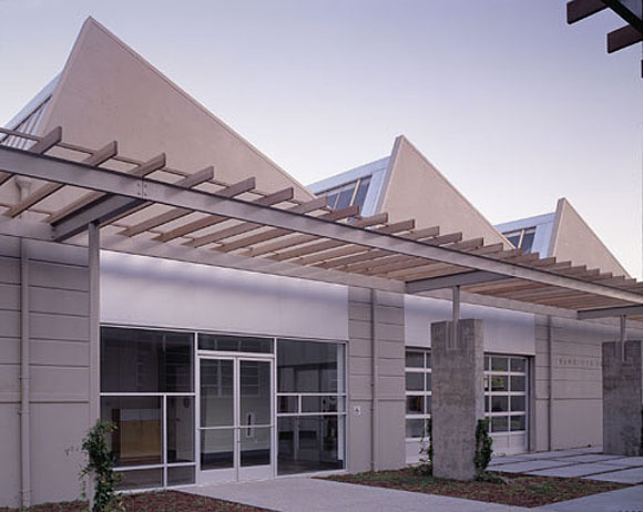
Part of an educational process is being willing to learn from one’s surroundings. Architect Tim Perks’s insightful redesign of two 1935 Art Moderne buildings respects the original structures and artfully brings their history to life. Perks, who worked previously for Jim Jennings Arkhitekture, retained the essential design elements of the cast concrete structures: streamlined horizontal lines inscribed on the façade and meticulously aligned with steel sash mullions.
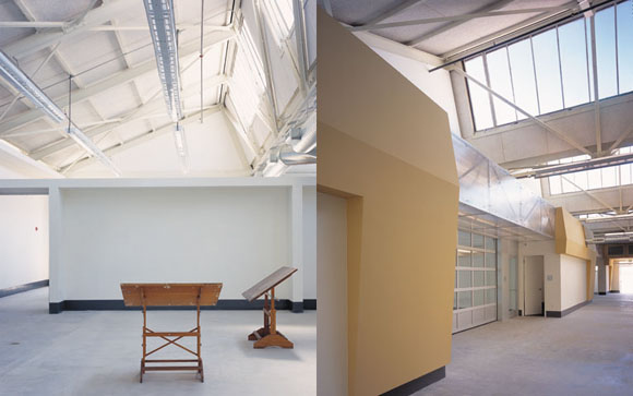
The twin buildings had initially housed the various technical trade schools: construction, welding, plumbing, and electrical. In collaboration with Ove Arup, consulting mechanical engineer, Perks utilized the resources at hand, inventively but efficiently expressing the industrial spirit of the previous use. The original interior was stripped back to its bare shell. The saw-toothed roof has been released to hover above freestanding classrooms below. Industrial roof monitors provide natural daylighting, highly desirable considering both the lighting needs of an art studio and the rising cost of energy. Mechanical ducts and conduits wind their way through Unistrut trusses sandwiched between translucent polycarbonate panels, their location often framing studio entrances. While each system is exposed and independent, they work together to unify the design.
Instead of a traditional double-loaded corridor, canted forms create a charged rhythm of open and closed spaces. Classroom walls are designed to double up as critique or exhibit spaces. Walls disappear, either through rollup doors or transparent glazing, visually linking offices and studios to the active courtyard. An exceptional merging of site and program occurs when the art gallery’s exterior glass wall rolls away during outdoor receptions on warm evenings.
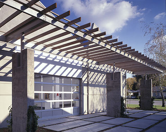
As a frame to the campus’ south entrance, Perks designed the building to promote social connectivity. In the courtyard, parallel shade structures define sitting areas. In addition to organizing departments, circulation zones provide for impromptu meetings.
Author Therese Tierney, AIAS, holds a Bachelor of Landscape Architecture degree from the University of California at Berkeley. She is currently a fifth-year student in the Bachelor of Architecture program at CCAC (California College of Arts and Crafts).
Photos by Matthew Millman.
Originally published 1st quarter 2002, in arcCA 02.1, “Image Mirror.”

