During the recent COVID-19 pandemic, employers pivoted from office to remote work, resulting in abandoned downtowns across the country – despite being filled with fully leased offices. As employers face tough decisions on office lease renewals and seek the right balance for hybrid work patterns, office vacancy rates are higher than normal, and appear here to stay. Meanwhile, a serious housing shortage continues with no easy solution in sight; the housing shortfall is also expected to last years. Can this be a “make-lemonade-out-of-lemons” moment for the conversion of excess office space to housing? How feasible are such conversion projects? What are design firms learning from doing these projects?
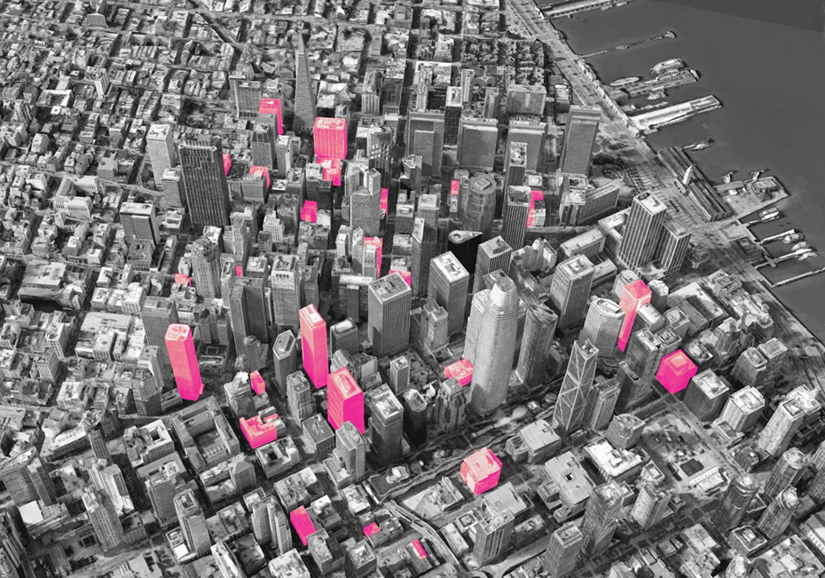
To understand more, we approached three firms – Studio 111, Gensler, and Solomon Cordwell Buenz – each of which recently completed such a conversion project. The projects are distributed among three of the most active markets for conversions, in the Los Angeles, Philadelphia, and Chicago metro areas; and they address three cost levels: affordable, market rate, and luxury. Each firm generously shared notes on their journey, comments about what makes a good reuse candidate, and lessons learned. Their enlightening stories begin with discussion of key questions about this project type.
The Critical Step: Find the Right Candidate
What makes a suitable candidate for an office-to-housing conversion? Based on these firms’ experiences, the geometry of the floorplate is the first and most important item to consider. Steven Paynter, Principal in Gensler’s Toronto office and a leader in the firm’s analysis of conversions, describes this point. “The real issue you struggle to overcome is the depth of the floorplate. How far is it from the wall of the elevator or the wall of the exit stair to the exterior window? Can you get a good market-size unit?” An effective unit depth, a market-correct layout, and access to light for each unit are all necessities.
What is the “right” depth and configuration of a residential floorplate? Michael Bohn, Principal of Studio 111, who led its firm’s Santa Ana Arts Collective adaptive reuse project in Santa Ana, California, notes, “A rectangular building with a depth of 100’ or less in one direction is ideal. When you have a 200’ x 200’ floorplate, that becomes very challenging, because you are only using the first 40’ to 45’ maximum around the periphery for light and air, and you then have a central core that is not very useful.” For projects in this article, unit depths of 28’ to 35’ (plus a common corridor) worked well. Gensler’s Paynter adds that a one-bedroom unit, for instance, should ideally have “the bedroom and the living space on the glazing.”
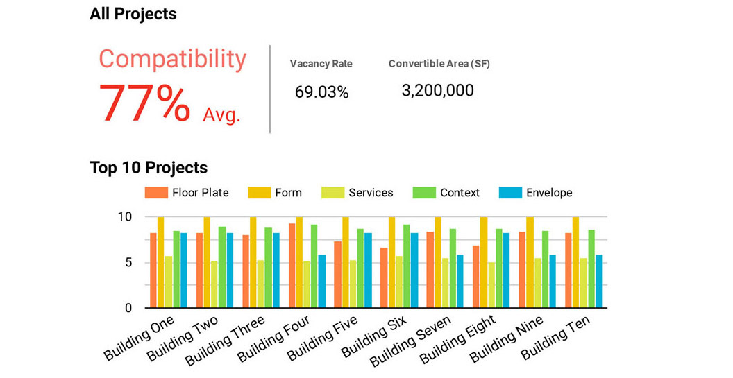
How does one get a complete picture in analyzing candidate buildings? There are other factors to consider beyond the floorplate. An example of a tool that evaluates potential projects is the ‘building calculator’ or ‘scorecard’ that Gensler developed; it considers a broad spectrum of characteristics at the feasibility phase. Gensler applied the tool to downtowns of cities such as San Francisco and Calgary in response to high office vacancy rates. The tool includes a weighted scorecard considering five factors: envelope (10%), building form and massing (30%), floor plate (30%), service (20%) and site context (10%). Built into the calculator are several other contributing factors.
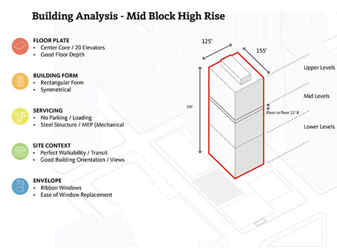
How many office buildings are candidates for conversion? Paynter says, “Only 30% of buildings we’ve reviewed are viable for conversion to residential, although this varies by city.” Typically, that includes older (1960s and 1970s) Class B and C buildings, which are more likely to have low occupancy rates and significant upgrade needs. Robert Fuller, AIA, Principal in Gensler’s New York office, who worked on its Franklin Tower reuse in Philadelphia, adds that the scorecard is just the first of three initial steps. “We will often start with the scorecard, and if it scores reasonably well, we go to the next step, where we see how the units might lay out. Beyond that, you dive into the technical details.”
How do other firms approach this kind of project? Chris Pemberton, AIA, President and CEO of Solomon Cordwell Buenz, architects for conversion of the historic Chicago Tribune Tower, notes four key elements that he believes need to be addressed on every project before moving forward. First, “the underlying business case” – the cost of conversion and underlying debt. Second, “the geometric side of things” – floorplate suitability for unit depths, access to light and ventilation, and related costs. “Third, the regulatory side of things, to bring things up to code including life safety, structural, and open space requirements.” Fourth, the context – is it suitable for housing? That includes neighborhood desirability, views, and local access.
Among the three firms’ work, projects are surprisingly diverse in terms of size, profile, and location. But there are also important recurring themes. The following summarizes these complex and challenging projects.
Firm: Studio 111
Affordable – Santa Ana Arts Collective
1620 N Main St, Santa Ana, California
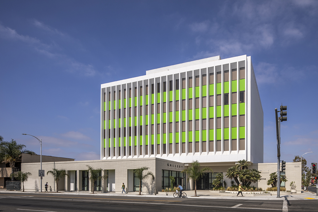
The Santa Ana Arts Collective (SAAC), Studio 111’s recent conversion project, resides in the walkable downtown of Santa Ana. More than half a century after the city’s boom times of the 1950s and 1960s, the downtown finds itself seeking revitalization, and affordable housing can help. The city’s small- and medium-sized building stock also includes intermittent larger buildings, up to nine stories. The SAAC, completed with Meta Housing as the client, addresses one of those larger buildings, a modernist, five story, 49,000 sf tower. The conversion was a reasonable choice, considering the 1965 former bank building was mostly vacant and in tired condition.
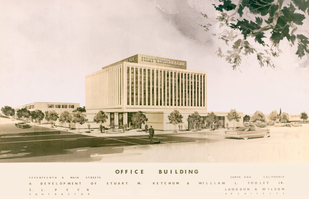
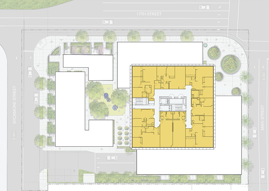
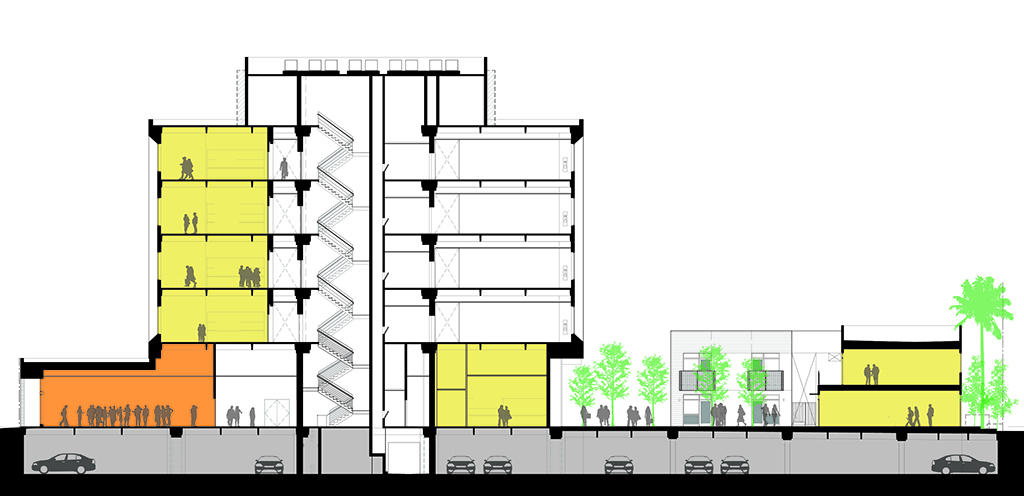
“The quirkiness of such older buildings makes them very attractive to a certain segment of the population that doesn’t want to be in vanilla, cookie-cutter style housing,” Michael Bohn notes. Initial study of the building confirmed feasibility for residential units. For the 102’ x 102’ tower, the distance from the core to the windows is different on the long and short sides of the building, and not centered within the floorplate. The design resolves this asymmetry with 28’ deep units (plus corridor) on three sides of the core, and 34’ deep studios at the fourth side of the core. The column grid’s lateral dimension is 34’.
Profile & Character
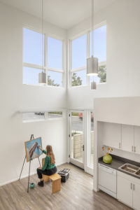
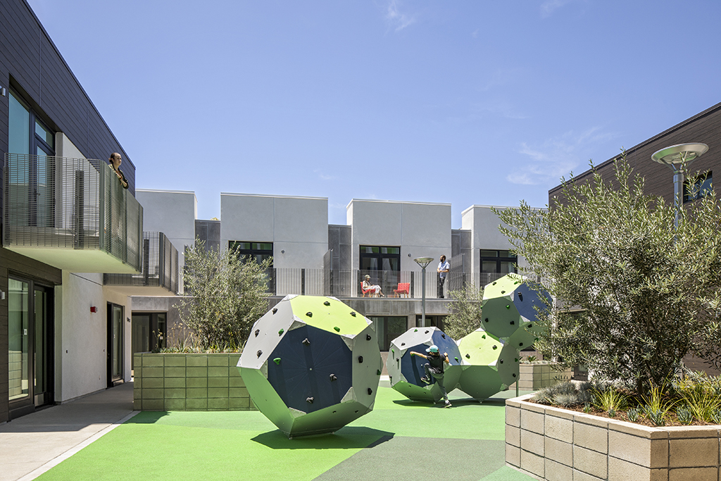
The result is a design that provides 58 affordable units for artists, plus 10 stand-alone townhomes and 6,000 sf of amenities. Units consist of studios, one-, two- and three-bedroom live-work lofts, and two- and three-bedroom townhomes that range in size from 512 to 1300 sf. An important goal for the project was to establish a creative community, including interactive work and gathering places for artists. A ground level gallery faces the street, and there is a music room, maker studio, meeting room, dance studio, rehearsal space, and family-oriented courtyard. The new townhomes are located on the site’s former surface parking, while the project retained use of the existing subterranean parking. This strategy took advantage of reduced parking requirements for a residential use, a bonus for the project. The SAAC is fully occupied with a waiting list.
The project evokes classic notions of artists’ lofts, with exposed concrete floors, walls and ceiling structure. At the ground floor, selective punches of color along a route that leads to the courtyard help reinforce the sense of a collective. As with many adaptive reuses of offices, units enjoy taller (13’) floor-to-floor heights than typical residential projects. Bohn adds, “With the height and the exposed concrete ceilings, the artists love designing in these spaces.” The building’s rectangular footprint assisted with unit layout.
The Critical Role of Due Diligence
“From a due diligence perspective, there was a lot more upfront work than on a conventional project; we needed an experienced team to get to the bottom of things,” Bohn notes. There was also team recognition that there could be unusual or unpredictable costs, given it was an adaptive reuse. “With adaptive reuse, a 15-20% contingency is recommended even as the drawings finish, due to unforeseen circumstances – and before full demolition is complete. If you are going in with a slim margin at the beginning, it is probably not worth pursuing.”
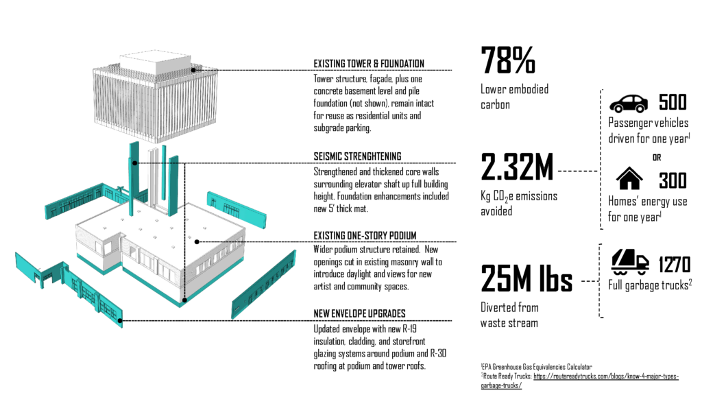
Among the conclusions of the due diligence phase were that the original exterior glass could remain, with recaulking; elevators, mechanical systems, and plumbing needed replacement. There were also surprises. Structural needs included a new mat foundation in the basement with a strengthened core and shear walls from the foundation upward, to tie in floors with the roof diaphragm. Based on a $17.8m hard cost, the largest cost categories were structural reinforcement, mechanical, electrical, and plumbing. Unit build-out costs were comparable to a new build. Bohn notes that structural conditions require careful investigation on all projects, as they can be significant.
Public Incentives & Sustainable Benefits
Two important public programs helped enable the project to pencil out. One was Santa Ana’s Adaptive Reuse Ordinance (ARO), a policy modelled on the City of Los Angeles’ ARO. Another was financing through the State of California’s Affordable Housing & Sustainable Communities Program (AHSC). The City was supportive of the project and recognized its environmental benefits. Bohn notes, “Everyone understood that tearing down the building and putting all the materials in a landfill was not the right sustainable solution.” The project met a LEED-equivalent standard (although it was not formally registered). Studio 111’s studies indicate the construction utilized 78% less embodied carbon compared to a new project, and prevented twenty-five million pounds of waste from entering landfills.
Firm: Gensler
Market Rate – Philadelphia’s Franklin Tower
200 N. 16th St., Philadelphia, Pennsylvania
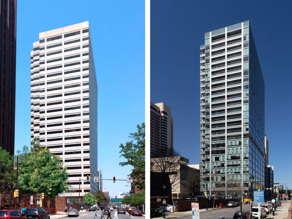
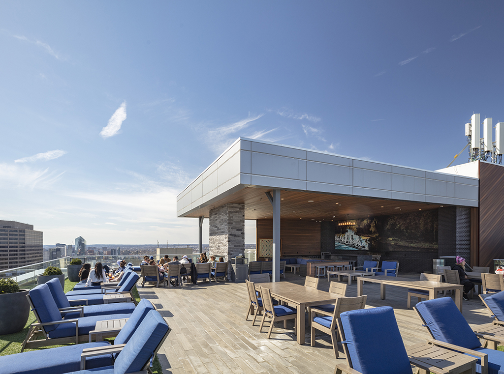
Logan Square in Center City Philadelphia is the site of a 582,500 sf tower that was the headquarters of GlaxoSmithKline until early 2013. Built in 1980, the conventional precast-clad, twenty-four story steel frame building stood vacant from early 2013 until purchase by PMC Property Group for $43m in mid-2015. By that time, the class B/C urban tower was no longer competitive as office space. The project’s conversion to housing included outfitting it with market rate units, recladding the exterior, fitting out 13,000 sf of ground-floor retail space, and building a 7,000 square foot rooftop pavilion. The upgrade offers a total of more than 50,000 sf of resident amenity spaces. The $140 million project proceeded rapidly, requiring three years to complete, from 2016 to 2019.
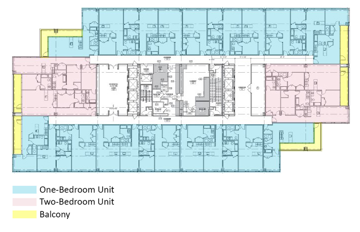
Robert Fuller, AIA, Principal at Gensler, notes that the Franklin Tower conversion took place before creation of the firm’s building calculator. A retroactive test showed it to be a desirable choice, although not perfect. “That’s because of some of the dark core areas and the window depths on the ends.” The project’s 240’ x 118’ floorplate with a 30’ lateral column grid dimension offered both advantages and challenges. The long side of the building offered a reasonable 40’ dimension from window wall to core, allowing 33’ deep units after incorporating a 6’ corridor and walls. The short side of the building was more challenging, with a 60’ dimension from window wall to core. There, the design team utilized a variety of strategies to fill in vacated core spaces (abandoned elevators, restrooms, fan rooms), such as locating larger two-bedroom units and amenity spaces there. The team also created new balconies for some end units, reducing unit depths while adding a desirable feature.
Profile & Character
The design provides 549 rental apartments, heavily weighted toward a market preference for one-bedroom units. It includes 455 one-bedroom, 90 two-bedroom, 2 three-bedroom, and 2 studio units. An existing 12’ floor-to-floor dimension enabled reasonable unit ceiling heights of 9’-4” at living rooms and 8’-4” at kitchens. The tower was reskinned with full height glass, increasing light to units, and replacing the original precast façade. The transfer of square footage vacated by new balconies enabled construction of a new rooftop pavilion (on space originally used for rooftop mechanical and a heliport).
Challenges posed by the core’s deep ends led to design solutions that enlivened the building. One of the solutions was to create a vertical spine of amenities using space within the core. “It was a unique way to distribute [amenities] throughout the project in underutilized space.” Fuller adds, “Financially, it was a bonus.” The vertical stacking of amenities allowed the team to abandon the original idea of locating all amenities on a single dedicated floor; instead, the floor was turned into 21 additional units.
Early Engagement with Experienced Contractors & Client
An important part of the project’s success was the value the client, PMC, brought to the effort. That included an in-house construction group with early participation by contractors and subcontractors. Fuller notes, “It was a bit of a design-build process. While it was not an ‘official’ design-build, there were contractors on their team sitting with us during design, early on. Compared to traditional design-bid-build, it was an advantage for us,” allowing rapid evaluation and problem-solving with the contractors and the client.
The architect did not have visibility to all the costs, but the strong due diligence effort limited surprises. Fuller notes, “This building was pretty robust, so we didn’t have to do a lot of structural reinforcement,” which can be costly. The largest surprise was the need for a retrofitted slab edge at the window wall. Costs for replacement of mechanical, electrical, and plumbing systems were consistent with a new build. The project benefitted from reuse of the existing subterranean parking garage with no modifications. Philadelphia did not have an ARO program.
Firm: Solomon Cordwell Buenz
Luxury – Chicago Tribune Tower
435 N. Michigan Avenue, Chicago, Illinois
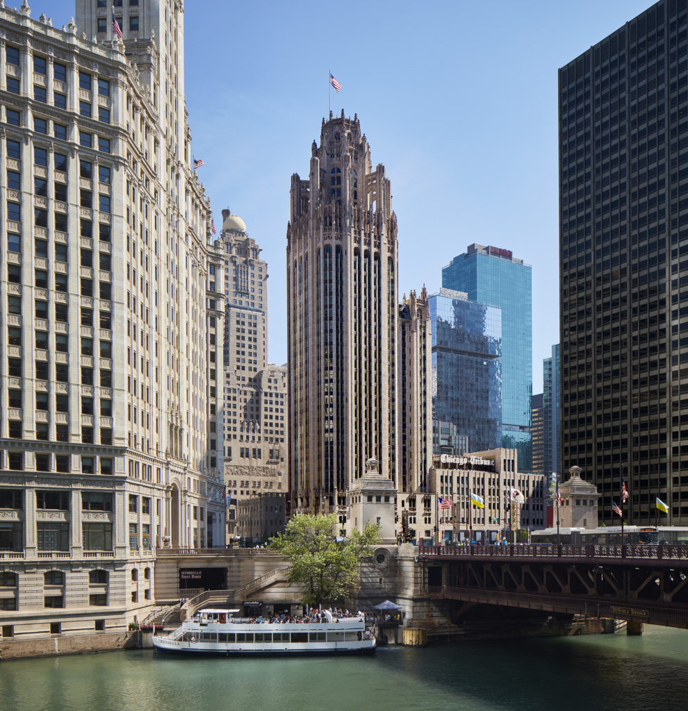
Downtown Chicago contains one of the most prized collections of early skyscrapers. In that grand history, the Chicago Tribune Tower is an iconic, 462’ tall, thirty-four story, 950,000 sf structure located along Chicago’s Magnificent Mile. The Tower’s design, the winning entry by Raymond Hood and John Mead Howells in the legendary 1922 Chicago Tribune Tower competition, is a landmark building. Occupied by the Tribune from 1925 to 2016, the building’s poor condition, the newspaper’s changing needs, and underutilization resulted in its sale (along with a valuable adjacent site) for $240m. Solomon Cordwell Buenz (SCB) was hired by clients CIM Group/Golub & Company to convert it to luxury condominiums, beginning with concept studies in 2015 and completed in 2021.
SCB’s Steven Hubbard, AIA, the project’s lead designer, notes that one of the project’s larger challenges was the variety of floorplate sizes. This variety was the result of incremental development, with four distinct buildings constructed over time: the Tower and Printing Plant Buildings (1925), Radio Building (1935), and Television Building (1950). “The floorplates ranged from 60,000 sf at the lower levels, to as small as 1800 sf at the top, behind the buttresses. Those big floorplates were just never going to work.” In the accompanying diagram, one can see how SCB addressed the problem by demolishing a center portion of the building mass lodged between the Printing Plant Building and the Radio/Television Buildings, creating a new courtyard. This adjustment provides light and air to units in each building.
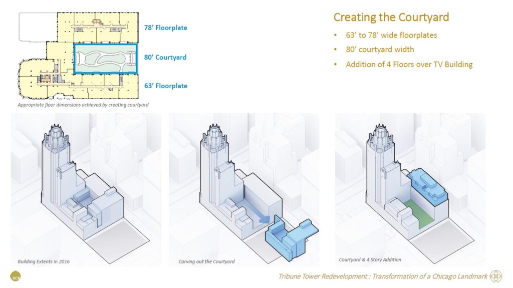
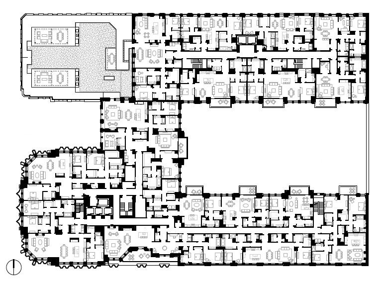
The modified floorplates work well for units. The Printing Plant building floorplate is 63’ wide, with 28’ to 30’ deep units on either side of a common corridor; the Radio and Television Building floorplate is 78’ wide, with units 33’ to 39’ deep. Column grids vary by plan area, typically ranging from 17’ to 23’. To address variations in the different floorplates and levels, SCB designed over 50 unique units. The 1925 Tower’s 100’ wide floorplate allowed units approximately 34’ to 35’ deep in one direction. In the other direction, 46’ deep floorplates were mitigated by locating larger units there, along with inboard bathrooms.
Profile & Character
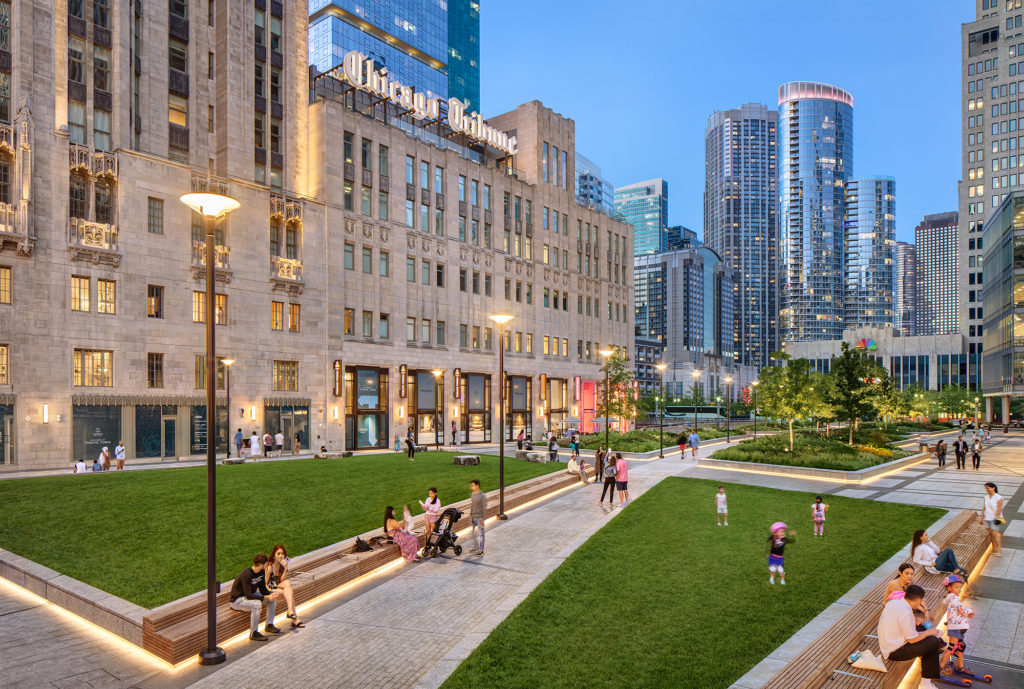
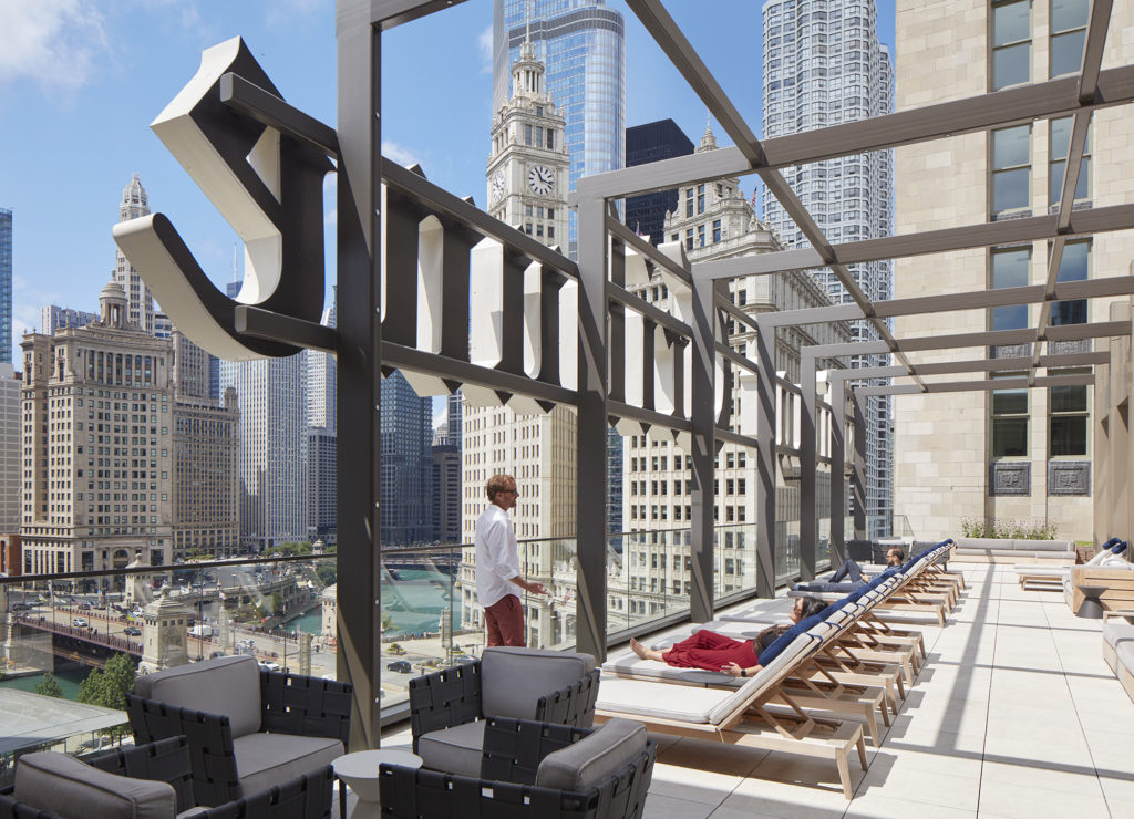
The project includes units of one to four bedrooms and 1100 to 4400 sf, with appealing ceiling heights of at least 10’. Where the courtyard demolition occurred, a transfer of existing square footage enabled construction of a new, four-floor structure built atop the existing Television Building. The project also includes 50,000 sf of first-floor retail, renewal of magical exterior and interior public spaces, reuse of a spectacular wrap-around terrace at the building’s crown, and a total of 55,000 sf of amenities.
Chris Pemberton reflects on the project’s uniqueness. “The fabric of the building – there is nothing like it. There were a number of unique ways to arrange residential apartments that you would never do if you were starting from scratch. With 162 units overall, there were so many different unit types to take advantage of the views, the shapes, and forms of the building.” Steven Hubbard adds, “Another thing that stands out is the historic legacy of the building. That includes not only its prominence in the architectural history of Chicago, but its urban context at the gateway of North Michigan Avenue and the Chicago River.”
Due Diligence & Scope
The due diligence phase revealed a variety of needs. Fortunately, the beautiful exterior stone was in good condition and only required cleaning, although all glass needed replacement. Updates to the core were also a priority; with reduced elevator loads, nine original cabs were removed and replaced with 3 new passenger cabs and 1 service cab. A new hoistway provided a fireman’s cab. There was also a need to relocate north and south exit stairs into the reconfigured core. The team designed a new lobby at the Illinois Street entrance.
There were unexpected structural challenges. The removal of the building mass at the courtyard required substantial lateral reinforcement at each column and beam connection from the ninth floor to the lowest floor of the basement. The basement, former home to the Tribune’s printing presses, required structural modifications to accommodate parking for 252 cars. Costs are confidential, but early in the project the developer indicated a $150m target (although the developer borrowed $328m at that time, which may have included funds for the adjacent site). Hubbard estimates cost allocations of 40% for exterior wall remediation and unit buildout, 30% for structural, mechanical, electrical, and plumbing, and less than 10% for exterior glass. There was no tax incentive program or ARO at the time of the project, although a new City program called LaSalle Street Reimagined is underway.
In retrospect, what are the collective lessons of these projects?
Lesson 1: Adaptive Reuse Offers Inherent Sustainability Benefits
Each project retained the existing building frame, saving significant resources and minimizing landfill use. For the Tribune Tower, cleaning and retaining the exterior stone preserved valuable historical character, without replacing it. The Santa Ana project retained the frame, cladding and windows, with other notable sustainable benefits. The Franklin Tower project reused the existing steel frame and required little structural reinforcement, although it included full recladding. Considering the scale of all these buildings, reuse offered substantial environmental benefits in each case.
Lesson 2: Conversions Offer ‘Built-in’ Advantages
Not all buildings will work, but one key advantage is that standard floor-to-floor heights for offices are typically much taller than for residential uses; a conversion’s sense of interior space can be preferable to even a new residential project. Another advantage is the reduction of parking requirements, offering an opportunity to reuse existing space. For buildings that require little structural work, shorter schedules can be possible.
Lesson 3: A Strong Team, Experienced with Adaptive Reuse, is a Necessity
An adaptive reuse project often brings to light issues that require special expertise in restoration, remediation, and repair, in addition to the skill sets of most ‘ground-up’ design teams. Clients, contractors and design team members who are experienced with adaptive reuse and design-build are extraordinarily important in strategizing and interactive problem-solving with the architect.
Lesson 4: Early and Thorough Investigation Helps, but Plan for Surprises
“The more you can demolish at the start, the better,” Michael Bohn notes. There are inherently going to be surprises. “In the ideal world you open everything up right at the beginning. There is a cost to such efforts, but with an adaptive reuse you are just playing Russian roulette, because you never know what is behind those walls.” All firms emphasized the need for a larger-than-usual contingency to cover unexpected surprises, including potentially costly structural conditions.
Lesson 5: ‘Bonus Opportunities’ Can Be Available
Office buildings require larger cores than residential buildings, so clever repurposing of abandoned spaces can enhance a project’s return. Reuse of square footage from other demolished spaces can also add value. Among projects in this article, firms discovered several opportunities, such as constructing added units on a site’s vacated parking area (Santa Ana), locating amenities in otherwise unusable core spaces (Philadelphia), and adding new units to the roof of an existing building (Chicago).
Lesson 6: There Are Benefits for the Community
New construction can be the target of community opposition due to added traffic, construction noise, pollution, and other concerns, potentially causing delays and litigation. In public meetings on adaptive reuse projects, be prepared to remind the community that reuse of an existing structure adds limited new pressure to infrastructure, and there is less construction. Residential uses are less car- and traffic-intensive than offices. Consider advocating for a local Adaptive Reuse Ordinance if one does not exist; uncomplicated ARO’s are the most successful.
The takeaways from these projects are as interesting as they are varied. The most basic takeaway is that adaptive reuse of this type can happen in a variety of places – usually urban – and span affordable to luxury markets. Projects usually require at least fifty units to be financially feasible for developers, either as for-rent or for-sale units. Amenities can address unique audiences, serving communities as diverse as artists, urban workers, or luxury buyers. Only the affordable project benefitted from an adaptive reuse ordinance and government financing (one or both of which may be necessary to hit a low-cost target). But ARO’s can assist cities with high vacancy rates, helping return disused buildings to the tax rolls.
An important recurring theme is that significant vetting is needed to confirm a building is viable. Suitable buildings tend to fit a specific floorplate profile and be out of date compared to “A” level offerings. Such older buildings can allow acquisition at a reduced purchase price and accommodate renovation costs. Reuse is an inherently sustainable choice, because it limits demolition and expends fewer resources than a full rebuild. While adaptive reuses can be complex and have less predictable schedules than new-build projects, they often highlight firms’ creative and analytical expertise, ability to collaborate with contractors and owners, and other field capabilities that are among architects’ most valuable skillsets.
Housing & Adaptive Reuse: Resources
Below are sources that can be helpful for adaptive reuse and housing from think tanks, universities, and other interests. Some are reissued annually, while others are one-time studies.
Adaptive Reuse Challenges and Opportunities in California, David Garcia and Elliot Kwon, Terner Center for Housing Innovation, U.C. Berkeley, November 2021.
“As Cities Consider Turning Offices into Apartments, Calgary has some Advice”, Jon Gorey, Lincoln Institute of Land Policy, February 2023.
Can Adaptive Reuse of Commercial Real Estate Address the Housing Crisis in Los Angeles? Jason M. Ward and Daniel Schwam, Rand Corporation, April 2022.
Case Studies in Adaptive Reuse: The Affordable Solution, Robyn A. Friedman, Multifamily Housing News, February 2021.
Eyesore to Asset: Building Housing Affordability + Sustainable Communities, A Guidebook for Adaptive Use of Vacant Retail, Florida Housing Coalition.
National Office Report, Commercial Edge, Yardi Systems, February 2023. Yardi’s research includes monthly data on Office Vacancies and has tracked adaptive reuse housing.
New Uses for Office Buildings: Life Science, Medical and Multifamily Conversions, Emil Malizia, NAIOP Research Foundation, Commercial Real Estate Development Association, March 2022.
The State of the Nation’s Housing 2022, Joint Center for Housing Studies, Harvard University.
White Paper on Expanding Adaptive Reuse to Support Housing & Economic Recovery, Central City Association of Los Angeles, April 2021. Recommendations for Los Angeles on Adaptive Reuse.
Author David Thurman is an architect in Los Angeles and longtime contributor to arcCA DIGEST.
Cover image: Chicago Tribune Tower, night view. Credit: Dave Burk/Courtesy Solomon Cordwell Buenz.
From arcCA DIGEST Season 14, “Building Histories.”


