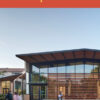
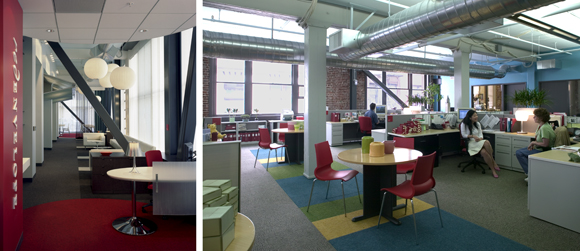
 Red Envelope, San Francisco, Hunstman Architectural Group. The Board Room doubles as a new product display area. The brand red was intentionally applied to make a powerful statement. Photography by David Wakely.
When he accepted the Pritzker Architecture Prize in 1984, Richard Meier said, “White is my favorite color.… White conventionally has always been seen as a symbol of perfection, of purity and clarity.” Meier’s preference is hardly an uncommon one among architects since the dawn of modernism, but it overlooks the powerful role that color can play in architecture.
Once, almost all buildings were constructed of materials that had inherent color, and the resulting palette—the terra cotta of bricks, the cream of limestone, the greens of the landscape, the blues of sky and water—was a natural part of the architect’s understanding. Today, designers have more options: they can leave materials in their natural state or apply paint or stain as a descriptive element to enrich structures with greater significance.
Color has the ability to trigger responses, memories, and reactions, both conscious and subconscious, and they differ from person to person. Individual subjective color preferences are based on memories. A positive experience in a blue room as a child can lead to a lifelong preference for blue. The idea of a perfect hue that always works, or of a formula of color relationships that is foolproof, is a fallacy. Perhaps this is why architects so often overlook color.
Nevertheless, despite the subjective aspects of color perception, skilled colorists around the world have developed sophisticated approaches to choosing the right hues. Some consider light the most influential factor; some cite geographic location, culture, or climate; some favor historic and archeological criteria; some work with styles and trends; and some rely on scientific studies.
Although any of these perspectives can yield a successful color solution on its own, the first person to rigorously synthesize a variety of approaches to color was Frank Mahnke, president of the International Association of Colour Consultants/Designers. In his 1996 book, Color, Environment and Human Response: The Beneficial Use of Color in the Architectural Environment, Mahnke defined an objective process for applying color in an individual environment. His approach includes six psychodynamic criteria: biological responses to color, the influence of fashion styles and trends, cultural and geographic considerations, associations and conscious symbolism, the collective unconscious (which stores our innate responses to color), and subjective personal color biases.
In addition to Mahnke’s work, color theorist Johannes Itten identified seven color contrasts critical to color application. He defined how to enhance edges where colors meet, how to apply colors to vault space, and how to create tonic and vigorous or serene and sublime color contrasts.
And science demonstrates how color can influence our senses of time, temperature, taste, smell, weight, and distance.
Each project is unique, and no project will have the same program and criteria for color selections. Yet the cross-disciplinary method offers great flexibility in a variety of situations.
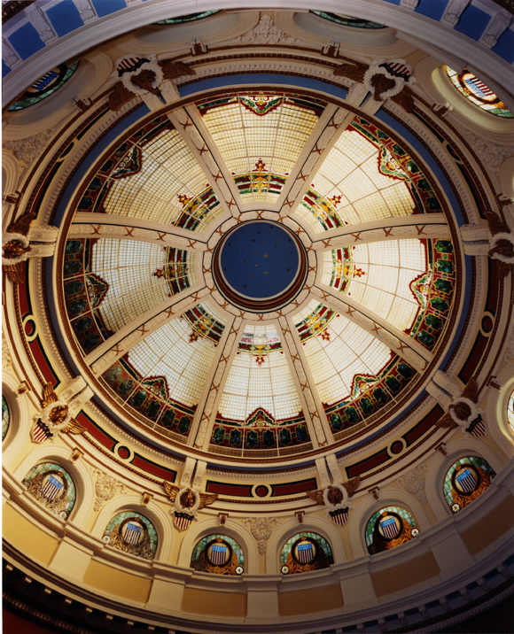 San Mateo County Courthouse All colors increase in chromatic intensity as they rise toward the sixty foot apex of the dome. Photography by Dennis Anderson.
Restoration and Theory
In historic restoration and rehabilitation projects, photographs of the original color scheme often exist and can be used to guide color selection. In some cases, however, little record of the original colors exists. After the 1904 stained glass dome of the San Mateo County Courthouse was meticulously removed for restoration, officials noted that the recently completed, seven-year restoration of the California State Capitol dome in Sacramento had applied a polychromatic color scheme. The county wanted a noteworthy landmark, as well, and investigated a similar approach.
The colors in the interiors had not been documented before the dome was removed, and the temporary, bright blue tarp installed three stories above the ground floor—to shield courthouse occupants from falling glass—tinted the light in the space, making it even more difficult to visualize appropriate color choices. The interior walls had been maintained using two cream colors for years. The city lacked a budget for forensic paint analysis.
A cross-disciplinary approach was the only course, drawing on research into historic pigments available to the West Coast market in the early 1900s and combining those findings with color science theory and a focus on visual ergonomics. In order to match a red found in the building’s stained glass, a primary red was used to visually mix with yellow light to create a red orange. To vault the dome, a highly chromatic blue was required to prevent it from mixing with the yellow light and turning green. The colors increase in brightness and intensity as they rise from the first floor up to the center of the 60-foot dome, a technique that fools the eye into thinking they are all of equal brilliance. The success of the project helped support the civic significance of the building, and the project received numerous restoration awards.
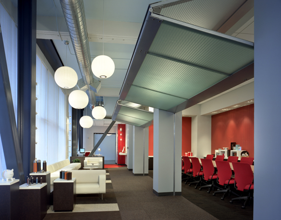
 Red Envelope, San Francisco, Huntsman Architectural Group. Photography by David Wakely.
Brand, Identity, and Color Response
Color is a powerful component of branding efforts for many companies—which can sometimes complicate matters when it comes to designing a corporate office. The key is to apply the brand color judiciously, so that it stands out without dominating a space and supports the needs of workers and visitors. When San Francisco gift company Red Envelope decided to expand in order to house its growing staff, it was clear that red would have to be an integral part of the architectural program. Red carries positive associations: it is primal, powerful, and dynamic. Yet it can also suggest blood, rage, fire, and death.
The initial color design used red everywhere, buffered by bright white. Environmental studies and research have shown, however, that one unrelieved color will become boring and monotonous, whether it is red, beige, or white. Furthermore, designing environments for multiple users who perform different tasks requires a balanced palette. Members of the creative team need different stimuli in their space than the CEO and CFO do, and those in the customer service center in particular need to remain calm and relaxed. No single hue could work for everyone. The color palette ultimately consisted of a well-balanced palette of hot and cool hues tailored to meet basic human needs.
 Monterey Bay Aquarium, EHDD Architecture. Royal blue on the large entry wall is visible from a distance, signaling the entrance to the Museum. To encourage visitors to explore the shop, red wraps the exterior of the focal walls. Photography © Peter Aaron/Esto.
Wayfinding and Focusing Attention
Color can also play an important role in helping people orient themselves in a space. As part of a renovation and expansion project, Monterey Bay Aquarium sought color consultation on the new entry and ticketing lobby. The scope expanded to include the graphics, display, and retail components adjacent to the renovation. The goal was to link disparate elements of the museum experience with a comprehensive color plan.
To enter the aquarium, visitors waited in lines stretching down the block. The dominant visual fields were white stucco walls. The application of color accentuated the entry point.
A new exhibit of Monterey Bay history consisting of photographs and canning machinery was being added. Large brick ovens sat between the entry point and the new history display wall. A highly chromatic yellow green was selected to complement the color of the brick ovens and call attention to the exhibit walls.
To create a sense of identity and welcoming, blue was chosen for its power to suggest reliability and stability. Visual cues such as differences in hue and color values attract attention to a formerly unused area of museum converted into a display zone. Around the corner, a red wall dramatically wraps around the façade and into the gift store in order to encourage visitors to explore the retail shop.
Recasting Healthcare as Hospitality
When skillfully crafted, color can suggest mood and create ambiance. Palomar Pomerado Health in Poway, California, asked Anshen+Allen to design an outpatient facility that felt spa-like rather than institutional. The facility offers exams, consultations, and lab work services to adult women. The color palette was developed to mimic the regional Southern California landscape, using bright colors judiciously. The team presented the color ideas objectively, describing how color psychology had guided the selection of a palette of sage, coral, light blue, and neutrals, which, combined with natural materials, would meet the overall project goals and create a relaxing atmosphere.
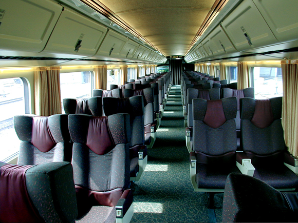 Via Rail, Montreal, Atmosphere Design. Using cross-disciplinary analysis, a palette of color was selected to enhance rider experience. Photography by Gaetan Tanguay.
Enhancing the Transportation Experience
Color can also help make environments such as public transit feel more comfortable and peaceful. As part of a project to renovate 423 subway cars for the Montreal Transportation Society, architect Bernard Pepin of Atmosphere Design in Montreal, Canada, delivered a 71-page report on color and experience. He considered factors such as perceptions of security, cleanliness, reduction of aggressive behaviors, vandalism, graffiti, motion sickness, noise, lighting, and heat. His goal was to apply color in ways that would stimulate a positive mood and compensate for poor environmental conditions.
The chief engineer for the subway project has stated that, since Pepin completed the first-class train for VIA RAIL on the Montreal-Toronto line, vandalism and graffiti have been reduced 40% and ridership has increased significantly.
In all of these cases, objective principles, drawing on art and science, informed the application of color. Not every environment needs to be polychromatic or dramatically colored. Yet color is far more than just a decorating tool. Used well, it can be an integral part of architecture, bringing life to large spaces, supporting the needs of workers, and helping people navigate complex environments.
Author Jill Pilaroscia, founder of Colour Studio, consults for diverse global companies and is a fully accredited member of the International Association of Color Consultants. She continues to research the psychological, biological, and visual ergonomic factors of color. Her thesis, Color in the Manufacturing Environment, analyzed the impact of color in both carpet and furniture manufacturing facilities.
Originally published 4th quarter 2008, in arcCA 08.4, “Interiors + Architecture.”