I am a skeptic of novel shapes in buildings. It seems to me—and I’m not the first person to have observed this—that novel form might best be reserved for novel content. And genuinely novel content, as far as living in buildings goes, arises infrequently.
I would feel more confident saying so, however, if it were easier to point to an alternative. If there were a tried and true way of making buildings, I would happily subscribe to it. Then I could entertain arguments for whatever novelties might appear. The catch is that the relationship between the novel and the non-novel, the new and the not new, isn’t so stable. The sad, mortal fact of the matter is that the not new is just the new, later.
Later and more widespread, since a new form has two possible futures: to be forgotten or to proliferate. As for “tried and true,“ the surest thing I can say is that much has been tried, but little is “true.” Otherwise, change would be slower—and harder.
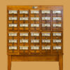
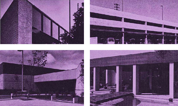
I have been looking back over the history of the AIACC Design Awards, which are in their twentieth year. The most intriguing document I’ve seen is actually from the pre-history of the AIACC program. It is a record of the Pasadena and Foothills Chapter’s 1980 Triennial Honor Awards Program. Of the eleven winners (out of forty-five entries), eight are striking for the similarity of their appearance. These eight—a low-rise office building, a twelve-story tower, two manufacturing headquarters, a recreational center, a bus maintenance facility, and two single-family houses—are all composed of simple, blocky shapes, with broad, unrelieved, horizontal spandrels or fascias and equally broad, unrelieved bands of near-mullionless glazing. Four of them are shown above.
The three other winners are anomalies: a Bay Area shingle style house, orphaned in Pasadena; a Japanese-themed shopping center; and an astronomical observatory. Each of these three tells us something about how the client or architect thought such a thing should look.
Paradoxically, the majority of the winners, not despite of but because of their similarity, tells us less about how the clients and architects thought buildings should look—or even if they really stopped to think about it at all—just as this is not the year to identify the real baseball fans in California. Popular success masks purpose.
It must make things tricky for a design awards jury, that the validation of popular sentiment, far from identifying conviction, favors its opposite: an easy opportunism. Among today’s elongated polyhedra and fetishized details, a jury may be able to tell who’s doing them well. What they can’t tell is who believes in what they’re doing.
Does it matter? It does, if the purpose of design awards is not only to recognize what has been done well, but also to air arguments for what is worth doing. Such arguments are, of course, difficult and contested, whether they have to do with sustainability (see Hal Levin’s article in this issue) or social justice or appearance.
Appearance may be the toughest. Even the most compelling arguments about the appearance of buildings get caught up in the fate of their popular exemplars. So, for example, Robert Venturi, Denise Scott Brown, and Steven Izenour’s arguments in Learning from Las Vegas have gone the way of the “postmodern” building fashion with which they are (to my mind, too closely) associated. Yet those arguments could be fruitfully applied today. I’ll give an example.
The authors of Learning from Las Vegas argued that the abolition of ornament had left architects with an unsatisfied yearning for visual interest. As a result, instead of making simple buildings and then ornamenting them, architects designed highly (and unjustifiably) contorted buildings. Paul Rudolph was their smoking gun.
Today’s irregular polyhedra could profitably be discussed on the same terms, as could the contemporary fascination with materials that prompts the companion theme for this issue. Some such continuity of argument (discussion, “discourse,” theory…) might make up for the wild discontinuity in visual styles; might, even, moderate it.
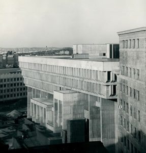 Boston City Hall, Boston Redevelopment Authority photographs, Collection # 4010.001, City of Boston Archives, Boston. CC-BY-2.0.
Learning from Las Vegas also gives us its own example of the proliferation of a novel building form: Kallman, McKinnell and Knowles’s Boston City Hall, which spawned diminished progeny from coast to coast.
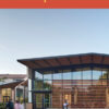
Interestingly, one of its offspring appears among this year’s Design Awards, as the “abandoned 1960s 3-story office building” that has been converted by Jeffrey M. Kalban & Associates into the headquarters for People Assisting the Homeless (P.A.T.H.).
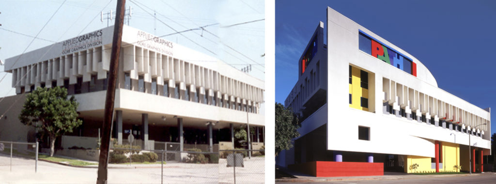 People Assisting the Homeless (P.A.T.H.), Los Angeles, by Jeffrey M. Kalban & Associates Architecture, Inc. The building before and after renovation.
Perhaps because it is, out of necessity, a problematic building for its time, the P.A.T.H. headquarters is, to me, the most intriguing of this year’s winners. Its attitude toward adaptive reuse is unpopularly synthetic: we’re not meant to tell easily what is old and what is new. It combines the earlier formal vocabulary of Le Corbusier’s Villa Savoye with the later language of La Tourette (of which Boston City Hall was itself the offspring). And it sports pop art signage. In short, it thoroughly confounds the question of the timeliness of form.
Amidst the churning of fashion, in which the new so quickly passes into the “oh, whatever” and timelessness seems entirely beyond us, untimeliness may be the most responsible way to be.
Originally published 4th quarter 2002, in arcCA 02.4, “New Material.”