When Julius Shulman visited his friend Gregory Ain one day in 1937, he unexpectedly witnessed a scene that would forever shape his understanding of the practice of architecture. Ain and his partner George Agron were designing a small house, and Shulman found them debating the placement of a wall between two rooms. “They had tracing paper over the board,” the photographer recalled. “They were going back and forth on that one line.” Even half a century later, Shulman remained astonished at the level of intellectual rigor applied to a seemingly mundane problem: “I have never forgotten that line. Here are two mature men—young men of course, but they were mature— … They were working on one line!”1
Of course, all architects give careful consideration to the placement of lines on a floor plan, but a review of Gregory Ain’s architectural drawings shows that his working method was especially meticulous.2 Clients were amazed at the number of alternatives he had studied; a colleague said he “suffered” over his plans at the expense of his private life.3 Ain developed this method simply because there was so much at stake. Throughout his career, he sought to construct bold new social relationships, and yet he also wanted to minimize his structures in order to save construction costs. The difference between 960 and 1,020 square feet might mean the difference between a built and an unbuilt project. At the drafting table, every quarter-inch counted.
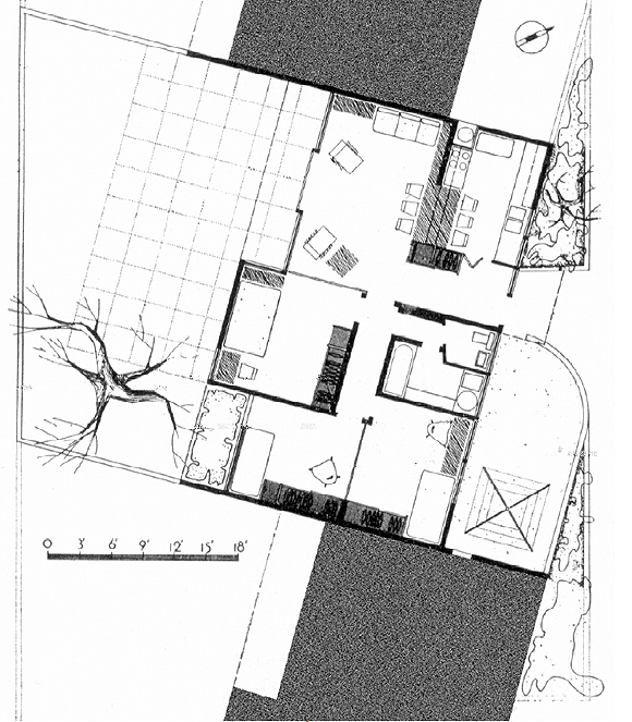
One of his most difficult projects, which clearly shows how his “suffering” carried significant social and architectural meaning, was Avenel Homes (Los Angeles, 1946). This ten-unit complex of attached row houses was the most progressive project of his career, as it challenged practically every convention of postwar housing: its social organization, economic administration, and physical form. But during the design process some of Ain’s avant-garde ideas were rejected by local officials from the Federal Housing Administration (FHA). In the initial plan, Ain designed a kitchen which was almost completely open to the living room, a pioneering attempt to enliven the work of the housewife by connecting it to the social life of the house. When the FHA demanded a closed kitchen, this important relationship was destroyed. In addition, the original design also used the dining table to bridge between the kitchen and living room, which was an eminently reasonable strategy for saving space in the 908- square-foot units. When this feature was eliminated, residents were forced to accommodate a freestanding dining room set in the compact living room. Many families responded by expanding the living room four feet, eliminating the south overhang that Ain had considered essential to the plan.

FHA officials also objected to Ain’s original plan for a “double bathroom,” which located the toilet and sink in one compartment, with the bathtub and laundry in a separate adjacent room. This plan would have accommodated simultaneous activities while maintaining privacy, an eminently logical and convenient feature. Again, Ain creatively interrogated the basic relationships between typical functions and their architectural planning. And, again, he was defeated. The bathroom, as built, was a common square room containing the toilet, sink, and bathtub. Summarizing the conservative institutional logic that Ain battled, Alfred Steinberg argued: “FHA opposes the novel and untried because it represents risk.”4
But when he made presentation drawings for publication, Ain used the “original” floor plan, which included the open kitchen, built-in dining table, and double bathroom, even though these innovations were not built. This post-construction idealization of the project was consistent with Ain’s earlier habits and his general belief that architectural publications should convey ideas rather than mundane realities. In the 1990s, at least three new Avenel residents rebuilt the kitchen according to Ain’s original plan, a sympathetic “restoration” effort that raised quite interesting critical questions about the meaning of the “original.”
Ain hired Julius Shulman to photograph the Avenel project, and Shulman might have been expected to have a heightened sensitivity to Ain’s work, given his 1937 epiphany as well as his belief that the purpose of architectural photography was to recover and communicate the design’s “true” intentions.5 Still, Ain found that Shulman’s images could not properly convey the progressive aspects of the project that he wanted to promote—the social relationships— in part because Shulman could not photograph what had not been built. Indeed, photographs of his projects frequently disappointed Ain; he worked with seventeen different photographers between 1936 and 1952, as if he were constantly, fruitlessly, searching for the artist who could correctly portray the underlying architectural ideas. At the end of his career, Ain told David Gebhard with a certain modest pleasure: “You know, I have many houses that have never been photographed at all.”6
Ain’s approach to architectural drawings was always calibrated against his curious and complex set of attitudes towards architectural photography. When he was asked to reflect on his achievements late in his life, Ain spontaneously launched into an extensive critique of photography and architectural publishing. He had become so dismayed at magazines’ habit of favoring photographs over plans that he audaciously proposed a moratorium on the use of photographs in all architectural publications. It was a serious suggestion; He apparently developed the idea while he was a prominent educator in the 1960s, and he repeated it twice in separate interviews in the late 1970s. He believed that the important architectural ideas—social relationships—were found in the floor plan. And he genuinely failed to understand why magazines represented his work primarily through photographs rather than drawings.
He admitted his own work had contained “far less ‘eye-appeal’ than contemporary work which may have had a different motivation.” And he insisted: “public relations was never a factor in my practice … the camera has never been part of my problem.”7 Ain’s anxieties about photography, then, shaped an ideology about how his project would be produced, disseminated, and ultimately received.
Ain was an excellent draftsman and he could draw immaculate aerial perspectives due to his mathematical mind and his training under Richard Neutra. But it is abundantly clear that Ain’s illustrations were not intended as objets d’art; they were only produced, when needed, to convey the project to his client so that it might be built. In fact, a number of Ain’s projects did not have pictorial drawings at all. Most significantly, Ain did not follow Rudolph Schindler’s practice of making stylized illustrations for exhibition, nor Neutra’s habit of using color for atmospheric effects. Ain’s ascetic, hard-line drawings were utterly “rational” and documentary, although he did sometimes prefer to show the building in an “ideal” state. A preponderance of his perspective drawings were only completed on trace paper, a material unsuitable for exhibition or for posterity.
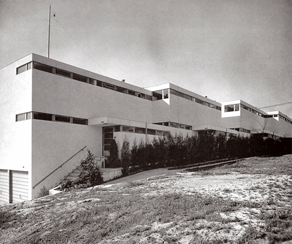
Ain was especially disappointed that one image, in particular, often represented his entire career: an exterior view of Dunsmuir Flats (Los Angeles, 1937, at beginning of article). This photograph, by Julius Shulman, showed the four-unit apartment building as a lean, streamlined “machine-in-the-garden,” the articulated structure appearing to cut through the landscape like a freight train. Because the image emphasized architecture-as-volume and the building’s repetitive form, it appeared to be a perfect illustration of the International Style. More than any other, this image garnered national recognition for Ain. It was published widely in period magazines, and it was displayed at the Museum of Modern Art.8
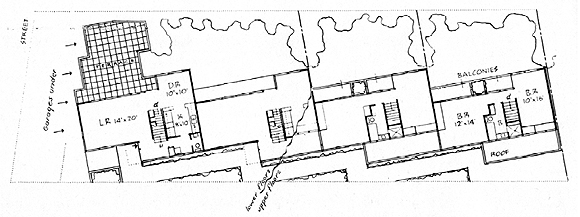
In a late interview, Ain claimed that he resented over-publication of the iconic Dunsmuir Flats photograph because the elevations were “simple extrusions of the plan.” This statement was patently insincere, since he went to so much effort to craft the solid-void relationships between the slab overhangs and the strip windows, for example, but in essence it was an effort to distance himself from Shulman’s image and deny authorship of it. Ain insisted: “I never liked the way they looked, though the plan was really extraordinary.”9 Indeed, the plan inventively solved several problems, and on this basis Ain considered Dunsmuir Flats his most successful project.

Yet, when Ain referred to “the plan,” he meant an idealized redrawing of the plan; as at Avenel Homes, here he also elided the fact that the building was not built as he wished.
Early perspectives and plans show that Ain intended that each unit would have a geometric integrity of its own and then participate in an idealized system where each would be staggered in plan and section at identical intervals. The building as constructed, however, compromised the purity of this system in several ways. First, the two rear units were built at the same floor level and therefore did not “interlock” at the roofline. Second, the four units were not, in fact, all attached. Ain was forced to “break” the building into two pieces with a three-foot clearance in between the second and third units. In reality, as a close reading of Shulman’s photograph demonstrates, Dunsmuir Flats was not the perfectly platonic mathematical game that Ain sought to portray. When he made presentation drawings of Dunsmuir Flats for publication, Ain “restored” the building to its ideal state.
If Ain’s habit of redrawing and idealizing his buildings indicated his suffering—and his perfectionism—it also placed him within a strong tradition among architects, including Frank Lloyd Wright and Andrea Palladio. These architects, too, used the mutability of drawing as a medium to elide issues of contingency that were considered irrelevant to the architectural ideas. What made Ain’s case significant and instructive was his insistence on using drawings as a means to compensate for the limitations of photography.
1. Julius Shulman, interviewed by Taina Rikala De Noreiga, Los Angeles, California, January 12 & 20, February 3, 1990, Archives of American Art, Smithsonian Institution, Tape 4, side B.
2. Ain’s drawings are archived at the Architecture & Design Collection (ADC), University Art Museum, University of California, Santa Barbara.
3. James Garrott, quoted by Esther McCoy, The Second Generation (Salt Lake City: Peregrine Smith Books, 1984), p. 134.
4. Alfred Steinberg, “FHA-Profits Before Housing,” The Nation 168 (January 1, 1949), pp. 11-13.
5. Julius Shulman, Photographing Architecture and Interiors (New York: Whitney, 1962), p. 2.
6. Ain, interviewed by David Gebhard and Harriette Von Breton, June 19, 1973. Transcribed notes, David Gebhard papers, (ADC), p. 2.
7. Ain, interviewed by Thomas S. Hines, April 25, 1977. Tape recording courtesy of Thomas S. Hines.
8. Elizabeth Mock, ed., Built in U.S.A., 1932-1944 (New York: Museum of Modern Art), 1945.
9. Ain, interviewed by Gebhard and Von Breton, op. cit.
Author Anthony Denzer is Assistant Professor of Architectural Engineering at the University of Wyoming. This article was drawn from his doctoral dissertation, “Gregory Ain and the Social Politics of Housing Design” (UCLA, 2005). He also received an M.Arch. from the University of Kansas.
Originally published 3rd quarter 2005 in arcCA 05.3, “Drawn Out.”


