By all accounts, Los Angeles architect John Lautner was a poor draftsman. Architect Wes Peters, Lautner’s friend and fellow apprentice with Frank Lloyd Wright at Taliesin, even called him “the most terrible draftsman I ever saw in my life.” Lautner admitted as much: “I took drafting when I was in high school and I couldn’t keep the pencil sharp. I couldn’t make a neat drawing and I knew the typical school, all they do is grade on neat and then to hell with the ideas, and Mr. Wright had ideas so I went for that.” This distinction between neat drawings and substantive ideas is more than the defensive response of a messy student—it reflects a common distaste among Modern architects for what was widely considered to be the superficial pictorialism of the Beaux-Arts tradition. At Taliesin, Lautner purposely used his poor drafting ability to deflect the rendering tasks that apprentices were typically assigned during their tenure with Wright. By consciously focusing on ideas instead of on line weights, Lautner hoped to avoid the lures of mimesis and “paper architecture.”
Instead of drafting, he preferred the physical tasks of building. His experience with masonry and pipefitting at Taliesin, coupled with his supervisory work for a building contractor during World War II, gave Lautner a direct feel for construction systems and materials. This knowledge helped him to achieve many ingenious structural solutions throughout his career. In fact, his penchant for structural efficiency and bold concrete forms have led some to align Lautner’s architecture with the work of structural expressionists such as Oscar Niemeyer, Eero Saarinen, and Kenzo Tange. These were, after all, the contemporary architects he most admired.
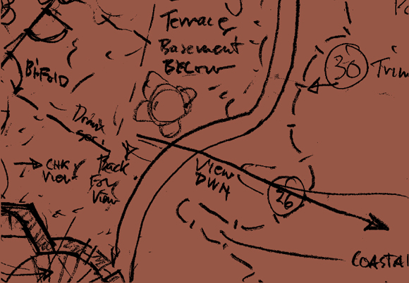
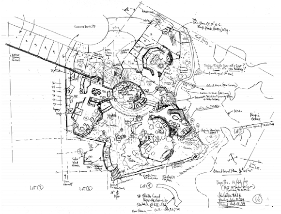
A closer look at one of Lautner’s seemingly crude drawings, however, reveals a greater concern for program than for construction. His schematic plan for the Beyer House is essentially a programmatic diagram of room functions, furniture arrangements, material notations, site conditions, and viewing angles. Seen as a presentation drawing, it is certainly unpolished, even child-like. But as a working diagram it is actually extremely sophisticated. It contains an enormous amount of information. No mark is superfluous. Every line means something. Of course, many architects of Lautner’s generation employed similar “bubble” diagrams, but few ever managed this level of complexity. And most surrendered what began as curvilinear forms to the rectilinear rationale of the grid during design development. As Lautner fleshed out his designs, however, they often kept their curvaceous character.

Lautner often began projects by taking a topographic map to the building site and indicating desirable viewpoints and orientations directly on the map. Then, practicing the creative gestation he learned from Wright, he would return to his office and spend days trying to visualize the project. As Lautner explained, “It’s thinking right from scratch and having a major idea, from inside. I’ve never designed a façade in my life.” Although many other architects have made similarly staunch “form follows function” assertions about their inside-out design processes, Lautner’s claim was largely justified. He rarely designed in elevation, diagramming projects instead in plan and section. After meeting with the client to verify program, he would then hand these seemingly rough diagrams to his staff to produce construction drawings under his supervision. His drafters were often surprised at the level of detail and accurate scale in diagrams that initially looked child-like.
Of course, this design process sounds similar to those of other star architects. Frank Gehry, for example, is known to generate napkin sketches of general building profiles from which his staff extrapolates built form under his guidance. Still, although Lautner’s forms are often as sculpturally plastic as Gehry’s recent buildings, they resulted from an extremely different impulse. Gehry’s surfaces undulate mainly for effect from the exterior, while Lautner’s forms curve primarily to accommodate views from the interior. Reflecting what Erwin Panofsky labeled the “spheroidal” shape of human vision, Lautner’s bulbous spaces diagram the alliance of site and sight. As Lautner explained, “Usually in the hills you have a panoramic view that people are interested in right away, and so most of my things are curved.” Even his innovative spanning systems—trusses, waffle slabs, and concrete shells—were employed largely to keep the views from his buildings as free of visible obstructions as possible. By using these long-span devices to eliminate intermittent walls and columns, Lautner opened the viewing “apertures” of his wideangle spaces. If Gehry’s buildings pose for cameras, Lautner’s houses operate as cameras.
Even during his early days with Wright, Lautner’s architectural attention was clearly focused on constructing views. In a 1937 “At Taliesin” newspaper article, he compared the behavior of Wright’s Roberts House at Deertrack, Michigan to that of a human eye: “The house itself is literally looking toward the lake because the living room roof and ceiling pitches up like one’s eyelash under a visor to the sky, leaving nothing but glass between you and the view.” During his later career, Lautner continued to note “eyelids” and “eyelashes” in his schematic designs. These often found architectural expression in moveable shades and deep roof overhangs that simultaneously shield the sun and frame distant views. Sightline notations and optical specifications such as “CHK view ON SITE!” also occur frequently throughout these drawings. These notes and arrows might seem crude, but they actually require more from the architect than is typically expected—more time on site (and sight), and less at the drafting table.
On one hand, because Lautner never became a very good draftsman, his reliance on graphic representation techniques was minimal. He was no captive of the two-dimensional surface, and neither are his buildings. On the other hand, neither was Lautner the child-like primitive that many assume. His curving, free-flowing forms were rarely the result of purely intuitive gestures. Although his schematic drawings often look like basic bubble diagrams, they are more than formally vague placeholders for future program; they are actually sophisticated design drawings that contain incredible detail and indicate precise layouts of space and vision. They are diagrams that surely asked and answered more questions than highly polished presentation drawings would have.
Drawings, for Lautner, were necessary devices for achieving the final building, but they were simply not valued as finished artifacts. This attitude hampered Lautner’s public recognition in the 1970s, when a major East Coast publisher wanted to issue a monograph on his work. The attempt was stymied when Lautner refused to “clean up” his drawings for publication. In order to be published, they would have had to become more like the presentation renderings he despised. “They just don’t get it” was his continued refrain. Drawing and construction were both transparent activities for Lautner—merely means to an end. He could readily see beyond both activities to imagine their implications. Graphic techniques and construction technologies were essentially lenses through which he visualized his projects. Like Lautner’s camera houses, his drawings are less for looking at than they are for looking through. They are operative diagrams of ocular desire.
Author Jon Yoder is completing a doctorate in Critical Studies in Architectural Culture at UCLA. His dissertation takes the ocular-centric projects of John Lautner as lenses through which to focus on issues of experiential and projective vision. Drawing on visual media theory and existential phenomenology, it is the first sustained study of embodied visuality in architecture. He has also worked as an architectural designer with Pei Cobb Freed & Partners, The ZGF Partnership, and SPF:Architects.
The author would like to thank Frank Escher and Brian Hart of the John Lautner Archive for their valuable assistance. See also The John Lautner Foundation website: www.johnlautner.org.
Originally published 3rd quarter 2005 in arcCA 05.3, “Drawn Out.”


