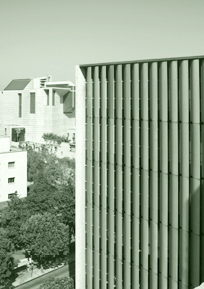
I had always considered the Los Angeles County Hall of Records, 1962, to be a soldierly and stolid example of mid-century Modernism. Reconsidering it through a visit and through looking at correspondence was a revelation. In fact, this building, primarily famous for the technical prowess of its striking 120-foot-tall, south-facing aluminum louvers, is really a lesson in designing for sustained productivity. When peppered by reporters’ questions about the louvers, co-lead architect Richard Neutra said, “All technical things are auxiliary to human well-being and an aid to vitality…. The most important thing about the louvers is that responsible government officials have been convinced by Mr. Neutra’s biological approach to protect the 1,200 employees working inside from unfavorable physiological conditions. The physiology of the eye, of vision, the fatigue and irritations produced were discussed by Mr. Neutra in open political meetings and reported in all Los Angeles newspapers…”
The fifteen-story structure was designed by a consortium of architects led by then-partners Neutra and Robert Alexander, a distinguished architect and urban designer, to house banal but critical government functions such as regional planning, probation, and legal records. The T-shaped building is sited to help define the north edge of the city’s civic core. To the west lies the contemporary glitterati of Gehry’s Concert Hall and Moneo’s Cathedral; to the northeast is the older Art Deco + Beaux Arts-style City Hall. The big, concrete-framed, windowless stem of the T, pointing south and clad in white terra cotta, with floor plates at 8′ 6″ to maximize storage capacity, stores paper records; offices, with a doubled plate of 17′, occupy the steel-framed east-west stroke.
Although it’s a little rough around the edges, the Hall of Records is an intelligent workhorse, with prescient responses to the ergonomics of working and environmental and solar issues. Its finishes of granite, brown and white terra cotta tiles (vertically oriented to acknowledge their non-structural purpose), stainless steel, glass and aluminum, were chosen to endure hard and incessant use. There is no stucco anywhere. Rendered in various scales, weavings, and panels, these elements often connect indoors to out. On the exterior, the effect is one of layers of subtly rich textures that articulate and soften the large volumes. The strategy speaks to a century of dialogue on cladding: Neutra studied with Adolf Loos, whose views on cladding were informed by nineteenth-century German theorist Gottfried Semper.
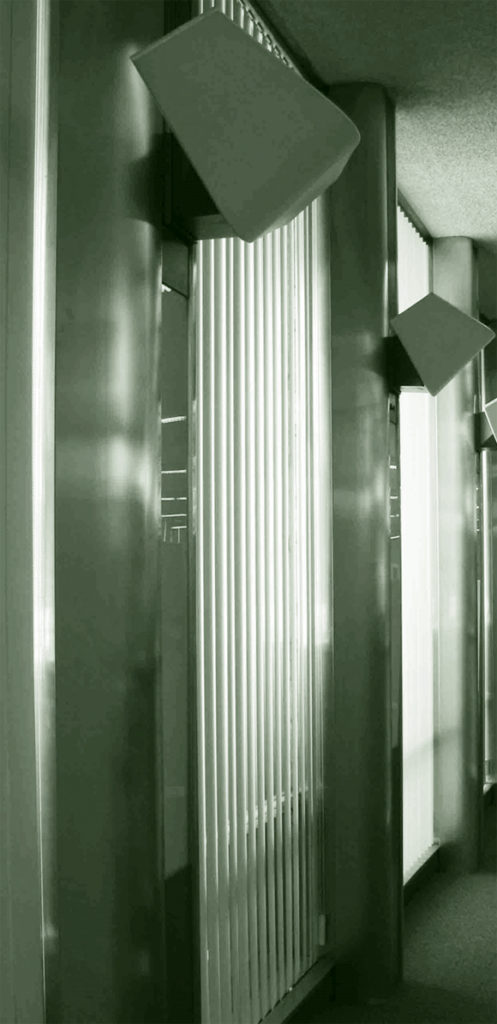
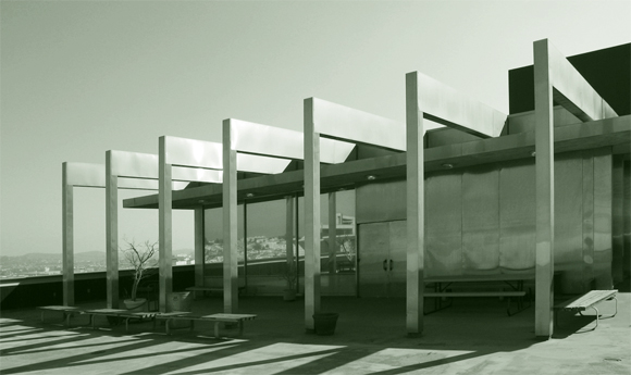
And then there are minor miracles, like the exquisite, shaded outdoor terraces scattered throughout, a reflecting pool (now empty) near the lobby that “eliminated ground cover and serves the psychology of the entrance,” a mosaic wall sculpture by Joseph Young, (slated, with the pool, for restoration), and stainless-steel light fixtures looking like a hybrid of Brancusi and Darth Vadar in what must have been a sleekly handsome cafeteria (now converted to office warrens) overlooking all the city. Not a bad place for a county office worker.
The architects layered functions as well. For example, the louvers, built by the manufacturers who built the louvers at Neutra’s famed 1947 Desert (Kaufmann) House, were designed to do several things. They eliminated solar gain before sun hit the glass. (The architects presented a cost/benefit analysis showing a $113,650 savings over five years compared to “air-conditioning and Venetian blinds.”) The hollow blades act as flues to encourage air flow outside the building envelope. Their sensual shape and silver coating diffuse light and provide ambient side lighting, reducing glare. (“Perpetually shaded and agreeably diffused, to the delight to human beings inside, whose comfort and efficiency, not impaired by fatigue and irritation, soon pays back for the millions of dollars investment in psychosomatic health,” Neutra wrote to the county.) Finally, the “verticalness” of the louvers saluted the legacy of the columns of a “dignified” classical building and drew on all those “emotional associations that go with wonderful tallness,” Neutra and Alexander wrote.
The building is rife with such intelligence. Smaller fixed fins on the north side of the building “provided shade after 8 a.m. all year long.”Because the architects wanted to reduce the cumulative eye fatigue created by intense contrasts of light and dark, the architects argued against “punched-in” windows, noting that the eyes of our genetic ancestors were attuned to sudden contrasts as a survival mechanism, not exactly helpful in an office setting. Instead, armed with research from leading eye physiologists, they proposed “continuous fenestration carried to the ceiling, like the high windows in Georgian architecture or from trees, reducing contrast by reflecting ample light on light-colored ceilings and partitions…”
The 17′ plate height also permitted the architects to engage in some good Wrightian (or Loosian, your preference) games in section: offices suddenly change in height, so that employees could feel both protected near the core of the building and then enjoy a feeling of expansiveness near the windows.
As I walked through the building, it occurred to me that I was seeing several moves that I had seen in Neutra houses. That is because on some level, Neutra did not distinguish between humans at work and humans at home. Their cognitive, emotional and sensory systems were ancient. Buildings needed to respond organically, no matter whether the building was home or office, Georgian or Modern.
Author Barbara Lamprecht, M.Arch., is an architectural writer and historian and the author of two books on Richard Neutra. Her third book, Reconceiving Ornament for the 21st Century, considers ornament post-Adolf Loos and in light of new science.
Originally published 2nd quarter 2006 in arcCA 06.2, “L.A.”

