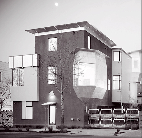
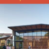
The Dwight Way is one of the most thoroughly “green,” small, mixed-use development projects in the Bay Area. Built originally as a corner grocery store with apartments above and a large side yard, the property had fallen into neglect, and the corner had become one of the noisiest and busiest in the city. By restoring the existing building and adding four small, two-bedroom units and a commercial space in an environmentally sensitive way, the project transforms this site into a tranquil, green showcase.
Leger Wanaselja Architecture, who were also the builders and the developers, set ambitious goals: to re-invigorate a busy but dreary urban corner; to create a landmark development from a nondescript old building on an underdeveloped big lot; to design and build as ecologically as possible; and to use ecological features as an integral part of a well-designed, highly crafted, and beautiful aesthetic.
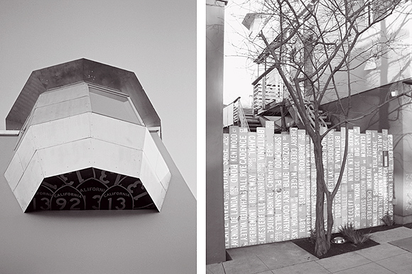
Some of the most ecological features are also the most striking architectural features. Throughout, the designers transformed discarded, underutilized and banal materials into striking architectural elements:
- Car parts enliven the buildings with Mazda hatchback railings, Porsche hatchback awnings, a gate made from Volvo doors, car headlight landscape lighting, and bathroom shelves made from car windows.
- Discarded CalTrans street signs were sanded and deployed as aluminum siding.
- Lath hidden behind plaster for almost a century was reused as a rich interior siding.
- Old growth Douglas fir and redwood were salvaged from the job and reused as window sills, walls, floor patches, and custom doors, and were finished with natural oils to highlight their beauty. Wood counters were hand crafted from salvaged, storm-downed trees.
- Salvaged Douglas fir beams were sculpted into richly shaped columns.
- Units are filled with natural light; high ceilings, oversized windows, and skylights dramatically reduce the need for artificial light.
- Unique glass terrazzo kitchen counters are made with 100% recycled glass.
- Stained concrete creates stylish and colorful but durable floors, eliminating the need for additional floor coverings.
Many other ecological features are less visible but contribute to the buildings’ energy efficiency, low toxicity, low embodied energy, and lack of virgin materials:
To conserve energy, the architects used 50% fly ash (a waste product of coal burning) in all the concrete; fitted the roof with photovoltaic solar panels; replaced existing single-pane windows with double-pane, argon, low-e windows; used energy efficient and Energy Star appliances throughout; and built all new walls with FSC certified, sustainably harvested, 2×6 framing lumber to create extra-thick insulated walls.
To eliminate the use of toxic materials, they specified low- or no-VOC paints and finished woodwork with natural oils; installed formaldehyde-free kitchen and bathroom cabinet boxes and 100% wool carpet; and insulated all walls and ceiling with cellulose insulation made from recycled newspapers. Most interior walls are plastered, largely eliminating the need for paint, caulk, and trim.
To reduce the need for virgin building materials, nearly all framing lumber, flooring, trim, doors and door jambs from the existing building were reused, and all construction waste was sorted at the job site. Anything usable was sold or donated for salvage, clean wood scraps (without paint, adhesives, or treatments) were composted, and all metal was recycled. A magnet was even run through all waste to collect discarded nails, screws, etc.
Outdoors, permeable decomposed granite paving at the parking area and a series of drywells replenish groundwater, and plantings are native and drought resistant species.
The new building is sited to take maximum advantage of the sun and to create a garden refuge. The mews, created by holding the new building eleven feet away form the existing structure, serves as the entry to most units, as well as bike parking and mail center. A sunny garden at the end creates an inviting refuge from the busy street. The space between the buildings allows winter sun to penetrate second floor living spaces. Placing the new rear unit’s deck at the second instead of the third floor gives the mews more sunlight and the middle unit distant views. South windows are placed high on the wall to bring sunlight deep into the building for both heating and lighting. Big skylights bring more sun into the building. The new decks are located on the south side of the building where the sun heats the slate floors, making them comfortable even on a winter day.
Originally published 2nd quarter 2005, in arcCA 05.2, “Other Business.”

