Editor’s Note: Here follow the 2001 AIACC Design Award winners. Out of these many, excellent projects, we have selected five for a closer look. Our process was neither systematic nor pure. I sought the suggestions of the editorial board, who were intrigued by the range of scales represented this year, then I freely modified those suggestions to include a project or two of particular interest to our roving correspondent. Roving and generous, for she — Therese Tierney, AIAS — graciously agreed to write the entire set of features, which follow the portfolio. We are grateful for her enthusiasm, her diligence, and her insight.



Metro Red Line Station
Los Angeles
Ellerbe Becket, Los Angeles
Honor Award
Photos by Timothy Hursley
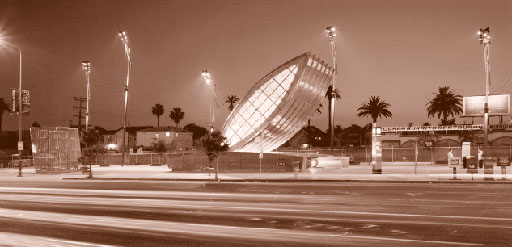
Defying gravity, like a shining fish leaping out of the water with a flick of its tail, a great silver ellipse beckons. Situated at the crowded intersection of Vermont and Santa Monica Boulevard, north of downtown Los Angeles, is a new metro station with an identity and dignity rarely found within the oppositional landscape of relentless grid and chaotic signage of Los Feliz.
Completion of this dramatic public structure and plaza required endless navigation through the stringent design regulations of the Metropolitan Transit Authority (MTA). The spatial configurations of stations, as well as the palette of allowable materials, were expressly defined by the MTA. In response to these parameters, project architect Mehrdad Yazdani’s strategy was to use bold, clearly understood gestures that could withstand the tedious planning and approval process. Instead of a ubiquitous parking lot, the architect’s proposal included a series of retail shops and a public performance space to enliven the square.

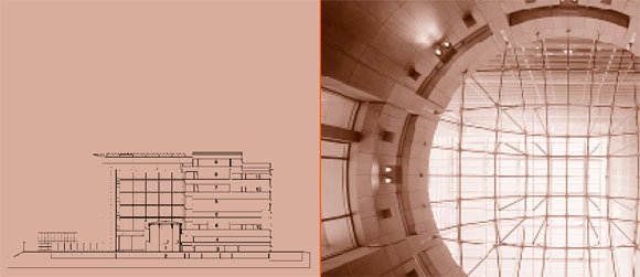
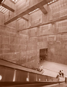
Escalators pass beneath the glass pavers, small skylights muting the bright sunlight. The descent invokes an almost primal response as cooler air and echoing sounds reverberate off a darkened double height space. A sense of enigma pervades this vault hollowed out of the ground, as if one were entering a tomb or a church. In the subdued light, ones eyes adjust, moving along the walls where Yazdani worked jointly with artist Robert Millar to stencil 10,000 questions about the design process on the exposed concrete walls: “How does art alter our perceptions?” “What is the relationship of art to architecture?” “What makes architecture?” “Why do we participate in social activities?” “What can the role of failure be in politics?” Yazdani elaborates that “the text is an exploration of the design process and the relationship between art, architecture, and the community.”
Situated within a context of uninspired orthogonal forms, the tilted light standards and canted forms of both entrance canopy and elevator clearly suggest the potential of speed and movement of the metro trains below. The concept is carried throughout the plaza in the landscape furniture, which angles off in unexpected directions, keeping the eye in constant motion. The canted, glazed elevator enclosure reveals the intermittent movement of gears and cables as the cab traverses from surface to depth and back again.
The Metro Red Line Station brings to mind the positive anticipation of movement and travel. Through a meticulous and inspired collaboration with artist and engineer, the architect was able to create a visual beacon and public place within the community. In an area where little civitas is evident, this metro station has the power to generate meaning, to shake off the commercialism outside, to give pause and provide a moment for reflection.
Diamond Ranch High School
Pomona
Morphosis, Santa Monica, and
Thomas Blurock Architects, Costa Mesa
Honor Award
Photos by Brandon Welling and Timothy Hursley, respectively.
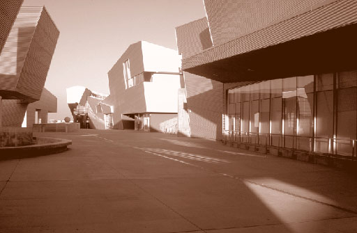
Speeding along Highway 60 in a hybrid gas/electric Toyota, I feel sure that the future has arrived. It’s proved with certainty as I turn a corner and a dramatic series of corrugated aluminum forms commands my attention. Incredibly, this dynamic artificial landscape is a public high school, one of the latest projects by Morphosis. With a vista of hard-edged mountains and the city of Pomona below, the school’s rooflines mimic the rugged hillside environment undulating with the terrain. Flanking the buildings, playing fields are incised in an act of terrestrial intaglio, carved into the earth, as the built structures erupt like rocky mineral outcroppings.
The project was concerned with three issues: the complex’s conceptual stance towards the site environment, social groupings, and educational flexibility. Morphosis’s first goal was to take advantage of the natural beauty of the site by integrating the playing fields and buildings into the surrounding hillside. The second goal was the creation of a dynamic built environment that would invite maximum social interaction among students, faculty, and staff. Finally, their third intention was to provide a flexible teaching environment that allowed a solid foundation of core curriculum for grades 9–10 and offered a focus on specific program majors in grades 11–12.
Morphosis was awarded this project through a competition, their concept illustrative of a fusion between architecture and topography. While much of the steeply sloped site was considered unbuildable, Thom Mayne, AIA, understood this to be an advantage, allowing him the opportunity to continue his investigations that blur distinctions between object and site. Acknowledging the complex balancing act required between cut and fill, he concentrated his efforts on a refolding of the landscape. His initial concept of geologic strata bending under unseen forces evolved into a linear plateau enclosed by shifting, folded roofscapes.
Socially, the intention was to create a densification of cultural experience like that found in urban areas, but juxtaposed here against the school’s suburban environment. Formally, the buildings’ canted metal accretions and angled parapets, though nonstructural, exhibit a dynamism that early twentieth century Futurists often associated with the modern city. Central to the school’s parti is the “main street,” which serves as a social gathering place and, in Southern California’s mild climate, becomes as important as the buildings themselves. Explains Mayne, “In this project, we were interested in providing a model for a public school facility that speaks to the students experientially through a symbolic, physically kinetic, architectural language. We were interested in reversing the message that has been sent by a society that routinely communicates its disregard for the young by educating them in haphazardly arranged, temporary bungalows surrounded by impenetrable chain link fencing.”
The grades 9–10 classrooms are located on the downhill side of the street, while grades 11–12 are placed on the uphill side. These two principal divisions were conceived as small “schools within a school” and are articulated as separate buildings that create a series of clusters. Each unit has its own outdoor teaching or gathering space and a teacher’s workroom. Each is orientated to command a view of the valley and mountains beyond. Arranged in split level configurations, a series of ramps and shaded tunnels interconnects these areas to each other as well as to the rest of the school.
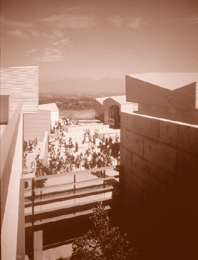
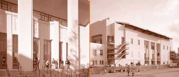
The excitement at Diamond Ranch High School is generated not out of a sophisticated material palette (the materials here—corrugated metal, stucco, glass, and exposed concrete—are simple and restrained), but instead out of the pure geometric potency of the forms and their structuring. An inventive, exploratory approach to site utilization has produced a socially stimulating school. And, through intelligent planning and careful detailing, it was built within the standard school budget of $140 per square foot. Most importantly, the students and faculty are wildly enthusiastic about it.
Reactor Films
Santa Monica
Pugh & Scarpa, Santa Monica
Merit Award
Photos by Marvin Rand
Santa Monica-based architects Gwynne Pugh and Lawrence Scarpa, AIA, say they never know where they’re headed, that the design possibilities are endless. Without predefining architecture, they respond directly and intuitively to the material qualities of place. The context and program for Reactor Films’ production studio suggested an experience ordered like a film or freeway, framing and containing reality. In addition, the compressed schedule generated an unusual approach that disassembled the project into discrete elements.
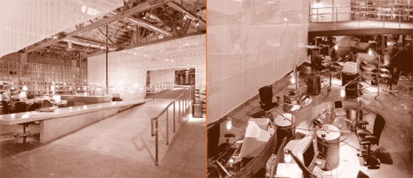
Given the incredible fourteen-week schedule from preliminary design to move-in, the firm’s methodology and organization alone are worthy of honor. A systematic working strategy was developed based on collaborative relationships among client, contractor, and architect. Relying on past experience with similar projects, the architects’ approach was to solve the rigorous technical issues and programmatic requirements first. Then the project was divided into distinct areas that could be studied and developed independently of one another to finer levels of detail as construction progressed. Their expertise in both architectural and structural engineering also expedited decision making. A fast and flexible format was established from the beginning: 11×17 free-hand pencil drawings, which could be faxed easily between all parties. The immediacy of working in this “one take” or “live broadcast” fashion increased spontaneity, just as a charette does. Says Pugh, “Contrary to expectations, the time constraint didn’t compromise design; if anything, it actually catalyzed the work.”
Their design examines the tension between the old and the new. The existing 1930 Art Deco tile-faced building was kept intact, with newly proportioned storefront glazing inserted between the masonry frame. As Scarpa explains, the interior can be viewed as “a skin or surface wrapper that moves in and out between the existing brick walls, alternately concealing and revealing the existing building fabric.” The layering and folding of the newly plastered surfaces weave together disparate materials. The existing concrete floor was sandblasted, and, where an existing wall was removed, a backlit, perforated metal panel traces the floor plate. Recalling film director Alfred Hitchcock’s interest in openings as metaphors, here, too, voids are as important as surfaces, revealing an earlier pattern of materials or use.
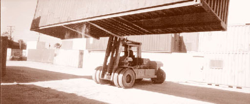
Of particular interest is the conference room, which is made out of a dissected and reconfigured ocean-shipping container. Procured from a Long Beach shipping yard, the rusted container is treated as an urban artifact encrusted with rich historical signification. Invoking the pervasive modern experience of the freeway, the redefined container has been elevated as an honorific object, its concrete bases generated from the forms of overpass pylons. Above, freeway lights brilliantly illuminate the piece as sculpture, an index registering the passage of time and miles. Mitered steel pipes, cantilevered concrete stairs, and perforated metal screens welded to heavy metal panels slide on tracks, alternately expanding or contracting the space of the conference room. One’s direct response to such overwhelming materiality is immediate: welded and patinated metal, sliced and reassembled, creates atavistic connections that extend into some future time when petroleum will no longer fuel our desires.

In Complexity and Contradiction in Architecture, Robert Venturi writes, “A familiar thing seen in an unfamiliar context can become perceptually new as well as old.” Context—here, a 1930s storefront—provides the frame. While acknowledging the mise en scene, the architects play with our cultural expectations. By placing objects, such as the shipping container, “outside the frame,” they create a new frame of reference and deepen our sense of perception. It has been said that art does not reproduce what we see; rather it makes us see. Such is certainly the case here.
Iann/Stolz Residence
San Francisco
Kuth/Ranieri Architects, San Francisco
Merit Award
Left-hand photos by David Wakely; right-hand photos by Cesar Rubio
At the end of a narrow lane on Nob Hill is a residence that explores the idea of house as fine artifact. Its board and batten exterior signals a recognition of Bay Area regional typology, but rendered here in a rarified treatment of varnished mahogany panels. Demonstrating a confident handling of materials and the art of joinery, the battens align and merge with steel horizontal window mullions angling out towards the lane. Folded into a synthetic assembly, the familiar elements of garage door, front door, and bay window coalesce into a sum greater than its parts.
The architect’s site-specific installation, “Fabrications,” at the San Francisco Museum of Modern Art in 1998, convinced the clients to select Kuth/Ranieri to design their home. The installation had focused on the complex relationship between the human body and the fabricated building. Exploring the idea of the body in repose, with thick felt seats and curtains embedded in a gallery wall, it was commended for its tactile and emotive use of materials.
Using a similar approach in their architectural projects, Kuth/Ranieri address programmatic requirements directly, starting from an analysis of basic systems and materials. Byron Kuth, AIA, explains, “We use common, everyday components and like to destabilize their traditional meaning.” In this case, they questioned the characteristics of typical wood-frame construction—limited dimensions, a matrix of small units, a particular means of assembly—to develop a rigorous internal logic that might escape the whims of fashion.
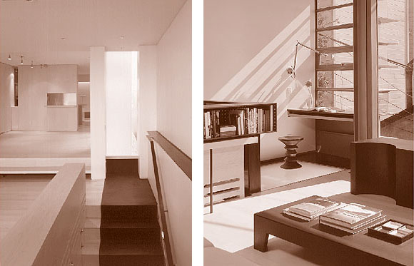
One of the challenges was to fit a fairly large program on a small, twenty-three foot wide site. Spatially, the intention was to open up the house as much as possible to views and light, placing services, stairs, and bathrooms at the blind sides. The plan at each level is organized to frame and receive expansive vistas to the bay, the Golden Gate Bridge, and the Marin Headlands beyond. In a loft-like configuration, the high-ceilinged interiors provide a continuous flow of space and light. And by excavating a full story below grade, the architects were able to include a three-car garage and impromptu gallery space for their clients.
Within the context of the open plan, living room, dining room, and kitchen are clearly yet unexpectedly defined. Instead of conventional walls that block light and shrink space, a language of visual cues relating to scale, material, and use subtly differentiate activity zones. Defined by a sectional displacement, the dining room is really a room within the larger living room. Evocative materials—stainless steel, blackened steel, limestone, bleached maple, and integrally colored plaster—articulate and communicate different programmatic uses.
With unusual singularity, this house shifts and moves, responsive to the inhabitants’ needs and desires. Walls perceived as solid and static transform into furniture or pivot and fold away completely. Meticulously planned moveable units with inventive dual uses provide flexible specificity. Precisely detailed retractable shelving, sliding panels, and rolling track doors shift effortlessly or disappear, creating the impression of a much larger space. At the roof deck located off the master bedroom, retractable glass doors disappear, causing the boundaries between interior and exterior to dissolve, merging the view with the room.
The design approach of Kuth/Ranieri balances the framework of a rational system with an open-ended exploration of ideas. “Our world has been reduced to surfaces,” says Kuth, “computer screens, signs, television. We’re trying to reclaim a tactile and physical presence in a world obsessed with electronic and consumer imagery.” This house, detailed to the level of fine cabinetry, with materials sensuously used and inventively joined, makes familiar forms new.
Long Meadow Ranch Winery
St. Helena
Turnbull Griffin Haesloop, Berkeley
Honor Award
Photos by Cesar Rubio
“It occurs to me now when we talk about ‘images that motivate,’ mine are not abstract or metaphorical but overwhelmingly concrete and tangible. They are the sites I build on and are always distinct from one another. The shape of the ground, the view, the quality and type of tree cover, the sun, the wind all have voices that I listen to and learn from.” —William Turnbull, Jr., “Images that Motivate: the Legacy of Charles Moore,” Places 11 (1998)
The accomplishments of William Turnbull, founding principal of MLTW, are numerous and well documented. It is probably less well known that this Princeton graduate’s abiding connection to the landscape was inspired by his early years on a farm and was later expressed in his own working vineyard in Napa. In the March/April 1988 issue of Architecture California, he expressed concern regarding the disneyfication of the Napa Valley, which was rapidly churning out Italian villas and French chateaux. Turnbull argued instead for an architecture that would respond to the rural landscape, drawing on local traditions and materials. Two projects—the Long Meadow Ranch Winery and a private residence in Northern California—begun by Turnbull and completed by his partners, Mary Griffin, AIA, and Eric Haesloop, AIA, illustrate the extension of Turnbull’s vision in the ongoing work of the firm.
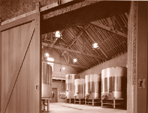
With one of the oldest olive groves in Napa County, dating from the 1880’s, the Long Meadow Ranch is now a family-owned organic farm with a small winery, fermentation caves and an olive oil processing facility. The owners are committed to sustainability in architecture as well as agriculture; their commitment drove the entire project from siting to construction method to the smallest fabrication detail. Simply, the intention was to minimize the impact on the environment. In a landscape of softly curved hills, native oaks, and grasses, the site was selected for its central location and northern orientation. Most importantly, the steep slope of the hillside was ideal for tunneling into. Weaving a synthesis between the natural topography with the rational program, the winery mediates between the native forest edge and the cultivated vineyards, between the raw and the refined.
The wine and olive oil processes share the same building, but are located in separate wings and have complementary seasonal harvest periods. Straddling the two wings is a shaded open porch used for the crush during grape harvest and for loading the olive press during the olive harvest. Based on an 18th century panopticon typology, the view from the second floor office extends across the entire vineyard and orchard beyond.
What is particularly innovative about this winery is its method of construction. The two-foot thick walls are made of pise de terre, as it is known in France, or PISE (pneumatically injected sealed earth) here. Excess earth, excavated to form the wine cellar caves, was mixed with cement and engineered with steel to form the rustic walls. Although similar to the Southwest’s rammed earth in composition, here the earth is not compacted within a wooden formwork, but instead a soil/cement mixture is pneumatically injected into a steel reinforcing cage. Extensive reinforced concrete foundations were required to support the weight of the earth walls; a 4’x16’x 2’ section of wall weighs over 10,000 pounds. The walls are finished with a mixture of white Portland cement mixed with the native earth to integrate the natural color of the soil. Last, piano wire is drawn across the face of the walls, leaving a rough texture. Requiring little maintenance and absorbing sound, the solid walls feel as if they are part of the mountain.
No air conditioning is needed; only passive features are used to maintain a constant temperature in the winery. Locating the building on the shaded side of the hill minimizes heat gain, while the thick walls provide the necessary insulation and thermal mass. Other passive strategies include a night air cooling/ventilation system and connection of the interior spaces to the stable, cooler temperatures within the caves.
The structure is exposed throughout; roof and floor framing utilize recycled timber from a bridge. The systems are expressed and detailed to bolt directly and unapologetically onto the earth walls. In addition, the architects designed the lights and worked with a local designer on the furniture. The tables, chairs, shelving, and lights were all fabricated locally.
Turnbull’s legacy is a deeply considered architectural response to the landscape; his talent was to place structures with a sense of always having been a part of their rural surroundings. “Bringing out the simplicity and clarity of a particular situation will be his most cherished tradition,” writes architectural historian Mitchell Schwarzer in William Turnbull, Jr., Buildings in the Landscape. At Long Meadow Ranch Winery, with appropriateness and honest simplicity, Mary Griffin and Eric Haesloop continue the timeless quality of his work.
Originally published 3rd quarter 2001, in arcCA 01.3, “Publicness.”

