Editor’s note: This article continues the exploration of architectural construction documents begun in arcCA 6.1.
According to a widely held assumption, architectural working drawings have emerged partly in response to new, complex technology, partly because of the necessity to avoid waste while using expensive and durable materials. A study of working drawings produced for Bernard Maybeck’s Palace of Fine Arts in San Francisco may provide an additional insight into the practice. Since 1916, when it was built as part of the Panama-Pacific International Exposition, terms such as “dreamlike” or “ghostlike” became permanently attached to this structure. Often summarized in comparison with a stage set, these qualities won the hearts of many Exposition visitors. To certain portions of the architectural profession and critics, the same characteristics amounted to an anathema.

Contrasting architecture with scenography—using the latter as a negative term—was typical of architectural discourse in the end of the nineteenth century, when the profession was making an effort to outline its own standards. According to this view, architecture should strive to be an honest and earnest representation of building materials and social conditions, while stage sets may be designed based on less discriminating principles. In an article published soon after the Panama- Pacific International Exposition, certain architects were criticized for practicing their craft as “stage scenery, camouflaging arbitrarily, as suited to the architect’s fancy, the real thing underlying it.”1 The reaction to Maybeck’s Palace of Fine Arts largely depended on its status. It was somewhat acceptable to architectural purists as a temporary structure.
However, when it surpassed this category— when it was spared from demolition after the Exposition’s closure in 1916 and, once again, when it was rebuilt in the mid-nineteen sixties in permanent materials—many architects and critics were truly scandalized.
Architectural historian William Jordy, who wrote his seminal Progressive and Academic Ideals at the Turn of the Twentieth Century soon after the restoration had been completed, concluded his analysis with a phrase that characteristically contrasted the Palace’s dreamlike architecture with earnest design principles, which would have been more appropriate for a piece of permanent architecture. In arguing his point, Jordy used definitions such as “scenographic” and “eccentricity” as derogatory terms, considering it obvious that visual effects used in a stage-set design should not be confused with real architecture.
As Jordy explained his attitude to the project—quite picturesque but short of meeting the standard of rigorous design—he remarked that the project was designed and built without “adequate studies.” Jordy made this observation in passing, simply assuming it self-evident that a temporary pavilion, such as Maybeck’s Palace, should have been built with fewer working drawings than would be required for a typical, permanent structure.2
Jordy could not have been more mistaken. The working drawings for the Palace were quite voluminous and were produced with a very high quality of draftsmanship. Most importantly, the surviving documents witness that the project’s “crudity” and grotesqueness—which Jordy criticized as an outcome of Maybeck’s lack of interest in construction—were in fact carefully planned. They were totally consistent with Maybeck’s concept, recorded in progression from the first charcoal sketches, to the working drawings, to full-size details, and, finally, to full-size molds of details. These were photographed, then pencil corrections made, then the next cast must have been made.
A close look at this process may shed a new light on Maybeck’s intent. Most of turn-of-the-century exhibition pavilions strived to become perfect simulacra of classical buildings constructed in permanent and durable materials. Maybeck’s design, by contrast, emphasized tectonic differences between stone and the inexpensive plaster of which his building was made. While evoking the Corinthian order, Maybeck refused to imitate those characteristics related to the use of stone as the main construction material. In classical originals, the slender proportions of columns and the crispness of details reflect such qualities as firmness and high resistance to vertical stress. On the contrary, Maybeck’s rendition of these details implies a highly malleable and impressionable material. A comparison with the Corinthian order of the Temple of Castor and Pollux—as shown in Hector d’Espouy’s Fragments d’architecture antique…—will demonstrate this point.3
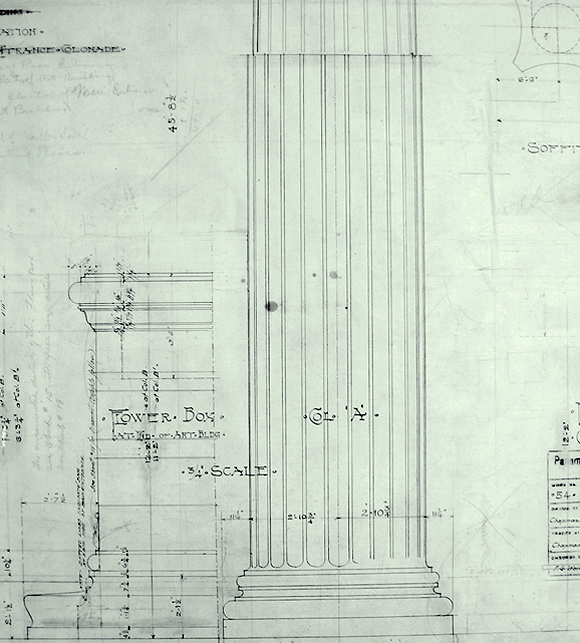
Virtually all writers acknowledged that the proportions of the Palace’s column shafts were too short and heavy for the Corinthan order on which they were based. Less often noticed, however, is the equally unorthodox treatment of other elements, which look as if they were made out of a material with greater plasticity and less crispness than stone. It can be seen in the example of Maybeck’s design of column bases—more flattened than those in most interpretations of antiquity (Fig. 2). The same concept is apparent in the treatment of the columns’ fluting. Traditionally made in the form of semicircular concavities, it is much shallower in the case of the Palace (See Fig. 5). Moreover, looking at an intermediate sketch, and their form in the final working drawings, one can see that the design was developing toward a more unusual rendition.
The same development can be seen in the evolution of Maybeck’s design for the columns’ capitals (See Fig. 1). One of the first full-size charcoal sketches already shows his tendency toward a soft, less-refined shape. If compared with Corinthian capitals after d’Espouy, it becomes clear that he intended to impart a feeling of imprecision. Occasional intermediate overlays on tracing paper show that oscillations occurred between the softness of his original sketch and a more traditional version of the Corinthian order. And yet the capitals as they were finally executed are closer to the charcoal sketch than this intermediate study. Moreover, the series of photographs of full-size models of these capitals serves as convincing proof of the fact that, during later phases of the design process, the architect once again returned to his original emphasis on the visual qualities of highly-malleable materials (Fig. 3). A highly-detailed template, hanging on the wall of the shop, indicates that Maybeck must have taken great care to specify these qualities. Besides, the pencil marks on some of these photographs—which were intentionally overexposed to allow for such marks— indicate that, at this stage of the design, Maybeck was still searching for softer and cruder shapes.

This phenomenon recalls a remark made by architect and historian Edward Ford in the context of his discussion of a project by English architect Norman Shaw. The style of the project was influenced by a medieval half-timber frame, and the drawing that caught Ford’s attention specified unevenly positioned vertical timber elements. Ford noticed the irony in the fact that Shaw “had to specify precisely, how the imprecision was to be achieved.” Accordingly, Maybeck used delicate working drawings, crisply drawn templates, and design tools such as photography— which became available with the new technology—to produce a building whose details gave the impression of incompleteness, improvisation, and pre-industrial methods.
A study of the working drawings produced for the Palace of Fine Arts reveals a number of paradoxes. It supports the notion of this project uniquely combining the sense of tactility with its overall dreamlike image. In addition, the production of meticulous working drawings for a temporary structure built out of inexpensive materials defies a number of assumptions about the origin of contemporary architectural practices. The fact that Maybeck emphasized the thrifty nature and temporality of his Palace makes this paradox even more striking.

It is unquestionable that architectural working drawings—whose production did not become a norm until the mid-nineteenth century—reflected the rapid change in construction technology, such as the use of cast iron, steel, and eventually, reinforced concrete. It is also clear that they evolved as the architect was becoming increasingly removed from the construction site. Finally, their production became possible because new design media—from tracing paper to photography—were becoming part of the late-nineteenth-century architect’s arsenal. And yet, Maybeck’s drawings also witness the architect’s desire to bring the feeling of tactility back to architectural production. Even as they made use of the new design media and facilitated the new construction technology, architectural drawings have often served the modern architect’s desire to return to the image of the craftsman, to be in touch with his design.
- See anonymous article “Architect Must Meet Changed Conditions” in The Architect and Engineer of California, vol. LIV. n.2. (August, 1918): 107-108.
- Jordy states that Maybeck’s design was “arbitrary,” that it “happened without premises,” and that the project was “unabashedly scenographic”—which, for the critic, amounts to “perversity” (Jordy, 1972: 276, 288).
- See Hector d’Espouy, Fragments d’architecture antique d’après les relèves et restaurations des anciens pensionnaires de l’Académie de France a Rome (Paris, Ch. Massin, 1905). According to a number of historians and contemporaries, drawings from d’Espouy’s collection were among Maybeck’s major sources. See, for example, Kenneth H. Cardwell, Bernard Maybeck: Architect, Artisan, Artist (Peregrin Smith, Inc., 1977: 149). A photograph copy of the plate from the book, showing a column’s capital of the temple’s Corinthian order, survived among Maybeck’s records pertaining to the project of the Palace of Fine Arts (See Fig 1 b).
Author Alexander (Sasha) Ortenberg, Ph.D., AIA, is an Assistant Professor at Cal Poly Pomona. He is an architect and a historian of architectural practices. The article for the current issue of arcCA is drawn from his doctoral dissertation, Drawing Practices: The Art and Craft of Architectural Representation (UCLA, 2005).
Originally published 2nd quarter 2006 in arcCA 06.2, “L.A.”


